
UX Design Tips for E-Commerce: How to Design Product Page and Improve User Experience in 2020
Online shopping is only solution for the user prefer no queues, ample choice and shopping at odd hours, so if you are a online seller and want online shoppers to go for your e-commerce then convenience factor must high on your website, Here I am sharing

Online shopping is a one-stop solution for users. No queues, ample choices, option to shop even at the odd hours…life is good. Yes, it is all about convenience and if you want online shoppers to go for your e-commerce, not of your competitors, the convenience factor must be high on your website.
The main reason here is that prior to being customers, your leads are mainly users. If they are not given simple, fluid and user-friendly solutions, the chances of picking your store are less. A product page, which reveals the uses and gains from a store item, explores all the features and demos and smoothly transmits to the checkout page, is regarded as a perfect UX design.
The web design UX aims at tackling all the issues that may hinder a user from performing an action and puts in features that provide ease to the user in reading, selecting, filling details or making payment for the final order. UX design, mind you, is not limited to the look and display of the product page rather it is about mastering the web design usability and knowing the users completely.
Further, it involves helping the users in reading effective content, looking at focused images, evaluating prices with product features, executing the checkout process and much more.
Every e-commerce store owner is on a constant lookout to increase traffic and boost sales.
Optimizing the UX design to enhance conversions is always a challenge for the developer, designer or the merchant as they have to substitute themselves in place of the user and work on the areas that need change.
You got to stay relevant no matter what. Essentials like selecting the target audience, social media influence, impressive portfolio of products or services, and loading speed of your website can make all the difference.
In this smartphone-driven world, don't forget the needs of the people who're shopping from their mobile devices and tablets.
Such is the mobile presence that according to a recent survey, mobile e-commerce sales counted for 63.5 percent of the total e-commerce sales worldwide. The number might reach up to 72.9 percent in 2021.
There are a lot of points you must consider in your UX design to review product pages carefully and strategize usability. Here we go…
The Shorter, the Better
Studies show that smartphone users devote up to four minutes in scanning e-commerce sites. This figure varies slightly for desktop and tablet audience, who give around five minutes. Whatever is the case, one thing is for sure, as an e-commerce store owner, your first impression is cast really fast so you must have a quick influence towards a positive buying decision. Time poses a challenge when it comes to the small screen. Simplicity is the key. Display your products in an open yet subtle way. The design should be concise; crisp yet complete in information the user wants. Using imagery can also be very effective.

Be On-Point
The customer journey should be well-defined. When a user goes to your e-commerce store, he must be properly navigated from point A to point B. And note that you have only four minutes to cast your charm. So, distractions are a big no-no.
A blunder that is made often is premature upselling or failing to set priorities. It is seen that e-commerce websites try to promote additional products or services even before the first purchase. A better approach will be to sell stuff after the initial buying has been done. Why so? Firstly, you will not impose a burden on the user with tedious steps and information during his checkout for purchase.
Thus, the risk of dropouts is also reduced. Secondly, upselling is simple when users are committed to buying products and services. Once a purchase is done by your customer, the probability of selling him something else is quite high.
Refined Images
Anything said on the importance of imagery in the e-commerce stores won’t suffice. No matter what is the nature of your product, imagery should be perfect. Product images have their own advantages like store interactivity, conversion, retention and lifetime loyalty. Leave aside these benefits, pictures are the only medium to show your product. With e-commerce platform you can’t access the option of physical contact, so your images become a great deciding factor.

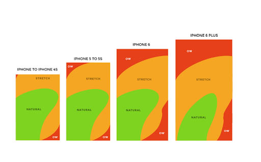
Proper Thumb Action
It is always advisable to keep your important and scrollable portions in the central space within the ‘natural’ region of the thumb. The topmost areas of the ‘stretch’ region and the ‘ow’ region are the ones where the users can’t interact clearly. Another point to be remembered here is the ‘large thumb’ concept. Don’t go for small clickable links.
Tapping on them sometimes becomes really annoying and they are generally considered flawed. A good principle is to go for bigger elements than the ones actually needed. Clickable elements can be designed as wider boxes so as to not go deceptive in the eyes of users
Upfront Information
Your website must be trustworthy to make the potential customers indulge in e-commerce. And it is indeed a herculean task to establish users’ trust at the very first stage. If essential details like shipping and return information or contact queries can’t be answered promptly, the users not only become irritated but also doubtful.
Various questions lurk in their mind like, is shipping fee not revealed because it’s too expensive? Or is this e-commerce genuine enough as there’s no way to contact it? The more the customer thinks over these details, the more the questions surface. If you don't want the target audience to be skeptical about you, be clear with the relevant information and keep it above the fold.
This will not only make the customers value your honesty but also the fact that you didn't waste their time and effort in locating crucial details.

Display Recent Purchases
Do you have a group of loyal users who are fond of purchasing the same things in your e-commerce store? If yes, then personalizing their accounts is a sure shot way to win their hearts. If some users come to your site every month to purchase fixed cat food, showing a portion of recent purchases right after log-in will add to their shopping experience.
No time is spent searching for the apt bag size and the choice of cat treat-just one tap and the product lands straightaway in your cart. Announcing that such a feature for the customer is present in your store will surely make them come back in hope of convenience.
Fast Filtering
First, make this clear; unless you are a seller of decent 100 products, filtering and sorting option is a must for your site. If you want customers to scroll endlessly in their lookout for things, forget delivering a memorable experience in your e-commerce store.
Filtering and sorting feature makes the search for the desired product much quicker and smoother. That's the reason it is crucial to have as many options as possible and make them relatable to the things you sell. For filters, set the multiple options so that the customers can exactly tell what they want. The best user-oriented design solution for filters is to create a dropdown that shows and shuts with the click.
The selected options should remain open and act as a sticky element. Through this, users can view which filters are on, without the trouble to shift to the top of the product listing page.

Customized View
Your product listings page should be modified not only as per specific shopping habits of typical customers but also to the various contexts of stopping over an e-commerce store. Some of the users may resort to a quick overview of the page searching for some required products; others might want to go through the description of many things.
In the first scenario, a lengthy list of small boxes will be suitable on a product listings page, in the second one; a zoomed and more defined set of information is preferable. Which to go for? Let the users be the judge. The users will feel valued if they know about the feature to adjust the view and number of products displayed on the product listings page.

Additional Product Details
The details users are searching for on a product listings page differ. Firstly, it is based on the category of products you are dealing with. In the case of clothes, for instance, the picture is of great significance whereas in the case of smartphones what is important is technical information.
This is what it looks like, on the face of it. But the reality is that you can never be sure of the information that the customer is expecting. That's why the greater the info, the better. As the product listings page is restricted to a limited area and can easily become chaotic, the best approach is to use hover to give more details. If the user shifts the cursor on a product that is of their interest, they will be served with more information right away.

Product-specific Notifications
A newsletter is a great medium to tell customers the latest news from your e-commerce but is quite general in its scope. Usually, you'll find similar information posted on Facebook profile. That's the reason many users don't subscribe for newsletters or ignore the emails outrightly.
What most of the people want is not general information but specific news about concerned products: When will they be in stock again? , Will there be any sale? Are there any special offers that can be availed? And if you want that they should take back pleasant experience from your e-commerce, give them what they seek.
A smart way is to create an email icon on the product page with a dropdown menu that lets users select the type of product news they are interested in. Such product-specific email notifications will satisfy the customers with the updates they are looking for. You never know, such messages can even become a touchpoint for your e-commerce store and you can be the ultimate choice of your customers.

Perfect Search
The search function on mobile devices is cumbersome with its zoom-ins, selection of search bars and tedious typing with your keyboard. Mistakes are common and hence the annoyance. But, when executed properly, the smart search feature is a competent way to enhance user experience and to surge e-commerce sales.
A great example of the smart search function is flight ticket booking. As you enter the first few letters of the word, the search bar instantly shows a lot of options for you to select from. It avoids unnecessary wastage of user time and simultaneously highlights your hot picks.
The Three-tap Show
This one is also crucial to heighten your e-commerce sales. By now, enough has been said on the importance of simplicity in e-commerce user experience. A three-tap rule is a simple approach which ensures that the moment the user arrives on your website, he shouldn’t use more than three taps to access your products.
The journey in an effortless e-commerce store should start with user arriving on the homepage and choosing from a particular type of products. Further, the user selects a sub-category to locate specific products. Then, the user is directed to your product page. That is all; the product page must make the user proceed to check out.
Avoid Pinch Zooming
Pinch-zooming is a thing of past. We have been over this trend and using it can backfire. Present-day mobile design is all about abiding by proportions. That means we got to be proportional with the contents on the screen of the mobile device. Pick up your fonts wisely; they should be readable without arousing the need to zoom in. Don’t forget to abstain from tiny links. Clickability should be achieved without pinching.
Cart in Style
Another section we tend to ignore in our mobile website is the shopping cart page. Remember to follow some practices while designing it. Firstly, you should notify your users when they include an item in their shopping cart. Don’t wait for confirmation, simply shoot a notification.
You must display the total number of items piled in the shopping cart right in front of the icon. Remember to have all the necessary product information shown upon selecting them before the check-out process. This way the customer shouldn’t be anxious about coming back and verifying the details. If you have the facility of coupons and discount codes, it should be applied easily without any complications.
Show the payment and shipment details with clarity in order to make it simple to evaluate and edit.

Note-Making
Let there be a field where the users can type down notes beside an item. For example, if the customer returned an item, they can enter the reason to make it a personal reminder. Customers generally tend to forget why they returned an item initially. It could be size, colour or material.
By enabling the note writing feature, you can save the user time and money by preventing them from accidentally re-ordering the item and getting stuck in the process to return it again. Such notes come handy for future references.
Takeaway
Change is now. To make your e-commerce sales improve, you need to make changes. The more options on the platter for the user, the better will be your sales. These tips will help you to restore your UX and proceed towards high conversions. Your aim is to reduce the stress for the user when it comes to buying products or services. Try to engage the users fully and render a satisfying experience. After all, awesome UX leads to awesome sales!


