
20 Common UX Mistakes In Ecommerce Websites
User experience (UX) is an important aspect of ecommerce. ecommerce company should work on fixing common issues and mistakes that impact on user experience.

Ecommerce websites have become showstoppers of online trade. There is a huge market out there providing e-commerce solutions and helping the customers reach their goal. As users are flooded with options, it is a big challenge for the retailers to immerse the buyers with meaningful experiences so that they don’t drop off midway. Amidst all this rat race, online retailers often make certain mistakes that give bad UX results and make the users leave major landing pages. However, these mistakes can be avoided if the makers execute vigilant planning.
If you have already made some mistakes, then don’t fret as it is possible to correct them later. Nevertheless, if you succeed to avoid them, you can enhance the experience to a great extent. Users are quick to shun your website if they come across a product that is bad in quality, has a tedious registration process or is unresponsive to calls-to-action. Having said that, you must also know that no website is perfect at first in the live display. Even if you adopt the simplest platform, there will be issues at hand. Although it is hard to foretell problems, there are certain common issues that can always be prevented or at least sorted.
Identifying the pain points of the customer can go a long way in keeping problems at bay. Now, you can only get to the right if you know the wrongs. So, here are some common mistakes that you commit which affects the site’s performance and slows the conversion rate-
Visitors prefer clear cut and straightforward websites. If you keep them guessing or provide insufficient information, they are bound to leave the page. Product information is one of the significant points to be kept in mind while creating a site. Your site can fall behind in the market if you don’t give ample information to the shoppers and help them to make the right purchase. By including detailed product info, you are also being transparent with the customers and winning their trust. This extra information will help them accomplish their goals faster and in turn boost conversions. By detailed we mean complete info, that is, features, benefits, ingredients/ materials, and measurements.
You don’t have to give elaborate data in the description that is of no importance to the shopper. Make sure that all the information is compiled in an interesting way so that the users are tempted to make the transaction. The idea is to convince that the product is just what they have been looking for.

You might be under the wrong notion that your website absorbs users well and engages them thoroughly. It is time you stop and consider your product pages again. Can they retain the users for long? What is interesting in them? Are there any videos present? Videos, did we say? Well, yes. Don’t neglect videos in your site as they offer great leverage in terms of attention to a product. They play a pivotal role and must be included in your content marketing strategy. Videos prompt the buyers to spend a great amount of time on the page. As per research, the average time devoted by a user to a site is just six seconds, however, if your UX is powerful you can persuade the users to spend great deal of time on a page. And this is when videos can actually come into play.
Absence of videos, without doubt, will hamper UX, but even when you are using videos what matters the most is the right approach. Putting videos is just not it. So, whenever you are including videos make sure you are using them in the right way to pull maximum numbers.
UX is not limited to products and shopping cart on your website. A shopper goes through various other pages before making a buying decision. Pages like shipping delivery returns policy, payment pages, and customer service are important and can be a major put off if they lack in the display or fail to appear. If such pages are ignored then the customer gets the impression of passive communication which means retailers are least bothered to give complete information about their business and its policies. By having an impressive customer support page, you can prove your credibility in the eyes of users and ensure them the gratification of their needs.
A customer support area is a major place in the e-commerce marketplace and by making it non-existent or creating a poor page, online merchants do a big blunder to their business. The page should give complete info to all the prospective buyers in order to assist them in their buying decisions. Customer support pages if well-designed guarantee terrific user experience and yes, also surges the conversion rate higher.

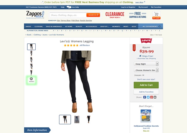
In this era of technical evolution, we have become advanced with our computer screens, resolutions as well as visual designs. Even responsive web design has come into picture which makes it possible for the website to be compatible with all the screens. This change has revolutionized the concept of websites for web designers and they have incorporated high resolutions visual designs for eCommerce websites as well. However, there are websites that are still not using large product images and resorting to low quality, small images for their product pages. As a result, this hampers the experience of shoppers who are keen to view the larger product picture in the interest in their purchase.
Online shoppers have the major drawback of intangibility as they can never know the products actually look and feel. So, as a designer, you can heighten their in-store experience by including larger pictures of the products. Users feel at ease if they are able to view the larger versions of the product coupled with other relevant info as it helps them to finalize their purchase.

Consumers want to deal with a company in real-time on the virtual platform. Whenever they hand over the credit card information, they want to know whether they are dealing with a real company. They want to be clear about the fact that if they face any problem can a real person come to their rescue and help them in need. If the contact info is missing from your site or is hidden, the customers won’t find your site genuine and most probably won’t even choose you for business. To fix this, put your contact details in a place where they can find it easily on your website. The best places can be header, top of your sidebar or even footer.
If possible, go for multiple ways of contact. If the customers find a contact form, email address, phone number, mailing address et al on your site, you will definitely gain their trust. Note that, the pricier the product, greater is the demand for your contact details by the customer.

This is the worst mistake an eCommerce site can commit. You must make the entire process smooth so that the customers can submit their payment and complete the order easily. The more tedious are the steps of putting the items in the cart and paying for it, the greater are the chances of the customers leaving the page without completing the transaction. A perfect checkout is the one where there is a single page to check the order and provide the billing and shipment details and then get a confirmation page prior to finalizing their order. Even a single step more is a burden on the users and makes the checkout process full of confusion.

This is related to the previous point. If you make it mandatory for the customer to sign up before placing an order, then you have added to the hassle in the checkout process. All that matters is getting the customers to order products, so why create an obstacle by asking for all the information and waste their time. If you get stuck on collecting their info before they place the order, it is likely they will drop off from the website altogether. A good way out here is to ask for the information for the purpose of the account after the order is placed to make them track the current order or help them in their future orders. This way, customers will give the details and they won’t even leave the page out of frustration.

Apart from the case when your product goes on digital delivery, your product info should contain various pictures. You must provide multiple images clicked from different angles to the customers. Users appreciate help in their buying decisions so shots captured in each color, from the front, back, sides and even detailed images of the features will definitely aid in making their mind. By including four or five images you can remove all the doubts of the customers and make them feel more comfortable about their purchase.

Often in order to fulfill their goals, visitors use a search engine to get directly to what they want instead of using categories and filters. Now, you must be particular on the working of a search engine in your site and even include filters to enable the customers to get exact results. Although variety is good, getting flooded with lots of irrelevant options as search results can be more of a trouble than a blessing. If there is an option on your ecommerce website that filters the results as per the category or feature then customers will not face any problem whatsoever and easily get what they want. Take care that the e-commerce software you are using has a good search engine page or even plugins to add to the functionality.
Ecommerce businesses often rely on one carrier to meet their shipping requirements. This is where they go wrong. Actually, each carrier has its own benefits and also can be an affordable deal for retailers. By having many carrier options, they can have good backups ready, in case one carrier fails on duty. Further, when customers expect two-day or overnight shipping, the eCommerce businesses should keep multiple shipping options in hand.
Without a doubt, the shopping cart is an important area on the page of your site. It must permit the users to put multiple products, change the quantities or do other stuff relative to the products; all in an open and clear manner. Now, this can be difficult but is possible. See that your cart allows a user to add an item and instantly return to the previous page after it is done. If you program the page to add items to the cart by the customers without leaving the page, then it is an added advantage. Give your customers the power to edit the quantities or even cancel an item from the cart. And finally, give them the preview of the shipping charges prior to the checkout procedure.

You must have observed that whenever you go to a provision store, they keep similar products together so that you can take whatever is of use to you. Batteries are kept in the electronics area and likewise, cell phones are kept near the cell phone stock. In the same way, you can also place the related items together so as to enhance the sales of your company. Always choose a platform that permits you to display similar products in the product description pages. These products will surely persuade buyers to go for other choices as well.

One of the biggest mistakes that the online merchants do is to have cumbersome navigation of the website. Nothing can put off the customer more than trying to find a product on a site that has chaotic navigation. A worse scenario can be to have a page that doesn’t separate the categories or differentiate the products as per their types. Or worst when there are categories with no products or with one or two products only. What is the use of category here? Make sure that you have clear categories and navigation features before you include the products in the catalog.
See to it that every category has some products at least or else club the smaller categories together. The customers should be able to browse through the categories and then proceed to the shopping cart.

Keeping the customers under the illusion of the shipping rates is a bad idea. Many users leave the purchase when they are not given the accurate shipping charges or are informed to be emailed before processing the order. Customers want to complete the order in one go without having to wait for the email for shipping charges and then complete the process. Be it any case, mention the shipping rates.

Before users make their buying decision, they always want to know about the shipping policies, return policies or other online store rules of the e-commerce business. There is absolutely no excuse to not include them on the FAQs page or give them a separate area on your website. Stating your policies clearly can save from a lot of troubles later when the customers complain or are not satisfied with the order. You must clearly mention how the policies are different for different customer interactions so avoid headaches later.

The prime aim of an e-commerce business is to sell products. If the site loses its focus by embellishing the design or other attractive features then you are falling behind in your goal. Remember to display your products first and keeping everything else secondary. You must have observed how products are displayed in a garment store where the hot products are flashed more along with the products for sale. The same should be the case with your website. Every design feature must highlight potential products better.

One of the biggest blunders eCommerce businesses do is to neglect mobile commerce. According to research, the majority of people prefer shopping through mobile devices. And coming across a bad mobile site can give their expectations a blow and in turn prove a major failure for you. This will also make them drift towards the competitor’s website in search of their goals.
Not having a mobile-optimized eCommerce solution can be a dangerous mistake as the web traffic is more bent towards the mobile platform. As a matter of fact, Google lowers the ranking of the site which is not responsive. So, let the flow be on mobile too.
Many online retailers ignore the power of social media. Absence of the social media pins is a big mistake as they lose out the opportunity to bring the traffic back to the site. Ecommerce businesses can be a rage on the web if they establish their presence on social media. And for that, sharing is important. If you make the images sharable and even optimize the size of the share icons, you can become hit in the online market easily. It is all about creating awareness for sales.
It is seen that online retailers use manufacturers’ descriptions of the products they sell. By doing this, they lose the chance to be different and become part of the herd. For extraordinary sales, your approach has to be unique and so you must write your own product descriptions with the major lines or hire a writer for the same. This will not only weigh the content more but even give substance to your product in the eCommerce market. A clean description makes your users experience and becomes acquainted with the product themselves. The descriptions shouldn’t be as short as a tweet or like an essay, but fairly descriptive.
It has been surveyed that most of the customers withdraw from an online purchase because of the lack of website security. Many eCommerce sites fail to establish trust with the users by not having indicators on the security of their information which is protected by HTTPS. By having a digital certificate you can make your website more authentic and also have encrypted connection which will safeguard your personal data. This way the customers are also communicated that the website is safe and the information is protected.
E-commerce retailers while outsourcing hosting, support and other services must demand strong security provisions from third party providers. Make sure that the security practices are verified through industry certifications and the service providers have protected their own data through HTTPS.
Making e-commerce sites that become users’ favorite depends on the UX that drives them to go for it. The question is what all it has in store for the visitors or prospective buyers? Leave aside creative web design, the main thing that matters is clear information presented in an upfront manner. A fully informed buying decision will always leave the customers happy and satisfied and further make the e-commerce business a sales king. Want that, don’t you?
Images Credit : http://usabilitygeek.com/
https://www.smashingmagazine.com/


