
Form Design Guidelines You Should Follow For Better UX Design! Tips & Tricks
Life is too short to waste your time filling a boring form. Engage with your users in the most unexpected way. Designing a form can be a tedious process but if done correctly, it will augment completion rates. By following these dos and don’ts you can obt

One thing that users can’t escape in a digital product: forms. Talk about contact boxes, payment details, account creation or lead generation, there is a form for everything!
Be it a signup flow, a multi-view stepper or a boring data entry interface, forms are an essential part of any website. For starters, a form is an electronic document that consists of a structured set of related user input fields.
As users have constant interaction with some form or the other, we need to be particular when it comes to designing forms. Having an impactful form design supports e-commerce business by ensuring that the users complete their goals. It makes their experience fluid and meaningful which leads to a rise in completion rate.
This post will bring to light some of the major guidelines which should be followed to design better forms.
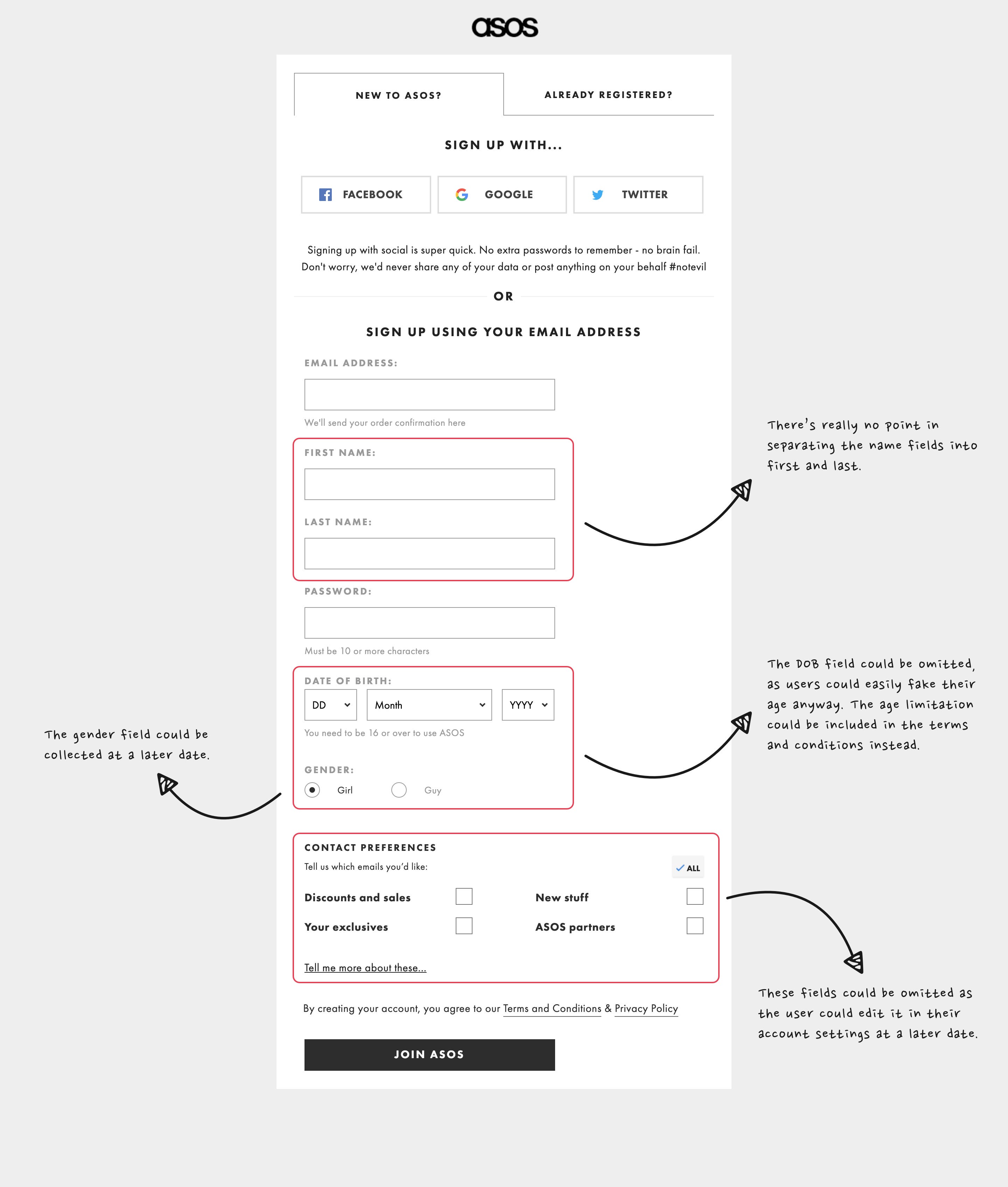
The Shorter, The Better
Long forms are such a big turn-off for the users. Although shunting the unnecessary fields consume a lot of time but it is valuable for the conversion rate.
At the time of defining the scope of the design procedure, confirm if each field is required by the user to attain their goal. Remember less user effort would always result in more users completing your form.
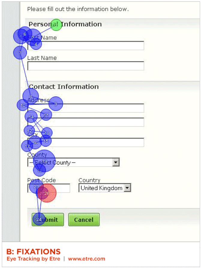
Proximity to Fields
Labels should be in close proximity to the relative fields. White space can be used to club or differentiate elements in design especially if the label is present above the field. If the form is lengthy, try breaking it down to steps like one step on each page. If your form enquires about varied topics, divide it into different groups of fields and label the groups respectively. Placing the label closer is beneficial because we human beings tend to connect things that are closely combined together.
Clear Purpose
Convey the users what is needed from them. Don’t wait for them to fill the form and then prompt an error message; this will create a negative image.
The user will not get the idea of what is required out of them if there isn’t any clear mention of the applicable rules.
This is typically true for the ‘password’ field as diverse products will have diverse objectives.
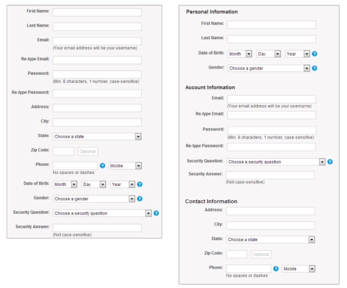
Single Column UI
Multiple columns disrupt the vertical flow of moving down the form. However, there are some exceptions to this guideline that short and logically related details like City, State, and Pin/Zip Code can be displayed in the same row.
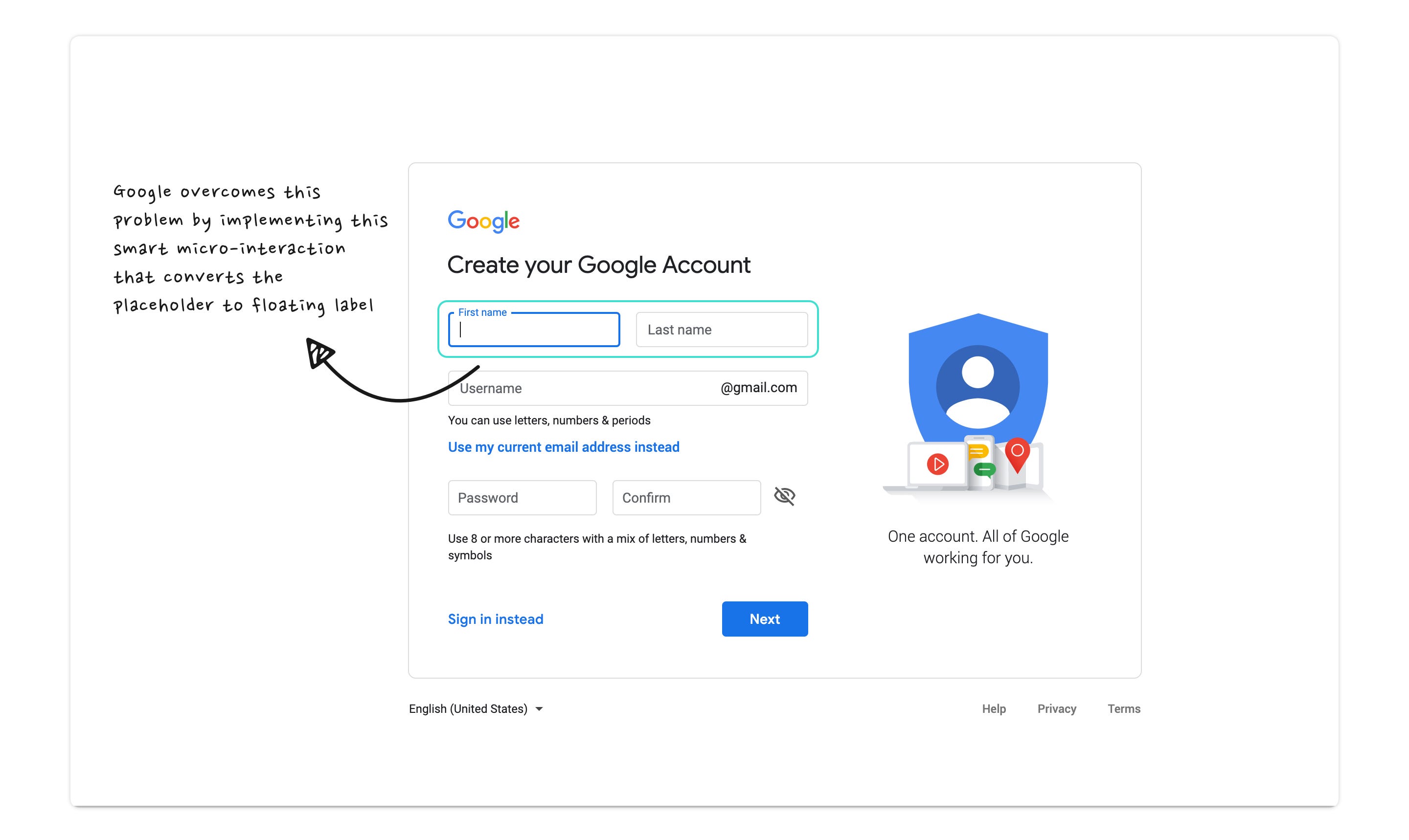
Placing the Placeholder
Placeholder is generally used to tell regarding the kind of information that is needed for a specific input field. However, some designers are substituting it for field label in order to decrease clutter and have a more subdued look.
The issue here is that the placeholder vanishes once the user comes in contact with the input field.
This might be frustrating if the user fails to recall the motive of the field and has to tap outside to view the placeholder again.
It is seen that when the user taps on the input field, the placeholder text disappears and turns into a mini field label on the top left.
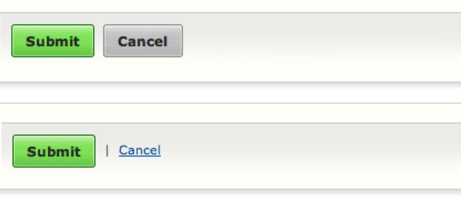
Primary Call to Action
Always remember that the primary call to action should be on the left and properly aligned with the rest of the form.
It should be easily visible and quick access by keyboard is a plus too.
Make sure that the weight of the primary call to action is denser than the secondary one. This will aid in lessening errors.
Allow Auto Focus
Users are happy when forms auto-focus the first input field automatically as then they have to just type, tab, type and then tab and finally done.
Yes, it just saves the user one extra click but it does increase the user experience in a minute way. When you enable auto-focus, make sure that the active fields are in bold so as to intimate the users that the first field is already selected and that they can move ahead to complete it.
Show Active Fields
This can be presented by varying the border color and size to put forth a stronger visual hint.
Take note that the color of the chosen field stands apart from the rest of the form so that it subtly helps the user to pay attention to the active field.
A similar approach can be applied for errors too; generally, the text field will be marked in red if an error is found.
Include Logical Flow
Resort to standard sequences and don’t ignore regional or cultural differences such as date formats.
While sequencing information, it always pays attention to the cultural difference. To explain further, Japan, Europe, and the US all adopt a different style of format.

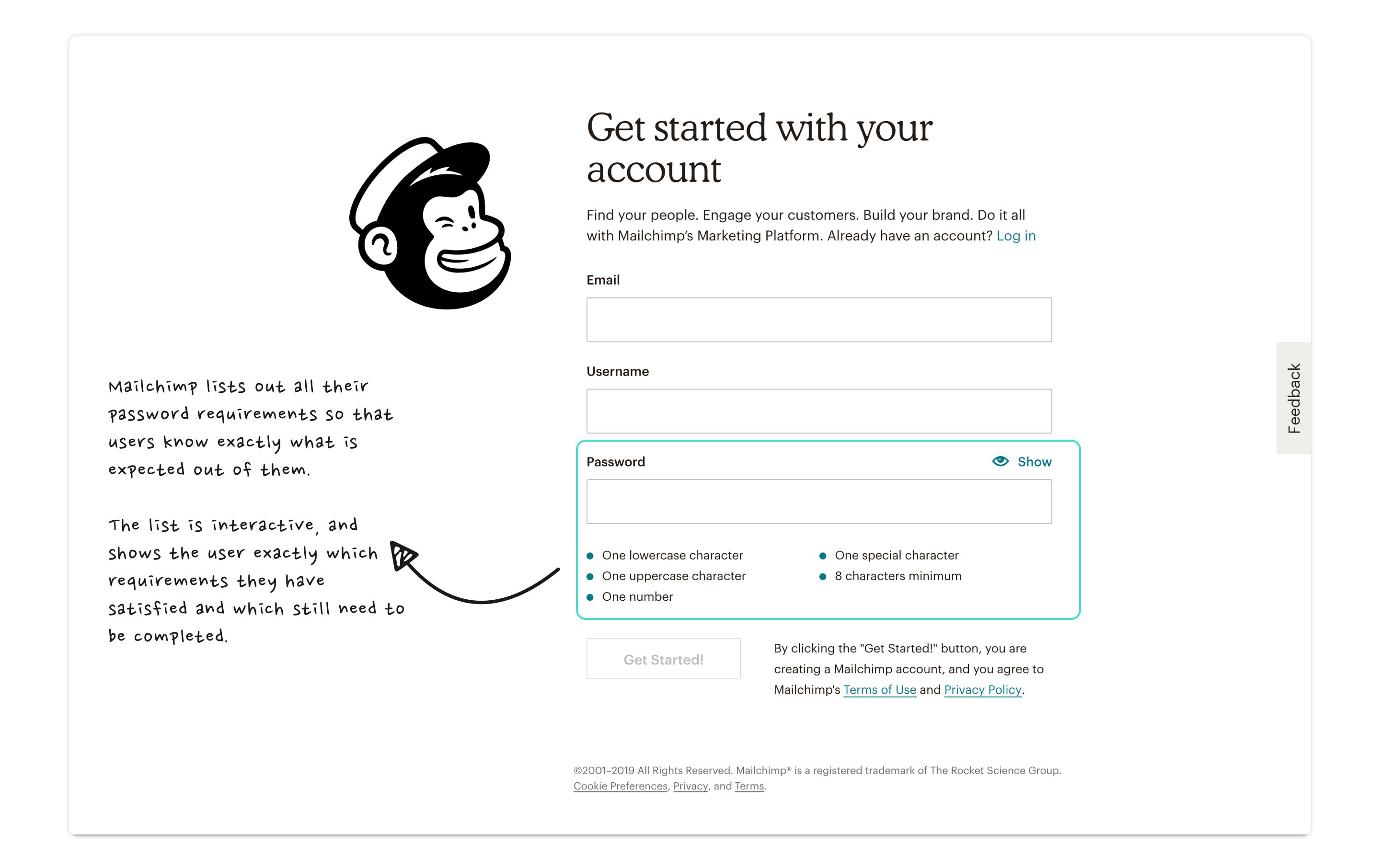
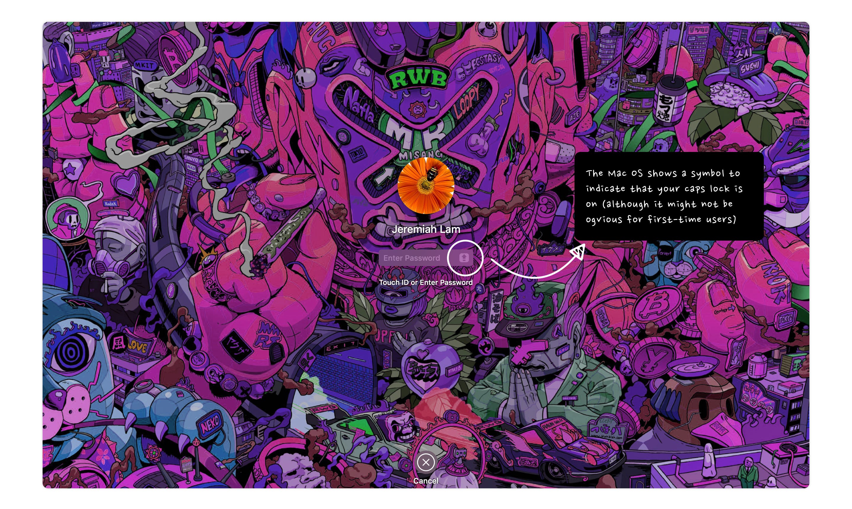
Save the Caps Lock Trouble
This is such a basic feature yet many products haven’t worked on it. There are times when users don’t realize that the caps lock was accidentally on, and get irritated when they are continuously denied access.
And the worst part is that the error message doesn’t even state that the caps lock was left on, it just mentions that the password was incorrect. This can be irksome for the users.
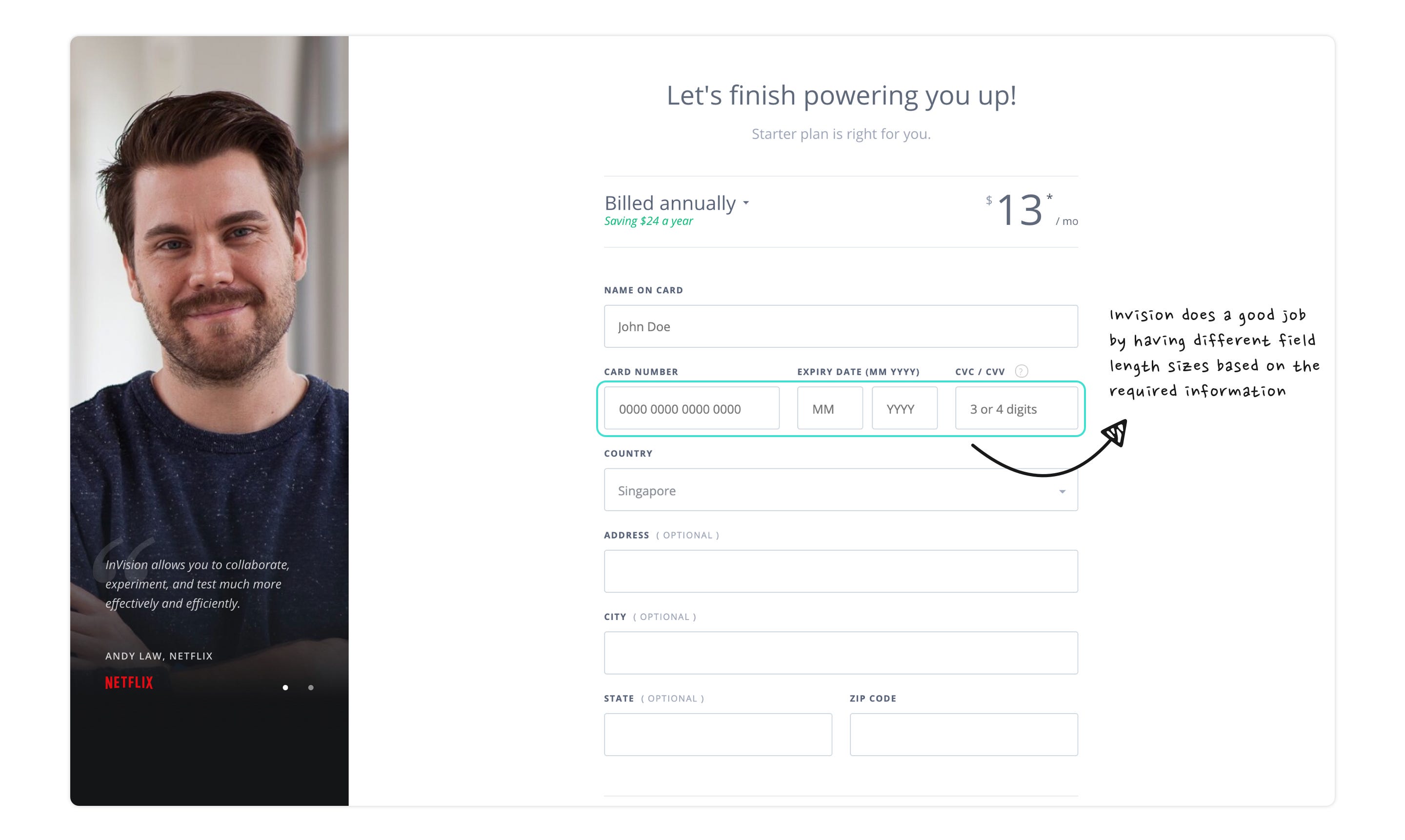
Action-oriented Visual Features
Visual constraints can pull out the right information from the users. For instance, if only two characters are needed for the month field then there is no point in keeping it spacious like the name field as you might end up confusing the user.
Another cause can be that if your form demands a 3 digits security number then design the field according to that size to avoid doubts in the mind of the user.
Separate Optional from Compulsory
Avoid using asterisk sign* in forms. Some users might confuse the meaning of asterisk as it is sometimes used to pinpoint validation error.
If any information is not required, no need to put an input field for it. If for marketing purposes, you wish to gather more data than what is required, you can always inquire for it later.
Another way can be to give a stronger visual hint by marking the fields with the text “optional” rather than going for asterisks.

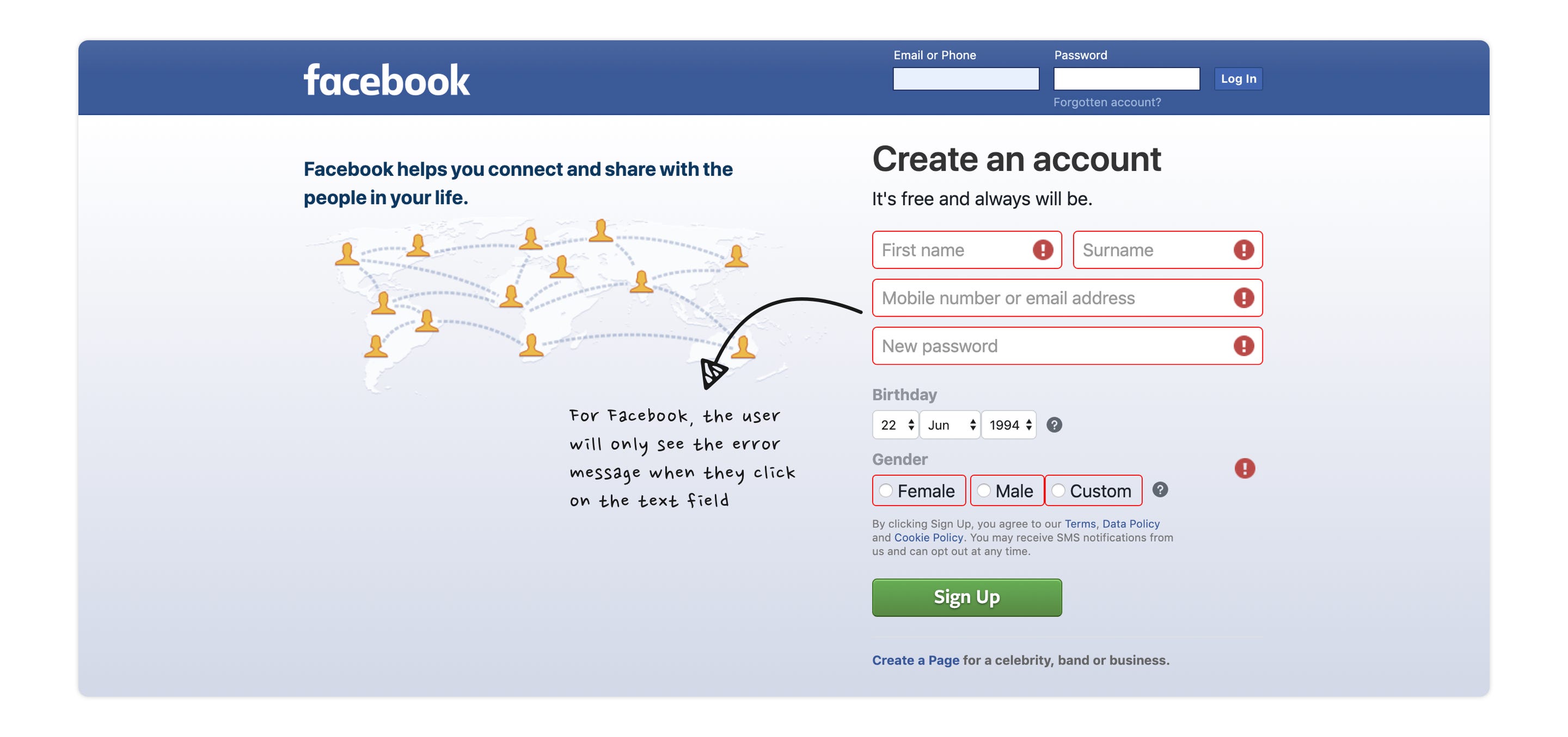
Display Error Messages
Some designs have a feature of hiding error messages. This is done by placing an alert icon adjacent to the text field and only when users linger on this icon, the error message is displayed.
This is pathetic UX as it needs more effort from the user to rectify their mistake. Some users might even be ignorant of the fact that they need to take an extra step (keep the cursor on the icon) to see the error message.
Be clear with the error message else users will be in doubt regarding their mistake and what’s actually needed from them.
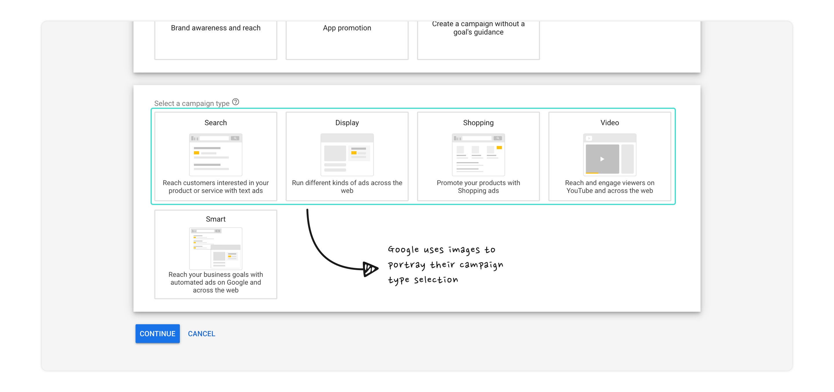
Engage with Images
When it seems appropriate, have images for selection to enhance the user experience. This is excellent if you desire to explain each selection clearly using text, icons or images.
Predictive Search Works
This is useful when users are asked to enter information that has a lot of predefined choices like their holiday destination.
This enables the user to only type a few letters to identify their destination city, instead of entering the complete name; a task that can be very frustrating.
It also lessens the probability of a failed search as the user can’t misspell their search term.

Takeaway
Life is too short to waste your time filling a boring form. Engage with your users in the most unexpected way. Designing a form can be a tedious process but if done correctly, it will augment completion rates. By following these dos and don’ts you can obtain an emotional reaction and enhance the user's experience. These points will make sure that your users don’t cringe by the very sight of forms and forget their hate for them.


