
Free 36 Amazing Serif Fonts For Modern Websites
Serif fonts have small decorative flicks at the ends of each stroke, which mimic a pen or quill. Originated in the mid-1800s they remain popular because of their readability and attractive appearance.

Website design is undoubtedly one of the most influential aspects of your company's brand. It provides an interactive and engaging platform to (hopefully) tell more about what your company does and why this service or product is important to your target audience.
What is "SERIF"?
Serif fonts have small decorative flicks at the ends of each stroke, which mimic a pen or quill. Originating in the mid-1800s they remain popular because of their readability and attractive appearance.
What is the difference between Serif and San-Serif Fonts?
One of the first choices to be made when crafting your own text is whether to choose a serif or sans-serif font. But precisely what are they, and how do they differ?
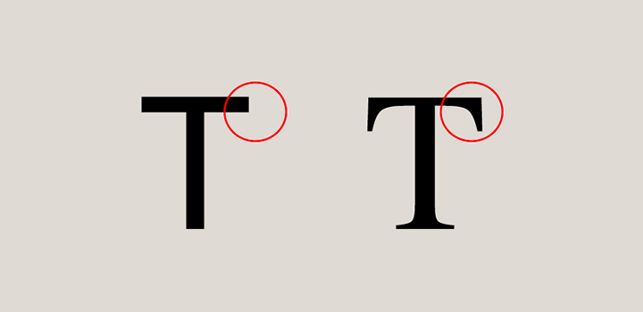
In a word, it all comes down to the little details that some fonts have on the endpoints of their strokes. Serifs or serif fonts are the names given to those typefaces that contain them. Sans-Serif fonts or sans-serif typefaces are those that don't. Here is an illustration of how serif and sans-serif fonts differ.
What is TYPEFACE?
Typefaces can be demanding. There are a few different types of serif fonts to choose from, such as Old Style, Slab, Didon, and Glyphic, among others, and it's important to choose the one that best suits your brand.
It's also important to consider that choosing a serif typeface can also improve readability, allowing readers to move through text on the page.
You have to choose the right one with the right look because typefaces convey the same feeling, emotion, and attitude that words can - and because of that, your typeface choice can greatly affect how your users view your brand.
Your company's typeface choice is an indicator of your company's style and personality, so it is important that you choose the right typeface for your company.
Let's take a quick review of 36 Beautiful Serif Fonts for Your Website Design.
1. Serif Font - PT Serif

PT Serif is a free and open-source transitional serif typeface designed by Russian designers Olga Umpeleva, Alexandra Korolkova, and Vladimir Yefimov.
It was released by Paratype in 2010 with funding provided by the Russian Federal Agency for Press and Mass Communications.
Functional with a pleasant aesthetic appeal, PT Serif is a practical typeface with just the right amount of merit – not too fancy, not too tedious.
2. LTC Caslon Pro

Released by William Caslon in 1722, the type Caslon font was based on the Dutch old-style designs of the seventeenth century, which were then used extensively in England.
Because of their remarkable practicality, Caslon's designs were an immediate success. Caslon versions became popular throughout Europe and the American colonies; Printer Benjamin Franklin hardly used any other typeface.
The American Declaration of Independence and the first printing of the Constitution were established in Caslon.
Adobe Caslon Pro is the perfect choice for magazines, magazines, book publishing, and corporate communications.
3. Grad

Serif typeface Grad is originally designed by Phil Martin and later updated by Mark Simonson.
Gradle was originally created as a bitmap font which did not make it very useful for modern typesetting purposes. In 2004, Mark Simonson recreated the typeface from the ground up in a digital version with some newly added flowers.
Few: a design agency, use Grad sparingly but in bold places; Including headlines and menus.
4. Plantin

Plantin font is an old-style serif typeface named after the sixteenth-century printer Christophe Plantin.
The intention behind Plantin's design was to create a font with thicker letters than at the time: designers of the previous type reduced the weight of their fonts for the effect of spreading the ink or achieving a more elegant image.
Plantin was one of the first revivals of the Monotype Corporation, which was not a copy of the already popular typeface in British printing; It has proved popular since its release and has been digitized.
This serif typeface is a great pick for websites that want to give authority, seriousness, and classic flavor to each character, just like Monocle. Look for this font in captions and section titles.
5. Aleo

Aleo is a contemporary typeface designed by Alessio Laiso as a slab serif companion to the Lato font, in 2013.
This font has semi-rounded details and a sleek structure, giving it a strong personality while still keeping readability high.
The family includes six styles: three weights (Light, Regular and Bold) with the same true italics.
6. Playfair Display SC

Playfair Display SC font is a transitional design, it is the Small Cap sibling to the main Playfair Display family.
The design lends itself to this period, and although it is not a revival of any particular design, it is influenced by the designs of John Baskerville and 'Scotch Roman’.
Being a display size in a transitional style, functionally and stylistically it can go with Georgia for body text.
With many small improvements and additional language support, this font was updated in November 2017.
7. Ultra

Introduced in 2011, Ultra serif is an ultra-bold slab typeface with nods to wood-type styles such as Clarendon and Egyptian.
This typeface is perfect for headlines of power and heading for influence.
Creates strong and dramatic characters for the title, a serious, friendly, and easily legible typestyle.
8. Alice

Designed by Ksenia Erulevich in 2011, the Alice typeface was inspired by Lewis Carroll's novel.
The designer decided to create a typeface that would be suitable for typing that book.
It turned out to be eclectic and quirky, old-fashioned, with wide proportions, open aperture, and soft rounded features; perfect for long-focused text-setting and headlines.
This typeface was released by Cyreal with the help of Gayaneh Bagdasaryan and Alexei Vanyashin.
9. Vidaloka

Vidaloka is the Didone display typeface for headlines and small blocks of text. It will work best at 16px and above due to its high contrast.
The main features are curved drops and sloping terminals. The tail of Q has a distinctly baroque-inspired look.
Vidaloka is designed by Alexei Vanyashin and Olga Karpushina in 2011
10. DM Serif Text

DM serif text is the lower-contrast equivalent of high-contrast DM serif displays.
While serifs remain delicate, the dm serif text family is a more robust version of the display sibling designed for smaller sub-headings and text sizes.
DM Serif was released in 2019 by Google.

LET’S WORK TOGETHER
Book a call with us and get the party started!
Book A Demo11. Roboto Slab

Roboto has a dual nature, with a mechanical skeleton and the forms are largely geometric. At the same time, the font has friendly and open curves.
While some awkwardly distort their letters to force a harsh rhythm, Roboto doesn't compromise, allowing the letters to be arranged at their natural width.
This creates a more natural reading rhythm typically found in humanist and serif types.
This is the Roboto Slab family, which can be used with the normal Roboto family and Roboto condensed family.
In November 2019, the family has updated with a variable font "weight" axis.
12. Merriweather
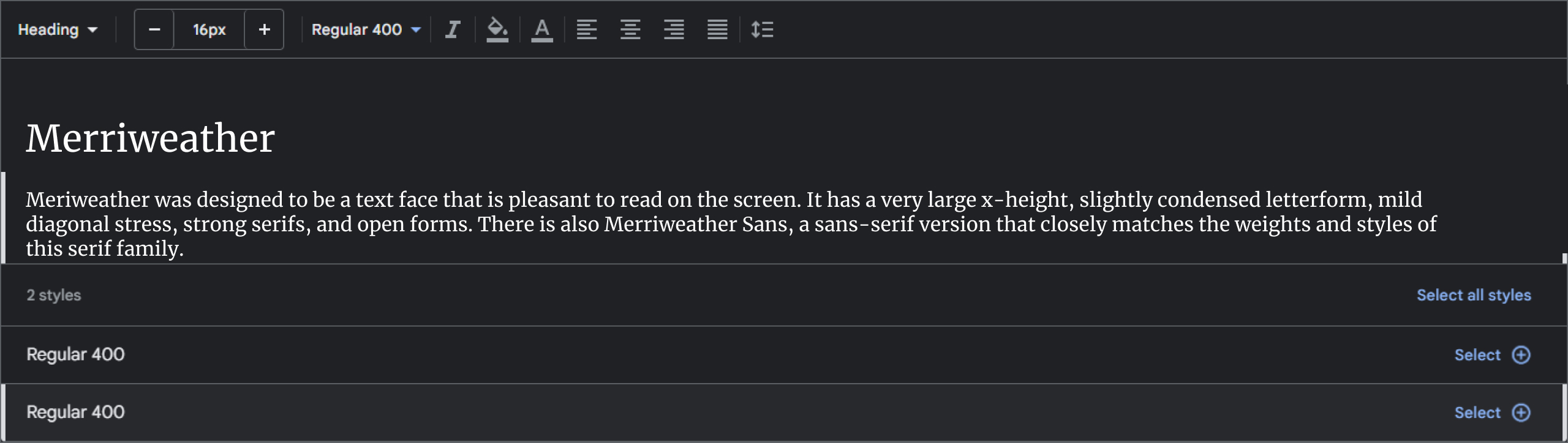
Meriweather was designed to be a text face that is pleasant to read on the screen.
It has a very large x-height, slightly condensed letterform, mild diagonal stress, strong serifs, and open forms.
There is also Merriweather Sans, a sans-serif version that closely matches the weights and styles of this serif family.
Merriweather is a trademark of Sorkin Type Co., released in 2016.
13. EB Garamond

EB Garamond aims to be a classic, excellent, and Garamond.
It is a community project to revive Claude Garamont's famous humanist typeface from the mid-16th century.
This digital version closely reproduces the original design by Claude Garmont: the source of the letterform is a scan of a sample known as the "Berner sample", made in 1592 by Christian Agenolf's son-in-law, Conrad Berner.
The specimen shows Garamont's Roman and Granzon's italicized forms in various sizes. That’s why the name of this project: Egenolff-Berner Garamond.
In November 2019, this font family has been updated to a variable font family.
14. Libre Baskerville

Libre Baskerville is a serif typeface that is a transitional Serif classification.
Designed by a noteworthy English Businessman and typeface designer, John Baskerville, in the 1750s.
It's based on American Type Founders Baskerville from 1941.
Libre Baskerville typeface has a taller x-height, wider counter, and slightly less contrast, making it a good fit for on-screen reading.
It is an open-source serif typeface available for free from Google Fonts.
15. Bitter

Bitter is an open-source slab serif typeface designed by Sol Matas for Huerta Tipográfica.
It was designed to be a highly-legible text font for reading on screen, thanks to its large x-height and thick, even strokes.
The bitter typeface is available in Normal, Italic, and Bold styles.
16. Source Serif Pro

Source Serif Pro is a serif typeface in the transitional style, that is designed to complement the Source Sans Pro family.
The close relationship between serifs and sans is achieved by careful matching of letter proportions and typographic color.
Without a pure historical revival, Source Serif takes cues from Fournier and re-imagines them for the modern era.
The two typeface families have different personalities because they originated in the hands of different designers: Source Serif was designed by Frank Griehamer, and Source Sans was designed by Paul Hunt.
Source Serif typeface continues Adobe's line of high-quality and open-source typefaces. Designed for digital environments, letter sizes are simple and highly readable.
Its historical roots, combined with expert guidance, give typefaces a strong character that will shine through when used for extended text on paper or screen.
17. Crimson Text

Crimson Text is a font family for book creation in the tradition of very old-fashioned typefaces.
Crimson Text is inspired by the brilliant work of people like Jan Tschikold, Robert Slimbach, and Jonathan Hoefler. We hope that the free-ranging community will one day be able to enjoy Crimson Text as a beautiful workhorse.
March 2022 brought several important bug fixes, including making line-spacing consistent across styles.
18. Cinzel

Cinzel is a typeface inspired by Roman inscriptions of the first century and based on classical proportions.
Although it is not simple revivalism, while it tells all of the ancient histories of the Latin alphabet, it also adds a contemporary feel to it.
Cinzel typeface was primarily designed for the screen.
19. Arvo

Arvo font is a geometric slab-serif typeface family suitable for screen and print.
The family includes 4 cuts: Roman, Roman Bold, Italic, and Bold Italic.
This Libre font was first published in Google Fonts. The taste of the font is rather mixed. It's monolinear-ish but has a bit of contrast (which slightly enhances legibility in Mac OS X.)
Arvo 2.0.1 was released in December 2013, with support for languages that use the Cyrillic script.
Updated August 2015: The bold and bold-italic styles were updated to allow document embedding.
20. Taviraj

Typefaces from 2016, Taviraj is a Serif Latin and looped Thai typeface with an elaborate structure that ensures legibility and legibility, and that is well suited for formal use.
Thai letters have thick and thin strokes similar to Latin with rounded and airy looped terminals. Taviraj is a 9-weight family made up of italics.
Taviraj takes a distinctive approach to deal with the thick and thin strokes of the Thai glyph.
Designers of other types of Thai fonts may like to use this approach as a reference.
Thai typefaces with formal loops have delicate details (such as ก ถ ภ ฤ ฦ and ฎ ฏ is something to take into consideration), so care must be taken when lifting them up to a heavy weight to retain all the details.
The size and position of Thai vowels and vowel marks are carefully managed as they are relevant to readability, legibility, and overall texture.
21. Slabo 27px

Slabbo is a collection of size-specific fonts for use in online advertising and other web uses.
Currently the collection includes this font, Slabo 13px and Slabo 27px. Each font in the collection is fine-tuned in pixel size for use in its name.
The Slabbo project is led by Tiro Typeworks, a type design foundry based in Canada.
22. Uchen

Uchen is a free, Unicode compatible, Tibetan script font designed in the Uchen style, suitable for use in desktop publishing.
The purpose of the Uchen script was to document the Tibetan language and the language of Bhutan; Dzongkha.
Uchen fonts Regular by Font designed by Christopher J. Fynn.
23. Cormorant SC

Cormorant SC was first released on Google Fonts in 2016; is a free display type family developed by Christian Thalmann.
The project currently includes a total of 45 font files, with 9 different visual styles (Roman, Italic, Infant, Infant Italic, Garamond, Garamond Italic, Upright Cursive, Small Caps, and Unicase) and 5 weights (Light, Regular, Medium, semibold, and bold.)
Cormorant SC was conceived, drawn, spaced, kerned, programmed, interpolated, and produced entirely by Christian Thalmann of Catharsis Fonts.
The Cormorant project is led by a Zurich-based type designer based in Switzerland - Christian Thalmann.
24. Ibarra Real Nova

In 2007, The Calcografía Nacional Española organized a project directed by José María Ribagorda, which aimed to reveal the priceless typographic heritage produced in 18th-century in Spain through the "Imprenta Real".
The project included the retrieval of types designed by Geronimo Gil for the edition of the most beautiful "Quixote", which was printed by Joaquín Ibarra for "Real Academia de la Lengua" in 1780. This font was called "Ibarra Real".
José María Ribagorda decided in 2015 that Octavio Pardo would be the first collaborator in the design. Octavio was the first student in the University of Reading MA Typeface Design program to study this project.
25. IBM Plex Serif
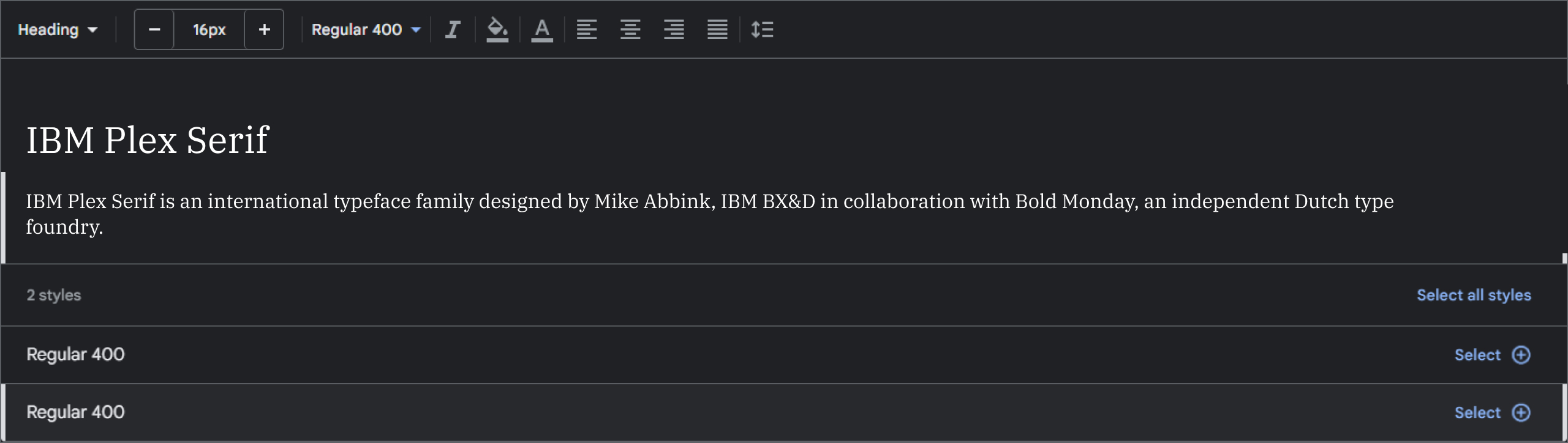
IBM Plex Serif is an international typeface family designed by Mike Abbink, IBM BX&D in collaboration with Bold Monday, an independent Dutch type foundry.
Plex Serif was designed to capture the spirit and history of IBM and to depict the unique relationship between mankind and the machine – a major theme for IBM since the turn of the century.
The result is a neutral, yet friendly quirky style typeface with uncondensed, mono, serif, and many other styles for multiple languages, and excellent legibility in print, web, and mobile interfaces.
IBM Plex Serif's three designs work well independently, and even better together.
Use as serif or mono to tell a contemporary comparator, editorial story, without the need to show code snippets. The unexpectedly expressive nature of italics gives you even more options for your designs.
IBM Plex Serif was released in May 2022.
26. Domine

From the first stage of the design process, the 'domain' was designed, tested, and optimized for body text on the web. It shines at 14 and 16 px. And it can also be used as small as 11, 12, or 13px.
Domine typeface was released in 2012 in regular and bold.
Harmless to the eyes while reading long text; domains are an ideal choice for newspaper or magazine websites, where text is the main focus.
It is visually friendly because it combines classic elements of familiar typefaces that have been in use for over 100 years, such as Clarendon, Century, Cheltenham, and Clearface.
- Round letters (b, c, d, e, o, p, q) are slightly square on the inside. This feature opens up the counter for better rendering and makes it a bit more up-to-date than the classic typefaces referenced earlier.
- Serifs are slightly smaller than usual. Another feature that improves rendering is to allow more "air" between each letter pair.
- In letters such as h, m, and n, the joints of the branching stems are deep enough to prevent dark spots, as well as improve legibility at smaller sizes.
- The friendly lowercase 'a', with a curve starting from the bottom of the stem, is reminiscent of Cheltenham and Clearface. That soft curve also resonates in the curves f, j, n, m, and r
- Spacing has also been optimized for body text on the web, which is markedly more open than typefaces made for print or headlines
27. Zilla Slab

Zilla Slab is Mozilla's main typeface, used for Mozilla wordmarks, headlines, and their entire designs.
It is a free-to-use, open-source slab serif font that was released in 2017. A contemporary slab serif based on Typotheque's Tesla, it is constructed with smooth curves and true italics, giving the text an unexpectedly sophisticated industrial look and a friendly outlook in all weights.
LET’S WORK TOGETHER
Book a call with us and get the party started!
Book A Demo28. Gimlet Micro

Gimlet draws its inspiration from George Trump's 1938 typeface, Shadow.
At the behest of Nick Sherman, David Jonathan Ross turns the oddball serif into an energetic contemporary workhorse, complete with a flexible set of widths to suit three optical sizes and responsive layouts.
Gimlet Micro typeface was released in May 2020.
A multifaceted series that speaks with a singular voice, Gimlet is a rare find: a typeface that's funky as well as functional.
29. Turnip RE

Where classic serif faces are urban and well-mannered, turnips are thick and straight the type that feels totally at home with salty language.
David Jonathan Ross creates an energetic tension between the inner and outer shape of the Turnip RE, while strong strokes and strong serifs generate dense paragraphs with a horizontal emphasis.
Released in Apr 2021, It's not your grandpa's bookish face, but it reads like that.
30. Mrs Eaves

Originally designed in 1996, Mrs. Eves was Zuzana Licko's first foray into the design of a traditional typeface.
It was styled after the famous transitional serif typeface Baskerville designed by John Baskerville in Birmingham, England in 1757.
One of Baskerville's intentions was to develop a typeface that would bridge the gap between thick and thin strokes, partly to reflect the new printing and paper-making techniques of his time.
As a result, his types were often criticized because they were too precise, rigid, and difficult to read.
Despite all its shortcomings, Mrs. Eves has sold all emigre fonts at various times, and through major distributors such as MyFonts.
Mrs. Eaves fonts are among the best-selling types for years, listed among such classics as Univers, Helvetica, Bodoni, and Franklin Gothic.
Its commercial and popular success has defined the Emigre Type Foundry.
31. Fertigo

Enjoy Fertigo Pro. It's a bit like Laphroaig; They say that the more you know it, the more you (probably) will appreciate it. Anyway... there's only one way to let it go.
Released in Sep 2021, it’s feminine, creative, and unique display font package by exljbris.
32. Calluna
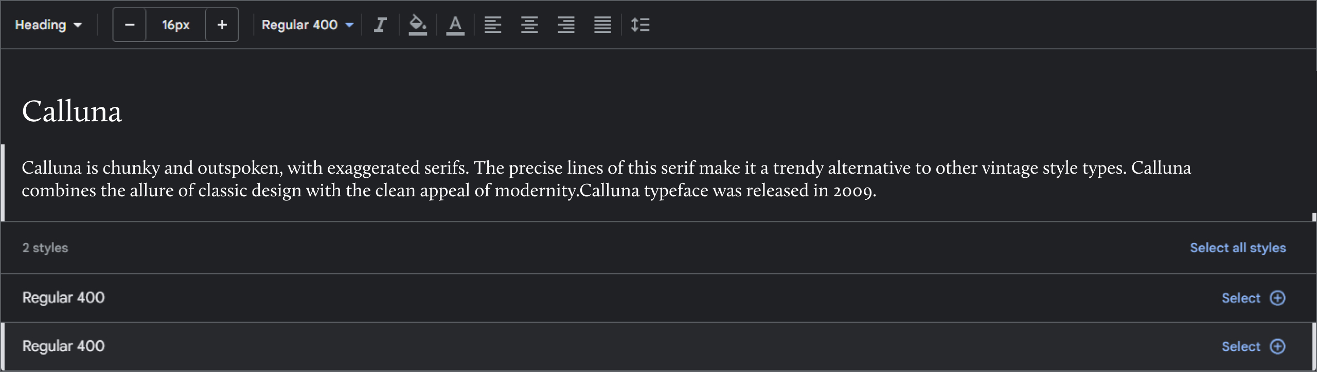
Calluna is chunky and outspoken, with exaggerated serifs.
The precise lines of this serif make it a trendy alternative to other vintage style types. Calluna combines the allure of classic design with the clean appeal of modernity.
Calluna typeface was released in 2009.
33. Le Monde Journal

Le Monde Journal Super Family was designed by Jean-François Porchez, and published by Typofonderie.
This typeface contains 4 styles and family package options
This family was designed in 1994 as a bespoke typeface family for the French newspaper Le Monde.
Le Monde Journal by definition is intended for newspaper use and is smaller in size. It is an economical and workhorse typeface that is adaptable to any extreme conditions of use.
Although it has the same color as the Times, it appears more open. The read stream is designed to be more fluent and less abrupt.
Le Monde fonts can expand your typographic palette.
Le Monde Journal's vertical metrics and ratios are calibrated to perfectly match those of other Typofonderie families.
34. Harri Text

Harri text is much more than an extension of Harry.
It shares a lot of its origins, a certain flavor, and its own characteristics, but Harri text is an uppercase-only typeface intended for display use.
Harri text is treated as a family of text types, which includes new extra-lightweight, italics.
Small Cap and other additions that make it suitable for editorial purposes.
The origin of the Harri text - Basque characters in the vernacular for the most part - is full of peculiarities and idiosyncrasies, which give them their own special character.
This stylistic set is available in 6 italic styles. This gives some letters a more fluid and cursive flavor if the calligraphy mood is desired.
Harri Text comes with 1054 glyphs in its character set (1078 in italics) with support for over 220 languages.
35. Servus Slab

Published by Dada Studio, Servus Slab Font Family was designed by Michał Jarociński.
Released in 2014, Servus Slab contains 18 styles and family package options. It contains a wide set of numerals, fractions, small capitals, ligatures, and other OpenType goodies.
Servus consists of 9 weights which offer 18 fonts with matching italics, Lights and Bolds, due to their strong personality, are perfect for display uses.
36. Adonis

Adonis is a typeface of classical form with slightly rectangular proportions, small circular serifs, and soft letters.
The face is both space-saving and legible at a small size. The family consists of four standard font styles and is proposed for text and display typography.
Designed by Natalia Vasilyeva; The Cyrillic character set in Paratype was released in 2002.
The new version was released in 2011 with an expanded character set supporting Western and Central European languages.
EXPLORE YOUR POSSIBILITIES
Book a call with us and get the party started!
Book A Demo

