I’m Prince Pal Singh, Working as a UI/UX Director. I am using Apple’s products Since 2007. A couple of months ago I bought a MacBook Pro. Unfortunately, I found some problems with my MacBook’s sound system. I go to the support center – the way they treated me and served me best customer experience ever motivated me to write this article.
“Most people make the mistake of thinking design is what it looks like. People think it’s this veneer – that the designers are handed this box and told, ‘Make it look good!’ That’s not what we think the design is. It’s not just what it looks like and feels like. The design is how it works.”
– Steve Jobs
‘To design something really well you have to get it- chew it up, not just quickly swallow it.’ Think over these words said by Steve Jobs (yes, ingest and then digest), our UX leader, who has revolutionized the concept of customer experience for millions of customers worldwide, with Apple products, App Store, and many other ways.
Apple is indeed a hot favorite because of its carefully designed products that are much more than it looks. Its ‘Simple, Sophisticated and Neat’ philosophy makes it sophisticated and simplified on the exterior but has refined interior of solid engineering and detailing to complement. Steve’s obsession with ‘perfect’ design led to some of the most significant innovations providing spectacular designs at Apple.
The Inspiration

Observation is the key to learning. Even Steve’s significant designs are a result of the effect of his growing years’ surroundings. His home was a simple and compact one with all the necessary supplies, particularly for post-war immigrants. These matched with the standards of lower-middle-class people and thus got engraved in his memory forever. Also, his faith in Buddhism made him view simplicity as the best form of sophistication.
The primary interfaces he created for video games at Atari (a company he worked initially) played a role in his decision-making. As Apple had shared working space with Sony, Jobs formed a tendency for its products. Later, he was exposed to Bauhaus style of designing that emphasized on simple rational designs with clear lines. Fonts have always been Apple’s priority, owing to his course in calligraphy in early days.
Jobs felt that simplicity should be linked to the use of a product. But this can’t satisfy the goals always. There are times when a design is very elegant and simple, yet very difficult to navigate and confuses the user. One point that he strongly favored was to make things intuitive when it comes to designing.
People recognize the intuitiveness of a desktop. Even when it comes to a pile of papers, the one lying on the top is assumed to be the most significant. Users can handle priorities. Jobs always wanted simplicity and ease in use, and for that, things had to be the one which people understood.
“Our DNA is as a consumer company – for that individual customer who’s voting thumbs up or thumbs down. That’s who we think about. And we think that our job is to take responsibility for the complete user experience. And if it’s not up to par, it’s our fault, plain and simply.” – Steve Jobs
Pleasant Customer Experience (CX)
According to Steve Jobs, it was not about being the biggest slightly best. His approach to selling any product was first to understand and measure customer experience (CX) and then get hold of technology that will help in nurturing the product. This is what forms the base of the usability factor and should be evaluated before designing and developing products. For instance, an Apple iPod was an instant success because of its user-friendly design and traits. There was no problem with multiple buttons and complicated directions. It delivered a remarkable user experience and connection with the consumer just with a touch.
Apple has never been rigid about technology i.e. the technology that is sold by Apple or employed by Apple to ease out the customer experience, mustn’t necessarily have to be invented by the company. Also, there is no compulsion with the usage of the technology lying at their disposal. There has always been a surplus of technologically proficient employees at Apple. Still, it refuses to let technology dictate customer experience. For instance, Apple isn’t the creator of Siri. Same is the case with mouse and even graphical user interface.
Another example, the Apple Store, no doubt, is thought of the best customer experience anywhere. So, instead of setting a mark of its customer service against Best Buy or Radio Shack, Apple chose to make the Genius Bar (inspired by the Ritz-Carlton Hotel Company) that are full of understanding and knowledgeable people who will speak to you and provide you assistance wherever and whenever you want. They greet the consumers when they enter the Apple Store. Now, that is indeed a superb entrepreneurial approach.
NeXT In Game
Innovations are always exciting. The computer, when invented, was considered a masterpiece invention but people had cold feet when it came to operating. So, the design was there; what was required was a brilliant User Experience (UX) With NeXT, our personal computer was taken over by an interpersonal computer. Here the software modules were such that all the operations became easy. Though a lot of effort was already undertaken, simplicity was one thing that was lacking. It was during this stage that Tim Bumpers found the World Wide Web. So, this was how Steve Jobs bought usability in computing.
Marketing Philosophy
In the 1980s, the design evolved as a Science & Art. It was then Design Thinkingcame into being that highlighted the feeling of empathy in fulfillment of the user needs. All thanks to Mike Markula, first investors of Apple, a father figure to Jobs, who wrote the Apple marketing philosophy that underlined three points – Empathy, Focus, and Impute. Empathy involved understanding the feelings and needs of the consumer. To do a competent job, you must remove all the vague opportunities and maintain your Focus.

The third point Impute said that people form an idea about the product or company based on the signals that it delivers. As people judge a book by its cover, so it is essential to give them the best product, supreme quality, usable software. If you are careless, you will be seen as irresponsible. If you give a professional impression, you will attribute the desired effect.
The Extraordinary ‘iPhone’

The iPhone came into existence in 2007 and was one-of-its-kind. It had the facilities of an iPod, an internet device, and a mobile phone, all features together in one product. With iMac and iPod as significant innovations in the market, Apple was taking a significant risk and let’s say that it was worth it. But it hadn’t come easy.
For long, Jobs had kept operating prototypes for experiments and test operations. But finally, after all the testing and presentations, the phone was launched in the market. iPhone was a classic example of extraordinary design and innovation which was like a one-stop solution for mobile phone, internet service device and an iPod, a perfect music device.
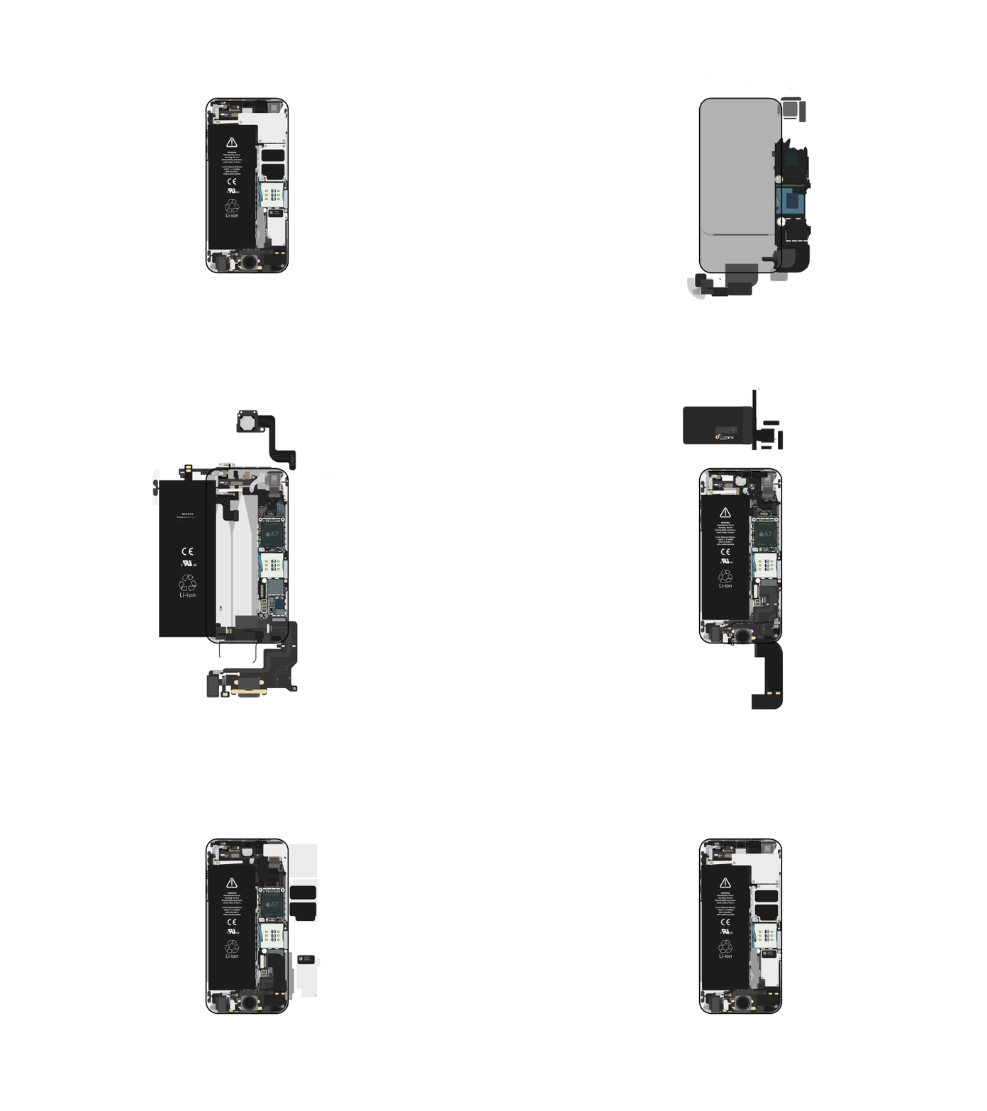
He had tackled the needs of the consumer who had to jump from one gadget to another to satisfy his requirements. It thus refined the user experience which kicked the mouse out and could be easily accessed by the fingers. This exemplary interface was the grand reason behind the success of the iPhone. On the looks of it, Apple devices are elegant, fun and trouble-free with great finesse, but in reality, there are a lot of advanced engineering mechanisms involved within.
Steve Job’s talent is reflected not only in his knowledge but the intensity with which he executed his principles. It didn’t just inform him, and it consumed him. All the lessons learned from him are addictive and can all be applied together in a single, dynamic design philosophy.
Designs that are based on opinions and without an underlying solid philosophy are baseless. Of course, it will be crazy as the definition of what is right and what is wrong varies in different situations. And indeed, this has been the chief factor behind the failure of major consumer electronics makers. There is no ideology rooted in the designs so the products are themselves soulless. The principles that Jobs has conceived will always be united with the profession. The design will always dwell on details no matter what and will rise from the needs of the consumers.
Role in Banking
Graphic User Interface (GUI) governs the computing world today. Apple first introduced it and the company launched multi-touch in the year 2007. Then was the time of direct input and hence the mouse and keyboard started becoming outdated. Banks began using iPhone, iPod and other apps like bio-metrics and gesture identification for mobile banking. This gave rise to digitalization, and the store concept started becoming redundant. The so-called waiting lines in banks are practically over now.
Be it shopping, purchases, bills, and even bank account operations, and all can be done just with a simple touch. The banking apps can be found on the App store on smartphones and users can check and manage their accounts. So, banks are still there to provide services, what has disappeared are the physical customers. Finally, banks are just a click away from every person, and this is all possible because of design master Steve Jobs.
Wrap Up
‘Design is the fundamental soul of a man-made creation that ends up expressing itself in successive outer layers of the product or service.’
Steve Jobs is the icon of design. He laid forward the concept of a UX design which paid heed to the needs of the consumer, delivered complete user experience and turned out to be profitable for the developer too. It is not just the visual quotient, but the usability criteria that take into account the user’s needs, the compatible environment of function and the ease in the usage of the product. These points sum up the ideals and vision of this important figure in our design history. Looking at the current rate, even the demand for UX design has surged up tremendously from the year 2006 as the companies have started recognizing the importance of a great UX and are working in that direction. A product lacking in usability will make you lag behind in this competitive race of conversions.


