
Laws of UI UX - Using Psychology to Design Better Digital Products
This practical guide explains how you can apply key principles in psychology to build products and experiences that are more intuitive and people-centered.

UI UX laws are an understanding of psychology—specifically the psychology behind how users behave and interact with digital interfaces—is perhaps the single most valuable nondesign skill a designer can have.
LAWS OF UX
by
The most elegant design can fail if it forces users to conform to the design rather than work within the "blueprint" of how humans perceive and process the world around them.
Whether you are a UX designer or a product maker, you should know basic UX laws. These UX principles help to guide product design because they show the insights behind users' expectations. Therefore, following them is necessary with the aim to create rewarding designs.
You'll learn
- How visually appealing design generates positive responses
- The most useful psychological principles for designers
- How can these psychological principles apply to UX heuristics?
- Predictive models including Fitts's law, Jakob's law, Miller's Law, and Hick's law
- Ethical implications of using psychology in design
- A process for applying these UI UX Laws
- Golden Ratio - Inspired by nature
- 8 Golden rules of Interface design
In this article, let's have a look at 21 UX laws - originally consolidated by a product designer; Jon Yablonski, in his book Laws of UX.
01 Aesthetic-Usability Effect
Users often perceive aesthetically pleasing design as a design that's more usable."

Overview
Users have a positive emotional response to your visual design, and that makes them more tolerant of minor usability issues on your site.
An example of this is Apple products, where the design is not 100% perfect but people tolerate the flaws more than they would towards any other less aesthetic designed product.
It is also common for people to develop feelings of a positive attitude toward great designs, and rare for people to feel the same for less aesthetically pleasing product designs.
02 Doherty Threshold
"Productivity soars when a computer and its users interact at a pace (400ms) that ensures that neither has to wait on the other."

If a computer responds to a user's input in less than 400ms, the user will take less time to make their next decision. It provides some kind of feedback to the user within 400ms to keep them engaged.
Overview
If a system requires more than 400ms, use loading states to let the user know their action was acknowledged. The longer a system takes to respond, the longer it will take the user to perform the next action.
Deliveroo, a food delivery service, does a nice job of utilizing the Doherty Threshold by using an entertaining loading state when fetching results for a search. It may take longer than 400ms for results to be found for a search query, so instead they activate a loading state within the 400ms which lets the user know that their action has been successful.
03 Fitt's Law
"The time to acquire a target is a function of the distance to and size of the target."

Fitts's Law states that the amount of time taken to move to and select a target is a function of the distance to and size of the target.
Overview
If you want to make an action more easily selectable, make it larger and position it in a place that's easy to reach.
You can also use Fitts's Law to purposefully make something harder to select by making it smaller. There are methods you can use to apply Fitts's Law on both mobile and desktop viewports.
Airbnb does a good job of using the edges of the screen on the homepage. Although objects are not placed directly on the edge of the screen, objects which are nearer the edge of the screen will be quicker to select than objects near the center of the screen.
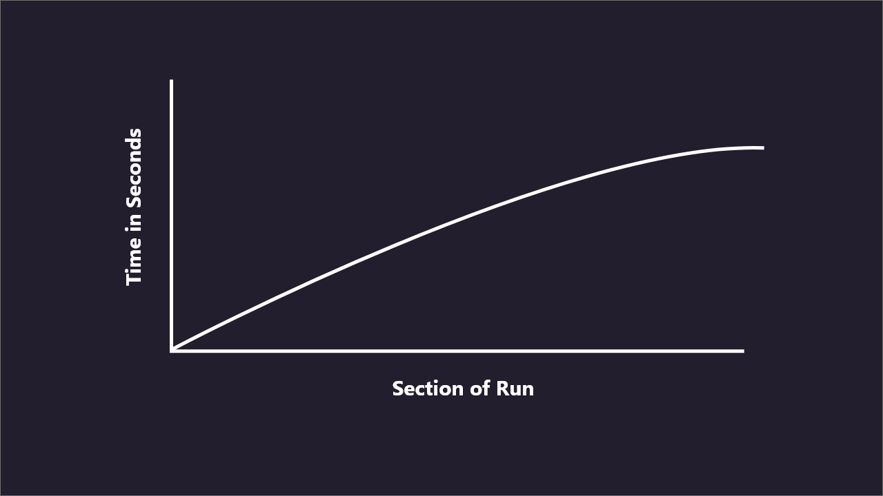
04 Goal-Gradient Effect
"The tendency to approach a goal increases with proximity to the goal."

The goal gradient effect means that as people get closer to achieving a reward they accelerate their behavior to progress towards the goal. People are more motivated by how much is left to reach their target rather than how far they have come.
Overview
If you want to make an action more easily selectable, make it larger and position it in a place that's easy to reach. You can also use Fitts's Law to purposefully make something harder to select by making it smaller. There are methods you can use to apply Fitts's Law on both mobile and desktop viewports. User-centered design and Conversion rate optimization apply the goal gradient effect to ensure users get positive feedback when they interact with a website or app.
For example, using a prominent progress bar or indicator to provide users with regular feedback during a sign-up process. Always set the progress bar to show some progress even on the first step as this will help increase your conversion rate. Display a green tick when an input field or drop-down is correctly completed. Remember to highlight how close the user is to completing the task.
05 Hick's Law
"The time it takes to make a decision increases with the number and complexity of choices."
Hick's Law states that the more options a user is presented with, the longer it will take them to make a decision.
Overview
Hick's Law is very powerful when considered whilst designing landing pages - a user has landed at your site, but what now? The longer it takes a user to decide on your site, the more likely it is that they could bounce away.
Take the example of the Google homepage, a user has very limited options presented to them. This means that the time it takes for a user to make a decision is likely to be very quick. It might be tempting to think "Google is doing this, so we should too!", but it's often fairly difficult to minimize options to the extent that Google does.
06 Jakob's Law
"Users spend most of their time on other sites. This means that users prefer your site to work the same way as all the other sites they already know."

Jakob's Law states that users spend more time on other websites so they expect your website to work in the same way, that they are already familiar with.
Overview
Jakob's Law is a lot about patterns, and understanding what products your user may already be familiar with. Often when designing, we don't need to be reinventing the wheel. The solutions to a lot of our problems may already exist so it's always worth doing your research.
Think about an eCommerce website and you will probably think of an experience similar to Amazon's. A lot of eCommerce sites will use the same patterns, as a standardized design is familiar to the user, so they will already know how to use your site based on their experience with other sites.
07 Law Of Common Region
"Elements tend to be perceived into groups if they are sharing an area with a clearly defined boundary."

The principle of the common region says that items within a boundary are perceived as a group and assumed to share some common characteristic or functionality.
Overview
Elements tend to be perceived as groups if they are sharing an area with a clearly defined boundary. In the above graphic, the boundary around the three middle circles causes them to appear as one group and separates them from the other, less-related surrounding circles.
In a user interface, using a border or background color to create a container for related items helps users quickly and effectively understand the UI's structure and which elements are connected.
08 Law Of Proximity
"Objects that are near, or proximate to each other, tend to be grouped together."

The law of proximity describes how the human eye perceives connections between visual elements. Elements that are close to each other are perceived to be related when compared with elements that are separate from each other.
Overview
Elements tend to be perceived as groups if they are sharing an area with a clearly defined boundary. Applying the law of proximity in UX designs is easy. Just place related elements near each other and unrelated elements apart from each other. Using whitespace to group or separate elements is key.
For example, Unilever's logo is made up of 25 distinct icons. But because they are placed closely, you recognize the whole U figure.
09 Law Of Pragnanz
"People will perceive and interpret ambiguous or complex images as the simplest form possible because it is the interpretation that requires the least cognitive effort of us."

This law tells us that people perceive complex things as simplistic forms to recognize the environment easily. This makes humans understand what they see as a whole rather than small pieces, or the sum of total parts.
Overview
Elements tend to be perceived as groups if they are sharing an area with a clearly defined boundaryApplying the law of proximity in UX designs is easy. Just place related elements near each other and unrelated elements apart from each other. Using whitespace to group or separate elements is key.
If you want to ease the user's perception use simple forms and group them in the obvious and expected way. If you want to highlight an element, well, break this rule, but try to avoid chaos. Breaking rules is effective only when it contrasts order.
10 Law Of Similarity
"The human eye tends to perceive similar elements in a design as a complete picture, shape, or group, even if those elements are separated."

The human eye tends to build a relationship between similar elements within a design. Similarity can be achieved using basic elements such as shapes, colors, and size.
Overview
The similarity is influenced by the shape, size, and color of the elements. When you mix objects with high degrees of similarity to each other with a group of dissimilar objects, the brain then devotes time and energy to creating a link between them so that it can try to understand their relationship with each other.
In web and interactive design, the similarity law can be used to contribute to building connections between linked elements. This relationship may be either physical or conceptual. You can make the most of this natural human inclination by helping your user's eye to discern parts of your design you want to accentuate.
11 Law Of Connectedness
"Elements that are visually connected are perceived as more related than elements with no connection."

The law states that elements that are connected by color, lines, frames, or other means are perceived as more related and grouped than elements with no connection.
Overview
Uniform connectedness creates a stronger connection between objects than proximity and similarity. The law can help you to make your design make more sense and groupings instinctual to clients.
- 1. Add related links or buttons to the same drop-down menu. This will make them connected.
- 2. Use the same colors, backgrounds, or shapes on the site elements to group them.
- 3. Place similar functions, such as login, and registration, inside a frame, or a colored rectangle. 4. Use arrows, lines, dotted lines, and others to create a visual connection between the elements.
12 Miler's Law
"The average person can only keep 7 (plus or minus 2) items in their working memory."

Miller's Law predicts that the average person can only keep 7 (± 2) items in their working memory.
Overview
Miller's Law directs us to use chunking to organize content into more manageable groups. This helps users process, understand, and memorize more easily. This was particularly significant for first-time users. Because they haven't had the time to encode the information into long-term memory.
The law also highlights the importance of foresight and proper planning in the design process, because as you add more features to a product — your interface must be able to accommodate those new features without breaking the visual foundation of what you built. Rebuilding a foundation takes immense time and resources.
13 Occam's Razor
"Among competing hypotheses that predict equally well, the one with the fewest assumptions should be selected."

Occam's razor is a problem-solving principle that, when presented with competing hypothetical answers to a problem, one should select the one that makes the fewest assumptions.
Overview
In design, Occam's Razor encourages us to eliminate unnecessary elements that would decrease a design's efficiency. So, when two products or designs have the same function, Occam's Razor recommends selecting the simpler one.
Therefore, when evaluating your designs, analyze each element and remove as many as possible, without compromising the overall function.
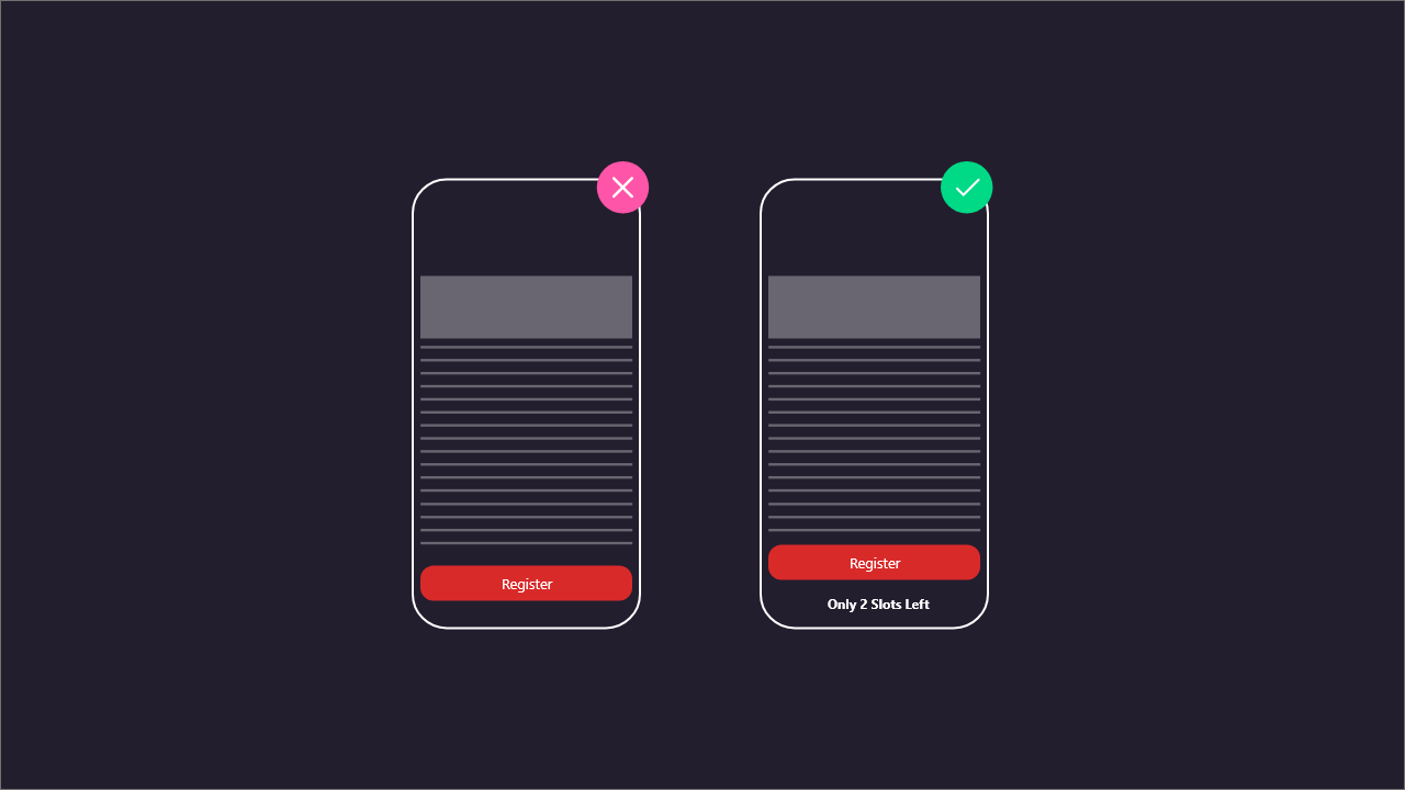
14 Pareto Principle
"The Pareto principle states that, for many events, roughly 80% of the effects come from 20% of the causes."

The Pareto Principle, also known as the 80/20 rule, states that 80% of results in a system come from 20% of the causes.
Overview
Its origins stem back to Vilfredo Pareto, an economist who noticed that 80% of Italy's land was owned by 20% of the population. Though it might seem vague, the 80/20 way of thinking can provide insightful and endlessly applicable analysis of lopsided systems, including user experience strategy.
Focus attention on the elements related to the top 15% of tasks used by 90% of users, 80% of the time. The target numbers for each variable will depend on many factors including product maturity, industry, type of users, the context of usage, business goals, etc.
15 Parkinson Law
"Any task will inflate until all of the available time is spent."

The amount of work expands to fill the time available for its completion—which means that if you give yourself a week to complete a two-hour task, then the task will increase in complexity and become more daunting to fill that week. It may not even fill the extra time with more work, but just stress and tension about having to get it done.
Overview
Its origins stem back to Vilfredo Pareto, an economist who noticed that 80% of Italy's land was owned by 20% of the population. Though it might seem vague, the 80/20 way of thinking can provide insightful and endlessly applicable analysis of lopsided systems, including user experience strategy. By assigning the right amount of time to a task, we gain back more time, and the task will reduce in complexity to its natural state.
16 Peak-End Rule
"People judge an experience largely based on how they felt at its peak and at its end, rather than the total sum or average of every moment of the experience."

The peak-end rule is simple: the most memorable parts of any experience are the peak the most emotionally-intense part and the end. If the peak and the end are good, people will conclude that the entire experience was good. But if the most emotionally-intense part was negative and the end was unsatisfying, people will conclude that the entire experience was bad.
Overview
An eCommerce platform that dwells on the price will make the user feel bad about spending that cash. After all, losing money isn't just a bad experience; it's a horrible experience. So instead of ending the purchase with a big ol' bill, why not end it by reminding the customer what they're getting? That's what Amazon does. After you finish spending money, it reminds you why you spent that money in the first place.
This window isn't much, but it makes all the difference. Imagine if you clicked the purchase button and nothing happened. How would you know that the order went through? The UX is only functional with a proper end.
17 Postel's Law
"Be liberal in what you accept, and conservative in what you send."
Be flexible in what you accept from your users and limit what you ask of them.

Overview
Postel's law also goes by the name of the robustness principle. And it makes two points:
1. Take what users share with you. For example, if you ask a user to share their country and they enter 'US' instead of 'United States,' accept it and convert the data for consistency yourself.
2. Ask for limited information. This means you ask for only what's important to encourage folks to take action—the same as Netflix does. After all, filling in a long form to get access to an eBook or service is repelling, isn't it?
18 Serial Position Effect
"Users have a propensity to best remember the first and last items in a series."

The serial position effect describes how a user's memory is affected by the position of information in a sequence. Essentially, it's the inclination of a person to recall the first and last items in a list more easily than the items in the middle of the list.
Overview
Understanding the limits of users' short-term memory can dramatically help the usability of an application. Most users have a relatively short attention span. By using menus with just a few items or grouped options, you can help users navigate a website more quickly or choose a product quickly and easily. You can utilize the serial position effect in your UX design by:
1. Placing the most important items at the beginning or end of a list (i.e., in a navigation menu), and the less important items in the middle.
2. Keep the most relevant information visible so that users don't have to look for it or navigate through multiple options to find it. For example, rulers in photo editing applications and maps in video games might be more frequently used features, so keeping them visible will improve the overall UX.
19 Tesler's Law
"Tesler's Law, also known as The Law of Conservation of Complexity, states that for any system there is a certain amount of complexity which cannot be reduced."

A key objective for designers is to reduce complexity for the people who use the products and services we help build.
Overview
The fundamental concept of Tesler's law is that by simplifying something, you inevitably will transfer that complexity onto another area. For example, when you cut down the need to select the type of credit card and allow the system to deduce it based on the card number automatically. You are simplifying the user interface but adding complexity to the development process.
image
The login process has been simplified in most products by replacing the need for a username and password with biometric login options.
20 Von Restorff Effect
"The Von Restorff effect, also known as The Isolation Effect, predicts that when multiple similar objects are present, the one that differs from the rest is most likely to be remembered."
The Von Restorff effect explains that of a group of similar objects, the one that looks different from the rest is most likely to be remembered.
Overview
This is one of the principles of psychology used by designers to enhance the user experience in different applications. Naturally, users inherently place a different degree of value on an item based on whether it is placed in isolation, or next to other possible alternatives.
In the example, Canva draws your attention to the Pro pricing plan. The bold blue enclosure within which it is placed ensures the pro plan is what you pay attention to initially. This is good for Canva's bottom line as more often than not, people will rush for the highlighted plan instead of spending more time exploring the alternatives.
21 Zeigrnik Effect
"People remember uncompleted or interrupted tasks better than completed tasks."

The Zeigarnik effect is a psychological phenomenon describing a tendency to remember interrupted or incomplete tasks or events more easily than tasks that have been completed.
Overview
The Zeigarnik effect can promote mental well-being by motivating an individual to complete tasks, develop better habits, and resolve lingering issues. The successful completion of assigned tasks can provide a sense of accomplishment while boosting self-confidence and self-esteem.
The development of productive work and study habits can also contribute to a personal sense of maturity and self-growth. Additionally, a person who can find closure for stress-inducing events will likely experience a long-term positive impact on psychological well-being.
01 Golden Ratio Law In UI Designing
"When a line is divided into two parts, the long part that is divided by the short part is equal to the whole length divided by the long part is defined as the golden ratio."

The golden ratio is a mathematical proportion between the elements of different sizes that is assumed to be the most aesthetically pleasing to human eyes. The golden ratio equals 1:1.618 and can be illustrated as seashell-shaped spirals.
For effective UI designs, all elements should be well-balanced and placed in harmony so that users could easily perceive the information and interact with a product without effort.
The golden rule works as One of the most common tools to build beautiful UI design compositions is a mathematical proportion. UI designers apply various techniques and methods to form efficient design compositions.
Overview
Design presenting the natural balance of the components and a well-structured layout is one of the core parts of powerful UI.
The golden ratio brings harmony to the design and makes the product pleasant to the users. It can help in creating user-friendly digital products to combine utility and aesthetics.
Let's see how the golden ratio can improve UI designs.
Balanced content
Designers often face the situation when a product needs to contain a great amount of content, and each part of the content is vital and cannot be replaced.
The golden ratio can be applied to combine all the components in a pleasant composition.
Divide the layout into little sections using a proportion of 1:1.618 and then put the content in the sectors according to their importance.
Such a content composition is sufficient for users' perception and helps to organize all the components.
Effective visual hierarchy
With content organization, we can't forget about visual hierarchy.
Visual hierarchy strives to present the content of a product in such a way that users understand the level of importance of each element.
Since a visual presentation of UI elements has a great influence on the user experience, visual hierarchy is one of the core techniques which are applied to the design process.
The golden ratio is about the efficient structuring of content components. By combining the principles of these two techniques designers maximize the chances of building a powerful design composition.
02 Shneiderman's Eight Golden Rules of Interface Design
Ben Shneiderman is an American scientist and the author of 8 Golden Rules of Interface Design. With strong expertise in the field of human-machine interaction, many of his works are fundamental to today's UI design creation.
Professionals can follow Ben Shneiderman's 'Eight Golden Rules of UI designs' to create great, productive, and frustration-free user interfaces.
To improve usability, an interface must be well designed to be "user-friendly", and Schneiderman's eight golden rules help designers to solve problems.
01 Strive for Consistency
Whether it is the layout, the color code, the size of the buttons, or the tone used when writing the page, is important to be consistent across the site. Consistency will allow you to build your identity and not lose users while navigating your site.

For example, Amazon. There's a consistency between all the pages on Amazon, the layout is the same, the color code is very specific and the button size is always similar.
02 Allow Frequent Users to Use Shortcuts
Let users access all parts of your website with the least number of clicks. To do this, you need to establish a good hierarchy in the menus, and also need to make things less complex.

For example, Canva allows its users to use shortcuts to copy and paste. This feature can be used by beginners as well as advanced users.
03 Informative Feedback
If your users are performing actions on your website, it is best to display immediate feedback, so that they have an idea about their actions.

For this example, when the user drags a folder across the desktop, the user can see the folder represented as physically being moved as he holds down the mouse.
04 Dialog Box to Yield Closure
Remember to close any interaction made with a user based on the cause of the interaction: A thank you message, summary message during installation, or validation message.
By offering him the end of interaction through feedback, you reduce his mental load and improve his experience with your interface.

Example: Thank you message after shopping on Amazon.
05 Simple Error Handling
A good UI design should be created to avoid errors. However, if something goes wrong, your system should make it easier for users to understand and solve the problem. Simple ways to deal with errors include displaying clear error notifications and descriptive prompts to solve the problem.

For example, many sites show you an error message when you log in if your login credentials are wrong.
06 Permit Easy Reversal of Actions
Finding out right away that choosing "Cancel" after making an error is a great thing for a user. If your users know that there is an easier way to solve a problem, they will be less concerned and more willing to explore more options on your site.

Example: The undo option in a photo editing app.
07 Support Internal Locus of Control
We need to give users more control and freedom so that they could feel that they are in control of the system themselves.

For example, the Mac's Activity Monitor allows a user to 'force quit option, when a program crashes unexpectedly.
08 Reduce Short-Term Memory Load
As humans are only capable of retaining 5 items in our short-term memory at one time, the limitation of human information processing in short-term memory requires that displays be kept simple.

iPhone allowed only 4 app icons in the main menu area at the bottom of the home screen. This decision involves considering not only memory load but also consistency.
Schneiderman's golden rules can be identified in various user interface guidelines produced by corporate giants, such as Apple, Google, and Microsoft. Respecting the rules proposed by Schneiderman should not be taken as gospel. However, having clear guidelines will orient your audit and allow you to detect the main problems encountered on your web interface.
Conclusion
The most effective method to include psychology into the design process is to incorporate it into daily decision-making.
We looked at a few ways designers might absorb and apply the psychological concepts we discussed in this guide, and then communicate them through design principles that link back to their team's goals and priorities in this guide.
We began by considering how you may raise awareness by making these ideas obvious in your workplace. Then, using the classic show-and-tell style, we looked at a simple method for developing a culture of discussion and knowledge development inside the team.
Finally, we looked at the importance and advantages of design principles, as well as how to build UI UX design principles and draw the dots between what each principle is trying to do and the psychological rationale behind it.


