
Tips: How To Get The Perfect Colors In Design - A Complete Color Guide
Colors are one of the most important considerations in designing a website, right colors can make your website look more attractive in design.

Everyone knows color gives the actual existence to design and art. It can frame the core in transforming any format. Did you ever noticed any digital product and gone through till its depth?
“The fact is there is no such thing as color in the physical sense; it's just a light wave of different wavelengths which gives the color to every single object.”
Content Index:
- Color Theorem
- Types of Color Palettes
- What color mean?
- What is color blindness?
- 5 Tools to create a Perfect Color Palette
- Five mobile apps UI With Great Color Schemes
- Color & UI design tips
- Endnotes
Article Index:
1. Color Theorem
For understanding color theorem, let’s remember the school art class to know the basics of colors, primary, secondary, and tertiary colors.
Primary Colors-
Primary colors are the basic, also called the parent color, which can be combined to produce other colors. In mathematical language, these are like prime numbers, which can not be produced by multiplying any numbers.
There are three types of primary colors
- Yellow
- Blue
- Red
Just play with the color until you found a guard nail color for your brand. You also can explore other shades, tones, and tints. (Explained Below)
Never restrict yourself with these three primary colors while designing or painting. Many different colors also can have a high impact on your product because color also has its meaning and explanation of using.
Secondary Colors
Secondary colors are a combination of two primary colors. Secondary colors are the complementary color of the primary color.
- Cyan (a combination of blue and green)
- Yellow (a mixture of green and red)
- Magenta (a mix of blue and red)
Also, keep one thing in mind that color mixture works perfectly when you use the purest form of primary colors, which is also known as color’s hue. For more understanding, check out the color wheel below/above.

Tertiary Color
Tertiary colors are the mix up of primary and secondary colors. Creating tertiary color becomes a little complicated for that 1st you need to learn experts' strategy to choosing design then you will be able to use other components of the color.
The most component of tertiary color is that not every primary and secondary color match-make the perfect tertiary color. I am defining some best tertiary colors.
- Red + Orange = (vermillion)
- Blue + Purple = (violet)
- Blue + Green = (teal)
- Yellow + Orange = (amber)
- Yellow + Green = (chartreuse)
- Red + Purple = Red-Purple (magenta)
Now let's jump into the Color Theory Wheel in detail
I hope now you know the basic concept of the color, but the main task here to choose the color for branding, especially on a computer. A color theory wheel is a circle graph that visualizes the colors with their hues, tints, tones, and shades, which helps you to choose the color accordingly. By using the colors wheel, you can also create lighter, softer, darker, and brighter colors mixing the hue of white, black, gray. This helps you to try many variants of chosen colors.
Below I am describing color variants in detail.

- Hue - We can consider it a pure spectrum of colors. In actuality, all primary and secondary colors are the Hue colors. While creating the hues of colors, always remember one thing only purest form of primary color makes the hue of secondary colors. That's because he has very few colors inside it. Mix up of two primary colors that carry tint, shade, and tones, technically are more than two colors. But the final color scheme all depends on the color compatibility of the colors.
- Shades - In common language, we consider the shade as a light and dark version of the colors. But technically it's a color you get when added black in the given color. And shade type depends on the quantity of black you have added.
- Tint - Fewer people know what tint is, it's just opposite of shade. A tint is a form of white and any given color.
- Tone - Tone is also known as Saturation; the tone is made up of mixing both white and black in a specific color. Mostly tone used for the painting work.
Addition and Subtraction of the Colors
While working on the computer, you probably seen the color listed with RGB and CMYK.
Do you know what does it mean?
CMYK stands for Cyan, Magenta, Yellow, and Key (Black), which is the subtractive color model. It also listed on the cartridges in your printer.
Let me clear you the concept of addition and Subtraction.
The addition of Cyan, Magenta, and yellow makes black, and for getting white, you have to subtract. The fact is, the more color you add, the closer the clack you get.
Still, Confuse?
Let's take the example of printing while printing the white paper; we added the color to block the wavelengths of white from getting through.
When you put the same paper back in the printer, you will see the area printed twice is much closer to the black.
For making you more easier, let's get into terms of its corresponding numbers.
CMYK always works in 0 to 100 Scale when C=100, M=100, Y=100, and K =100. It ends up on the Black. When these colors equal to 0, these end up on the pure white.
RGB, these colors basically designed for computers and electronics displays.
RGB stands for Red, Green, Blue, which based on the additive color model of light waves.
RGB color scale is 0 to 255, the more color you add, the closer you get the white color.
When R=255, G=255, and B=255, Creates the true white. Oppositely when all colors equal to 0, create the Black.
If you are designing a digital image or product, then RGB would be the best option.
2. Types of color palette
As a designer, it's difficult to choose the best color scheme for branding Suite. There are many color schemes by using you can give a perfect look to your product.
Below I am defining few of them -
Monochromatic
This is the simplest color scheme that visualizes the hue of different tones, shades, and tints.it becomes boring when done meanly.
Monochromatic schemes are easy to create, but can also be boring when done meanly. A perfect addition of white and black can make the design interesting.


Monochromatic Website Example

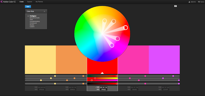
Analogous
The analogous color scheme is the second easiest 12 - spoke color wheel. This scheme visualizes more than three next to each color. The chroma level of this scheme is the same, but you can make it interesting by using tint, tone, shades.


Analogous website color example

COMPLEMENTARY
Complementary color scheme made up of opposite colors of the color wheel. This scheme consists of only two colors, but you can expand it by using tint, shade, and tone
Beware of using a color which are opposites of the same chroma.

Complimentary website color example

SPLIT COMPLEMENTARY
This color scheme is a little more complicated than other regular schemes. In this scheme, we choose colors that are either right or left of the opposite color in chroma.

TRIADIC
The triadic color scheme is a diverse color scheme which consists of three colors with evenly spaced in color wheel. This scheme can be a little difficult when choosing colors but add more visual interest in design.

DOUBLE-COMPLEMENTARY (TETRADIC)
Earlier I have explained the complementary scheme in which we take the 2 opposite colors in the color wheel, similarly double complementary scheme; we use a combination of four colors opposite of each other in the color wheel with evenly spaced.
The best way to use a color scheme is one color as the primary color in a design and the others just as accents.

CUSTOM
The custom color scheme is doesn't follow any rule; it all depend on the balance of shade, tint, and tone of any chosen color. While choosing color, just whatever adding(shade, tint, tone) keeps it in balance in each selected color.

3. What colors mean?
- Red: energy, passion, power
- Orange: enthusiasm, joy, creativity
- Yellow: intellect, energy, happiness
- Green: growth, safety, freshness, ambition,
- Blue: confidence, tranquility, intelligence
- Purple: ambition, luxury, creativity
- Black: elegance, mystery, power,
- White: purity, cleanliness, perfection
Learn more about Color Psychology.
I talked with individuals who are getting better in design; they don't know the real sense of creativity, for the psychology and user behavior only does creativity. Few Infographics which will help to understand the visual design Phycology in the next 15 minutes.
4. What is color blindness
Above, we have learned all about color. But what if you can't see the colors in the way they are.
Not understood?
Let me explain to you in detail, and you must have heard about color blindness, it occurs when you are not able to see the color in their actual way. It happens when people can't distinguish between the two colors (red & green) occasionally blue.
As compared to female color, blindness affects more in male.
Types of color Blindness
Monochromatic color Blindness, people with this blindness lack all cone receptors in their eyes and can't see any color.
Dichromatic color blindness, people with this blindness lack either(green-red) or (blue-yellow) receptors and can not see the color in a given range.
Color weakness is another color blindness, which is also known as anomalous trichromatism. In this particular can perceive the color but with less acuity. A visible color is the high intensity of wavelength. This can also cause of aging process in humans.
There are two factors of color blindness
Physical factor, as we have discussed above it happen when people see the color differently
Technology factor, In technology factor color, read differently in print and on-screen. RGB colors appear differently than CMYK. Sometimes it happens because not every computer monitor and television screen os color corrected. We can't make sure how our chosen color will show in these media.
5. Five Tools to create a Perfect Color Palette for designers
Adobe Color
Adobe color is one of the most natural color tools to design anything like infographics, brochure, web design color scheme.
By using this tool, you can create a color scheme based on the color composition, which I have discussed earlier.
Firstly you need to choose the color scheme which suits your product accordingly. After that, you can copy and paste the HEX or RGB codes into your design.
Adobe color also provides you the hundreds of premade color schemes for your design. Either you can save your color scheme if you are an adobe color user.
By using Photos

It's my favorite way to create a color scheme. By using a photograph, you can also get a perfect color scheme for your design. You need to upload your selected photo, and you will get your color palette just in seconds.
The best thing about adobe capture is easily import the color scheme to illustrator, and photoshop.for example, take a photo from the cloud or (capture yourself ) and create a color palette as I have created above.
Photoshop
Well, that could because of the beautiful color scheme that clicked with the design. Color plays a pivotal role in establishing a communication with the design as it creates an emotional connection by way of atmospheric impression.
However, if the color palette goes poor in the selection, it can weaken the look and create friction for the viewers. Mismatched colors can prove jarring and ruin the whole draft by putting a creative block in the outcome.
If you aim for successful experiences, then as a designer, you must crack the color code with the combination that fits in perfectly.
You never know, your choice can not only delight but even serve as inspiration for the audience. So, at any cost, never underestimate the impact of colors in a design.
Illustrations, even though the same can have a different effect through variations in the color grading and tonal quality.

Yes, even a tinge of variation in the hues can take the product to heights or falls. Be it straightforward shades or low scale palette; color can provide that visual kick to a great extent.
You, as a designer, might be expert in your craft, but it is your choice in colors that can create a gap between success and failure.
Want to experiment with new and exciting colors, but confused about the styles that can come handy?
Okay, here I have a quick color guide for you that can help you fetch results. Now, this is not a magic mantra or something for your color issues, but will surely set the visual trigger for the users.
Creating a Perfect Palette
Let the first step be setting up palettes in Illustrator. Do not be worried about the perfection of the colors at this stage. This is the time when you should be more concerned about what the colors will be, for example, if you plan to use red, white and blue, let them just be an old red, white and blue. You must be contended by the fact that you can manipulate the palette in the stage of post-production. So, the point is, take up whatever color you desire and dream.
Do not restrict yourself in this initial stage. You can even take your pick from the Illustrator’s default color swatches. It is possible to create a wonderful scheme by way of altering these colors in the default Illustrator swatches. It is important to select the colors that stand appropriate to the context of the environment.

If you are new to working with an illustration or handling many at a time, it is always a good method to set up a playground for these colors. I have benefitted a lot with this technique of color play. It is still good to see how colors interact with one another and emerge as a dynamic, cohesive pattern. When you set a palette, build a scheme so that each color has at least one point where it merges or interacts with each of the other colors.
After the colors get selected and there comes a canvas or environment to play them in, it is the time to reform them in Photoshop so that the palette gets graded and turns out to be more exciting and visually appealing, or we can say more readable for the eyes.
Photoshop’s Adjustment Toolkit
Let us admit. Photoshop is every designer’s baby. The wonderful transformation that images witness is very much courtesy Photoshop. There are few tools with the help of which color grading is done. These are-
- Curves- Want to control the image tones? This adjustable graph manages the tonal range.
- Levels- An adjustable graph that modifies the tonal range and color distribution of an image by manipulating the intensity levels through image shadows, mid-tones, and highlights factors.
- Selective Color- A set of a color mixer that gets directly applied to the selected color.
Now, if you think that these three are the only tools in Photoshop that can for color grading, then you are highly mistaken. These do not comprise everything, but compose a significant chunk of what is applied or is usable in the app. For using these adjustment layers, you need to go to the Layer option, select the adjustment layer, and then choose the type of adjustment layer you will be adding.
Curves to Control
Curves have various properties controller. Here, we are majorly focusing on the channel selector that is also known as RGB and the line graph that covers the lower left quadrant to the upper right. Our work mainly incorporates RGB channels for this specific task.
Firstly, take the red channel to add some variation and then start playing with the pretty line graph. To assess the line graph, the lower-left area stands for the shadows corresponding to this channel in this piece, on the other hand, the upper right area is used for the highlights of that channel. Whenever you click a point on the line graph, there will be an anchor point that can be maneuvered by simply dragging it.

While working with the curves tool, my suggestion is that try to play with these controls as much as possible. As far as I know, there is no restriction on the placement of the anchor points. Whenever you feel like clicking and placing, do it.

Raising With The Levels
Levels work on parallel lines to curves. Here, once again, we will be changing the tonal range of the illustration. On the contrary to a line graph, we will be taking into consideration sliders to alter the tonal range of shadows, mid-tones, and highlights. Moving ahead, we will again take RGB color channels in action so as to have an impact on our channels in isolation. Okay, there are some points you must keep in mind. The target with the levels is to alter the shadows and highlights of an image, that is, the areas where it is the blackest and the areas where it is the whitest.
The result will affect the trueness of the dark and light tones. This implies that blacks will not be fully black anymore, and also, whites will have a deviation from being pure white. For instance, if we choose a blue channel and then select the Shadows slider that is black towards the right, by doing so we are adding a blue into the blacks and modifying with the black value to some extent. On the whole, the entire picture except the pure whites will be full of blue that will, in turn, enhance the dark value of the respective dark areas of the image.

However, if you drag the Highlights Slider (gray) on the left side, it will add its counter to the whites and any color value with a white hue in it (all except true black). Experimenting with these tools will change the contrast level of the image, so you must play a little with the brightness and contrast settings to maintain an overall balance.

This is the toughest tool as it deals with polishing the colors that you have already been working with. No doubt, Curves and Layers will do the magic for the palettes you set, but there will be times when no matter how hard you try varying and manipulating with the grading, one color might feel too dominant or dry for the piece. Look at the color pattern below. Don’t you think that red is way too strong and is somewhat pricking the eyes? Are you thinking of changing this red? Yes, only red.
Well, then, here is your wish granted. Selective Color is what you need right now. It is the apt tool to select a single color and change it in isolation with the whole image.
From the Colors dropdown option, you can choose the exact color you want to alter, and then you can manipulate with the CMYK percentage to add or omit the specified color value from the typical color. When you move on to the Selective Color option, by all means, you must begin trusting your instincts and eyeballs to stand by your choice for cohesion. This final finesse will surely bind and blend your palette on a more consistent and precise platform. It should be used with care.

Color Hunt

Color Hunt is an open platform with thousands of trendy and hand made color palettes? Here just keep scrolling and explore the new trendy color scheme until you find the best one for your design.

This tool helps to create a super-fast color scheme as compared to other tools. This tool comes along with an IOS app and adobe Add-ons for Photoshop and Illustrator by using you can make your color palettes in very less time from any community, save and access from everywhere and use it in your design in few clicks.

This also works similar to colors and color CC; only the difference is that you are not limited up to 5 tones, if you want to play under primary colors and want to explore with new tones for different color palette then this is the best tool.
6. 5 mobile apps UI With Great Color Schemes Designed by Think 360 Studio
1. Health Guru UI Color Palette

2. EASYBIODATA WEB UI COLOR PALETTE

3. Lab Advisor UI Color Palette

4. Teledentix Color Palette

5. HoppInRide Color Palette

7. Colors and Web Design
It is through these tools that you can very well master the properties of a palette. These palette generators offer great functionality and come very handy for web projects. So, folks, that was all about the color card. I hope you got your cues for the hues. What are you waiting for? Pick your palette and let the collection take over.
Can css animation create an excellent user experience? Read my next article and figure out the secret of animated transitions in your interface.
Once design online, it will be viewed on different platforms like Macintosh, window, etc. each with their gamma curves on separate monitors (LCD, CRT), each set of contrast and brightness levels that no designer can control. That burgundy you specified might be blown out as fire engine red.
While that subtle pattern of darker hues designed as background can end up with close black, however, the disparities not ridiculous, but technology has advanced. And people see the website in 24- bit colors.
Basic Design Tips
- Always test your design on each platform/medium and notice the variances
- Try simulating the level of contrast and brightness, how your design will stand up.
- For understanding the graphics formats, here are two basic rules.
- The images composed of solid colors (type, icon font, etc.) should use GIF format.
- Normal photos and complex images should format with JPEG.
- In the end, try both when exporting on your web and app for best looking results.
The Final Words
Designing is all about diving into colors. There are a vast amount of tones that create a perfect blend by way of palettes that bring forth the best features. Various color tools can deliver great colors through amazing styles that range between tones. Adjustment layers will help you dig deeper into your images and achieve the best outcome through Curves, Levels, and Selective Color.


