Have you seen those tiny icons in your browser tabs and address bar? Yes, that small square image representing a website. Well, these are favicons (aka favourite icons). Before you ridicule and say it is just a pint-sized image, big deal! Let us tell you that these icons hold a lot of power and can prove to be the ultimate game-changer for your site. Before we start exploring the designing tips and tools, we must understand what exactly favicons are. Let's go.
Favicon Tutorial: How to add a favicon | What is a favicon?
Favicons are small pixel-size icons that are created to be displayed next to a website title when bookmarked. They are also seen in the URL section of a web browser, browser tabs, website history and other areas based on the browser and device that you are using.
You might have viewed these when you go to sites such as Amazon, Facebook and other big-shot brands and also many small ones.
Nowadays, when people resort to keeping multiple browser window tabs open, a favicon permits the user to relocate to the correct page without the hassle of opening each tab to check what the website is about.
A well-designed favicon shows your brand in a very compact space. It enables your website to become more noticeable and suitable when a past visitor is looking through bookmarks, history or favourites.
Besides, the aim of a favicon is not just to add visual appeal, but it is also important branding tool that can enhance the other branding features of a website such as a logo, overall colour scheme and theme.
As mentioned earlier, favicons are found in three main places – in the address bar, in the browser tabs and the bookmarks list. Just as the case with logo, it is crucial that your favicon co-ordinates with the rest of the branding on your website and marketing content.
Think of a case when a visitor is browsing through various sites and thus three or four tabs are opened in a browser window. Each site displays an attractive, custom favicon and then comes to your site supporting default blank favicon.
This is where a red flag comes and makes your site look less genuine and dependable that your competitors’ products.
Before you underestimate the power of a teeny-weeny favicon, think of this scenario. You want to order a birthday cake, something that will sparkle when kept amongst all the presents and balloons. You go to the bakery and look at the display case intently.
All the cakes are mouth-watering frosted in different colours. But one particular cake keeps a bright flower right in its centre. Yes, it's a small flower, but undoubtedly it makes the cake pop out from the rest.
A great favicon, like the icing on the cake, catches the attention of the eyes. Although minuscule, it generates brand identity, which we all know is required to earn loyal clients.

Favicons are pictures but they are compatible with.ICO extension. So, you can't just form a JPG file and start working on it. You can utilise your own illustrations but have to be careful regarding its size and you'll have to upload them to a favicon generator to have them converted into the correct format.
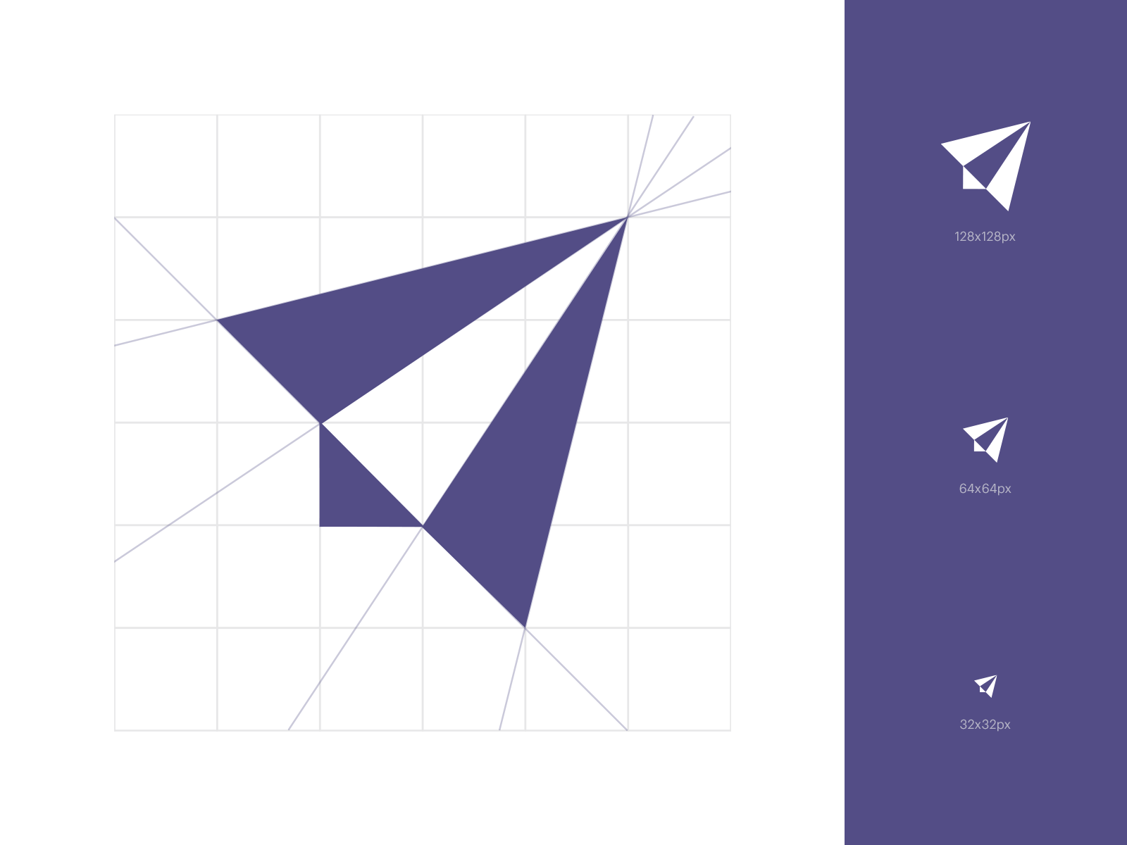
Generally, favicons are square and 16 pixels by 16 pixels in size. Some sites prefer slightly larger icons to exhibit details i.e. 24 pixels by 24 pixels or 32 pixels by 32 pixels. It must represent your brand image. Some worthwhile examples of favicons those are easily identifiable as brands are Apple, Twitter and Google Plus. It is possible to add transparency to your favicon, in other words, you can design a transparent background or conveniently overlay elements to build the look you’d want.
It is recommended to keep the design as simple as possible to comply with the limited space.
Take note that your favicon creates a nice contrast to that of a standard browser tab background. Browsers typically have a light grey or blue, hence your favicon should rise against that colour.
Keep greys or extremely light colours at bay. Similarly, there are chances that the user chooses their browser of a different colour (could be black). Here, the design should be visible on darker backgrounds.
Elaborate designs prove to be of a disadvantage as they get hidden in translation, particularly on smaller screens like smartphones. Don’t use scalable vector graphics (SVGs) and build several sizes of the same favicon in its place.
In the first look, it might seem sensible to build a scalable graphic that is compatible with various browsers. But the issue is that all the browsers don’t read SVG favicons. The ones that can presently read SVG favicons are Firefox and Safari.
Anyone who uses Internet Explorer, Chrome, Opera or any other browser will be lost. Any image editing software can be employed to make the fundamental design of your favicon. Stick to 64 pixels by 64 pixels size. After that upload to one of the favicon editing tools to turn it into the correct size and to convert it into .ICO extension, you'll require to upload onto your website.

Framing a single 16 x 16 icon is simple. But what if we want to go for iOS, Android, Windows 8 Metro and desktop browsers? For this, we need 4 pictures at least. If we want to do a perfect job and cover everything (first-generation iPhone, macOS Safari etc.), we can use up to 26 pictures.
Now, that will be fun! Unfortunately, it is not only about images. Announcing them is also challenging. Microsoft launched browserconfig.xml for Windows 8.1 and IE 11. The main aim of this file is to build ‘live tiles’ and make your Metro tiles smart. In fact, this is the time you announce your 4 images meant for IE 11.
For instance, the 310 X 310 tile image, which is suggested to be 558 X 558 for high-density screens, will be announced as 310 X 310 logo image in browserconfig.xml. All this just to make a fascinating favicon…really!
It is recommended to keep the favicon in the root directory of your website. Even though it is possible to keep a favicon in any directory and connect to it accordingly, majority developers prefer to position it in the top directory to maintain the consistency.
It is common sense to place it into an images folder as it is an image, but the usual practice amongst developers is to place it in the top directory along with the main pages.
256 colour palette is the default setting of Windows colour palette. It shows what the majority of the browsers that see your favicon will allow. Also, the simple colours enable a more appealing visual result for a design, that too, in such a limited space.
Try to stick to the main goal of using a favicon: let it contribute to your website brand. It is seen many favicons are a humble version of the website logo or a somewhat relevant image.
They stick to the main colour scheme as that of the website and don’t deviate much from the overall look and feel of the website. Avoid using a random picture or compelling sample of pixel art for a favicon as then the very purpose is defeated.
Make it apt, suitable to your branding and matching to your website’s overall appearance. Stay away from decorative design features like drop shadows, texture and others.
Clean lines and shapes are the safest elements to form a neat, smart and relative favicon. Lack of minimal design can cost a lot by giving a cluttered and vague view which in turn hampers branding.
Once the core design is ready, look for a tool through which you can convert the favicon into the right file extension.
Favicon.cc
This website enables you to create a favicon from square one or upload your own picture, make changes and save it as an.ICO file. One thing that is amazing about this site is that you can view the favicons other people have made. You can explore recently uploaded images and favourite icons.
Favicon Generator
If you are on the lookout of adapting your design into the favicon format, this is where your search ends. You select the size you’d prefer your favicon to be (default size is 16 pixels by 16 pixels). Next, simply press the button that mentions Create Favicon. This site allows JPEG, PNG, JPG and GIF.
Favicon from Pics
This is a remarkable way to form a favicon. Choose any image, even a snap from your Twitter profile and change it into a favicon. This can be of great help if you are an author, artist or someone who represents the actual brand. It can create a vibrant and captivating icon.
Favicons are not-just-another-image that is complementary to the look and feel of the website. They generate a lot of interest in your website. They can stamp your brand as professional and trustworthy. Favicons are a dynamic branding tool that influences your website’s overall image and attract quality visitors. Its biggest strength is that it is always visible so it succeeds in keeping people’s attention. By all means, a wonder icon, isn’t it?


