
How to make websites accessible as a UI/UX Designer? Tips & Tricks!
Everyone wants visitors to flock their website. But is it usable for all? Is it easily accessible? Designers think that spending so much effort for a small group of people is worthless. But mind you this small group of people consists of 65% of the popul

Everyone wants visitors to flock their website. But is it usable for all? Is it easily accessible? Designers think that spending so much effort for a small group of people is worthless. But mind you this small group of people consists of 65% of the population.
Yes, 65% of people are disabled in some way or the other. Think of the day when your mouse stopped working and you had no other option but to go for the keyboard or when you were driving and couldn’t view your mobile screen for route guidance or when you had to zoom into your mobile screen to look into a website.
While there are a lot of disabilities and conditions that can affect the way people use websites, let’s take a look at some of the most common categories of impairments:
- Visual Impairment: This includes a partial or total inability to see or to perceive color contrasts.
- Hearing Impairment: Some users have a reduced ability to hear.
- Motor Skills/Physical Disabilities: Users may have difficulty moving parts of their bodies, including making precise movements (such as when using a mouse).
- Photosensitive Seizures: Conditions such as epilepsy can cause seizures that are often triggered by flashing lights.
- Cognitive Disabilities: There are also many conditions that affect cognitive ability, such as dementia and dyslexia.
So, there are millions of users who are in need of accessible sites, and if you fail, you’ll miss out on them.
Truth is users are worth every bit of your effort and you certainly don’t want to ignore them. By making your product accessible, you’ll prove to be of great help to everyone. The good news is that accessibility isn’t a hard nut to crack.
[?]{=forms:contact}[?]
You just need to be aware of the problems that make a site tough or difficult for some users. Once you take care of these issues, you’ll make your site welcoming to all visitors. In this article, you’ll get to know some brilliant accessibility techniques and how to apply them. Let’s get started!
First things first, for a website to be accessible, it must function without a mouse. The reason is that many assistive technologies depend on keyboard-oriented navigation. So, there shouldn’t be any hindrance in using your site’s major features through a keyboard and nothing else.
This means all pages, links, content, etc. The most go-to way of navigating via a keyboard is by Tab key. This will shift to areas on a page that accepts keyboard focus like links, forms, and buttons. Hence, your motive should be to direct all content and navigation towards Tab for easy access.
Testing is also easy in this case. Simply put your site to use without a mouse. If there are some elements you can’t see or use or moving around the site is challenging, you can highlight those points and work on them.

Besides making your site keyboard-oriented, you must take care that all content on the page is easily approachable. Although this usually doesn't cause trouble but can pose a problem when a page consists of dynamic content.
Content can be labeled as dynamic if it changes without the page it's on reloading. This can be of an issue if the site doesn't tell about the assistive tools of the change. For instance, many screen readers will only scan the site when it first loads.
To avoid that, you need to highlight when something different happens or the user will remain unaware of the new content. One solution is to use ARIA landmarks. These are tags that you include in your content so as to show it on the page clearly.
You can mark dynamic content as a ‘live region’ which allows screen readers and similar devices to view the content as it changes. ARIA also makes the navigation more direct as it permits the users to jump straightaway to relevant content and can easily skip link-heavy portions.
The same result can be attained by using skip-to-main links; the invisible links that allow users to leave out on menus. ARIA is generally more adaptable and agile.
Hovers are a big problem for people with motor-related issues. As soon as they linger the cursor over popover content, they need to take care to not move the mouse out of the stipulated area. The issue becomes grave when someone uses a screen magnifier.
For users with keyboard navigation, if the button isn't visible, why would they reach an empty space where it will be seen? There is no aspect of this concealed information. Actually, the majority of the screen narrating software assumes that the button will be visible.
The motive is to make the page appear easier and balanced with limited decisions to make. These can be done if we group these hidden icons inside a menu or a dropdown or if play with the contrast of the icons to lower the impact. Further, this can be achieved if we reduce the size of the icons or to display content on hover, we employ the info icon as a trigger.
Think of an IVR service on your mobile. The most frustrating thing ever! For every button there comes the next set of instructions. What if you had to listen to the menu all over again when you pressed a key?
Considering the navigational link, breadcrumbs, search tool and a list of related resources, it is very time-consuming for a person opting for keyboard navigation to reach the main content of the site. And this is not limited to one page, the drill continues for every page.
A ‘skip to main content’ option helps to sail through such blocks. Keep this link the very first link on the page, it should be finely designed just like the sign in and support link on the vertical top.

The Alt text serves as a replacement for the picture if it doesn’t succeed in loading. Also known as alt attributes, alt descriptions or alt tags, alt text is used by screen readers to go through the description of the image.
This field can thus be used to explain an image and provide context to the users who would else miss it. To add to it, alt text can also enhance your site’s SEO. Be careful to use explanative summaries of each image and do mention your keywords wherever they are applicable.

Talk about color blindness and that’s where the black-and-white world comes. But it’s more or less a spectrum as diverse people identify colors in diverse ways. Therefore, be careful when you choose colors on your site so as to contrast them well and let everyone recognize various elements on the page.
The most critical thing is to make the text distinguish against the background. Suitably, you should separate a dark color against a light one and be particular that they don’t merge into each other. Whatever color scheme you opt, try not to make a palette where the shades are the same in tone and density.
It will make things hard to read. You are not performing an eyesight test on your users. Low contrasting colors might come to your rescue when you are abstracting unnecessary details or when you are trying to get aesthetic, but it becomes complicated for people with visual disabilities to spot the difference.
If you want the number game, the contrast ratio should be minimum 4.5:1 or 3:1 (if your font is 24px or 19px bold). Avoid using the analogous or monochromatic color system.
Also Read: Tips: How To Get The Perfect Colors In Design - A Complete Color Guide
Prefer complementary, triad or compound color scheme for more color variation. Take note of not writing anything below 12 points.

Screen reader users can use the heading structure to navigate content. By using headings correctly and strategically, the content of your website will be well-organized and easily interpreted by screen readers.
Be sure to adhere to the correct order of headings, and separate presentation from the structure by using CSS (Cascading Style Sheets). Do not pick a header just because it looks good visually (which can confuse screen reader users); instead, create a new CSS class to style your text.
Examples of proper use of headings:
- Use for the primary title of the page. Avoid using a for anything other than the title of the website and the title of individual pages.
- Use headings to indicate and organize your content structure.
- Do not skip heading levels (e.g., go from a to an), as screen reader users will wonder if the content is missing.
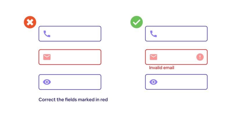
Sticking to only colors to display information is a big no-no. For users who can’t make out the color red, all the form fields look similar and they can’t explain what is hindering them from filing the form.
Other cases are incorporating color to show links instead of underlining or marking required fields in red. This causes trouble for visitors using text-only, limited-color or monochrome views and browsers.
Apart from colors, use text and pattern to relay information. Include colors only to emphasize or complement what is already in view.
At the time of presenting links in your content, properly specify with text where the link will lead the users. The stereotypical ‘click here’ is not ideally descriptive and is vague for a screen reader user.
While sighted users are on the lookout for linked text themselves, visually-impaired users can be assisted by their screen readers to scan for links. Consequently, screen reader users end up skipping the context of the link to the rest of the page.
Descriptive text can provide some clarity to the screen readers. Exclusive content of the link should be displayed first as screen reader users typically move across the links list by finding through the first letter.
For example, if you are pointing visitors to a page called "About Us":
- Try not to say: "Click here to read about our company."
- Instead, say: "To learn more about our company services, read Our Services."
If labels are missing from form fields, the screen reader doesn't get entitled to the same prompts as the sighted user. It may be tricky to guide what kind of content should be filled into a form field. Each field present in the form should consist of a well-placed, explanatory label.
Like if the field is for a person's name, label it properly as ‘Full Name’ or include two separate fields i.e. ‘First Name’ and ‘Last Name’. Type the tag to add the label text along with the form field. While filling a form field, a user should be empowered to tab through the form and enter all the fields, before pressing the ‘Submit’ button or they might end up missing on additional fields.
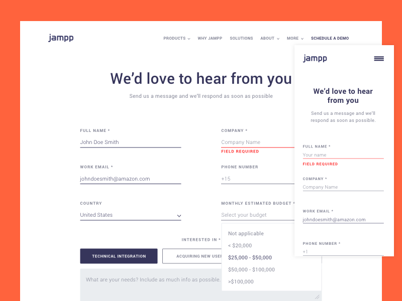
Ideally, the tab order must pursue the visual order. If particular form fields are mandatory, the field must include an apt label and programmed as such to alert the screen reader user. Keep in mind to place the labels next to relative fields.
Yes, a sighted user can easily make sense of the label with the relevant option, but this might not be the case for a screen reader. Necessary fields are marked with an asterisk, which will not be said by some screen readers.
Asterisks are put in use for sighted users, people with learning disabilities or for visitors who speak English as a second language. After submitting the form, the user must be given instant submission confirmation and prompted submission errors, if any.
The best way is to mention any error counts in the page title so that the user is aware of the errors on the page. If a user files a form with errors, the user should be shifted to a submission page that tells what the errors are and provides an easy path to locate those errors.
Tables instinctively come to mind when we are to present data. It is convenient for all the users, even those with assistive technology, to understand a large amount of data. To reap maximum benefit, keep your tables assorted as possible.
Further, don't use tables for other features except for tabular data. This can be seen in layouts, lists, and many others. Such tables can cause confusion to screen readers and similar devices.
Majority devices and browsers permit users to resize text, which can be beneficial for people with visual impairments. But if your website is not configured to pass this feature, resizing text could destroy your design and make it hard for the user to engage with your site.
The best approach is not to use absolute units like disclosing text size through pixels. Rather, include relative sizes, which allow the text to adjust based on other content and screen size. Never disable user scalability as it will make the resizing of the text hard for the users.
To confirm whether your site complies with these criteria, test your font sizes properly by adjusting the zoom level in your own browser.

Automatic media files have been very troublesome for internet users since the days of MySpace. Indeed, it is very irritating when the music or videos play on their own when a page loads. Further, don’t forget the blow to accessibility.
Just like existing the media is not easy when using a screen reader; other people can too be puzzled or even startled by the sudden noise. So, try not to use elements that function without any prior notification to the users.
Stay away from automatic navigation like carousels and sliders. It can be immensely annoying for the users if they need more time to understand the information before shifting to the next slide or section.
Come one, come all. Make your site welcoming to as many people as possible. Follow the above accessibility checklist and you will not be left with a reason to exclude anybody from your website. Not only will the users be happy, but even the traffic and conversions will be on a roll!


