
What Is Microcopy & How It’s Improving UX?
Microcopy add great value to your design & as a designer, every designer must be considered it as an important part of ux design process.

When it comes to crafting a perfect user experience, we get worked up with all the components- the fonts, the colors, the content, the flows. Yes, everything. But one part that is critical to UX and still we tend to ignore is microcopy. Copy has become the catchword in the digital world. People are increasingly bringing words into play to make the website killer. That is because they have come to realize the importance of content in a website or application. However, they forget and leave microcopy aside in the UX flow. You do that too? Don’t worry, better late than never. Here in this post we will be explaining this fine tool of microcopy and how it can be used to improve performance.
1. What Is MicroCopy?

Microcopy consists of regular text placed in tiny portions that is used as and when you need it. It can be the label on a field or rapid set of instructions on particular button to push etc. It is in fact this small piece of text on which majority of the UX of a product depends. As per research, most of the scanned text denotes real content. Still, when we are about to perform, we require clear set of instructions. And this is where microcopy comes into scene; it provides timely understandable instructions. Microcopy occupies almost the entire website. These tiny chunks can be seen in page title, sign up instructions, loading screen message, placeholder text, form labels etc.
2. The Right Use
If you want your microcopy to add to the user experience, begin with having a direct talk with your users. As a matter of fact, the ideal time to create microcopy is during usability testing. You can converse with your users and figure out how they view the actions you want them to undergo. This can give you the cue on the language and tone of the microcopy. If you employ the same language as that of your users in microcopy, they will definitely find your microcopy easier to use.
3. Clarity For Users
Designers tend to be laid back with microcopy. We just imitate something we have witnessed in a similar situation but in reality we should take care that our users understand what is expected out of them. For instance, if your field is named educational history and what you receive is details of the college or university they went instead of the professional qualifications you are looking for, then there is a big mismatch between the user’s expectations and that of your own. Something like this cannot be sorted easily; try labeling the text to please give your professional qualifications and not your academic qualifications.
4. Short And Simple

Although users are smart, but there are moments when they run out of sense and logic. The more you keep the text crisp and to the point, the better it will convey the message. If you are creating microcopy targeting the readability factor, then you must stick to the word count of 10 words or less. Generally, it should be less. Now, ‘Click Here’ is an instruction that is complete in itself and can’t be made simpler.
5. Match The Tone
If your brand is meant for the youth, let the microcopy voice the same. Trust me; it is quite easy for the microcopy to be like a boring, tedious 1980s instruction manual from Japan. It need not be mechanical and lengthy unless your user wants that from you. If your brand follows a style and tone, make sure that your microcopy works on the same lines and represent the image of your brand.
6. Consistency Is Good
If you display a particular explanation of a field and its data on one area of your site, you must be careful to provide the same explanation for the other areas as well. If you are always shifting and modifying your microcopy on the site, it will complicate the things and confuse the readers.
7. Be Of Help

When you see the text wrong email or password, you assume the error is with the password. But this is not always the case. In case of sign up form, not sign in, this assumption can prove totally incorrect. If people are creating password and it does not match the standard, guide them on what is missing. Whether it is too short or a number is missing, explain them. A microcopy should provide help to the users and sort their problems successfully. When something goes wrong, knowing what exactly happened sorts the issue easily. But if the microcopy isn’t clear about the error, the users will have a tough time interpreting what happened and how to find solution to it.
8. Full Of Delight
Generally microcopy is to fulfill functionality that makes the experience easy or usable. However, there is another level of copy and its purpose is to offer delight. Just like you come across a form that says you have a pretty name. Such a comment is unexpected and even unnecessary but still delightful.
9. The Smart Move
There is no harm in reminding your users or subscribers that they are onto a very smart decision. Be confident to add a little boost in your site page. It doesn’t affect the sign-up page to give the idea of recency by flashing persuading figures of the choice they have taken. Make sure to maintain the right balance. If you load up on information all at once, you will make your UI redundant and make the users’ cognitive load suffer with vague information. Display microcopy only when the user enters a place where it becomes a requirement to use.
10. Useful Bursts Of MicroCopy For UX Magic
Have a look at some of the valuable bits of microcopy that you can implement in your site without even bothering for the need of testing. These will definitely enhance your UX and make it powerful :-
1. Never Shared, Never Spammed

Some apps put the user at ease by being pretty honest with its email address field. Although ‘never shared’ might be just assumed by the competent marketers when asked for email addresses, but the user are still left in doubt. Obviously, one has to take care that this message falls in context with the other fields. If you seek permission for third party contact from the users, then this might prove the ‘never shared’ message false. Be it in overall terms, it is excellent to re-assure users through this if you are willing to support it with action.
2. CaSe SensiTive

A good example is eBay as it tells how simple it is to help the visitor. No need of extra copy to explain the users, just a few upper case letters to show to the hazy what case sensitive implies. Being vague with copy and not following the style guide is the theme of microcopy. Without irritating the users, one can have Earth copy elements that people can gauge.
3. No Credit Card Required

These are actually the four most important words for the companies that give a pure free trial. B2C is no restrained with psychological barrier; it will either charge you big with ad-hoc or if you forget, you’d be adjusted with charges.
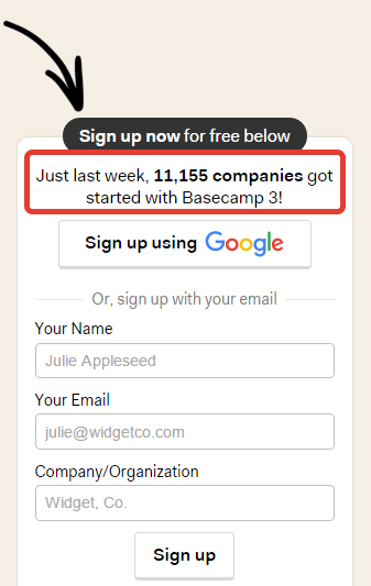
4. Last Week (_) Customers Signed Up With Us

Even though not microcopy but the smartness, confidence and transparency in this sentence is what comprises microcopy. The sign-up pages are so monotonous that a statement like this brightens up things and makes the user proud to join the league.
5. Easy To Remember, Hard To Guess
It is always worthy to encourage the users to be inventive in their secure password selection but without disrupting the UX, so that they can accomplish the task successfully.
6. You Can Change This Whenever

This fantastic bit is implemented by Tumblr. If you want to raise the number of blogs created on such a platform, try putting the user at the comfort and encourage them from the beginning to go ahead with experimentation.
Small Is Big
Microcopy goes a long way in making the user journey satisfactory by alleviating any fear or confusion. It is hugely important and if you want to stand out, make it every bit functional so that the website can get maximum advantage. These little touches if well written are awesome to guide the users but if are poorly executed, are bound to confuse and frustrate them. Hope the above tips will help you in creating a fabulous microcopy that adds scalability to UX.


