
How To Design an Error Message For a Mobile App?
Errors make you perfect. It’s failure that gives meaning to success. When people interact with user interfaces, it is pretty normal for errors to happen. And yes, how can we forget forms? Form filling has never been a simple task for the users.

Errors make you perfect. It’s failure that gives meaning to success. When people interact with user interfaces, it is pretty normal for errors to happen. And yes, how can we forget forms? Form filling has never been a simple task for the users. Even if you think you have eased it out a lot, still visitors will make mistakes.
Now, how do you confront them? Error messages do the trick. But wait a minute? Do your error messages make them fret or reassure them? Error messages that disturb the users make them leave the form and search for comfort somewhere else.
Messages that offer support can make it simple for them to rectify mistakes and complete the form. Error handling has a huge impact on user experience, hence beware while using useless error messages as it can irritate the users and make them dump your app.
Here are some design tips to make your error messages more comforting so that users are relaxed towards finishing the form-
1. Leave Negative Words


Negative words prove to be very heavy for form messages. It can give an impression that the users have made a big blunder and thus, make them feel that they are in a complicated situation.
When people are scared or tensed, it’s difficult for them to sort the problem and find a way out. Avoid making them so anxious that they are forced to seek help from somewhere even when the trouble is under control. Also, don’t make them so fearful that they end up leaving the form altogether. Remember, there are witty ways of telling the user that they have made a mistake without directing it at them.
Don’t put them in the spotlight by stressing that they have committed a mistake rather shift their attention to the form by highlighting what can be done to come to a solution.
The tone of the message must be courteous and professional. Choice of words in such a message is important as it can influence the user’s feelings. Opt for positive, affirming words, not off-putting types.
2. Point Out in Orange or Yellow
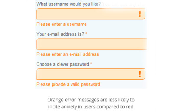
Red is the universal color used to point out error fields. Yes, it is helpful for the standing out effect, but it can make the users really very anxious and make them think that they have committed a serious mistake, ruining the task of filling the form. Red also stands for danger and that is not what you want to convey to your users.
Orange and yellow are subdued colors that not only highlight the error fields but cause less panic when it comes to their view. These colors are different in wavelength to that of Red and are not that strong. Users won’t stress seeing an error message in orange or yellow color as it’s not as alarming as red.
3. Tell The Reason

There are times when stating that the users have committed a mistake is not sufficient. Your error messages must specify why their information was not accepted. For instance, an email field must mention the users that they need to have the ‘@’ sign if the user is not doing so.
It must elaborate on using the domain if they are forgetting that too. This is more assistive and clear rather than just displaying the message that says the information is not valid.
4. With The Labels

Giving a detailed summary of errors at the top of the page doesn’t reassure the users that they can handle them. It’s stressing to read the large message as the users will recall it when they head towards the fields to fix the mistakes.
Error summaries add unnecessary importance to the mistakes especially if they are grouped together as a list. When people look at all the errors at one time, they always get discouraged and leave them all together. A wise technique is to keep the error messages adjacent to the field labels.
The disabled user will like this approach as it will enable the screen reader to read the error message and the field label at once to rectify their mistakes.
An error summary if shown will get placed in their mind and it will come back again and again when they get to the fields. Also, displaying both the error summary and error messages near to the field will get the user worked up.
5. One At a Time

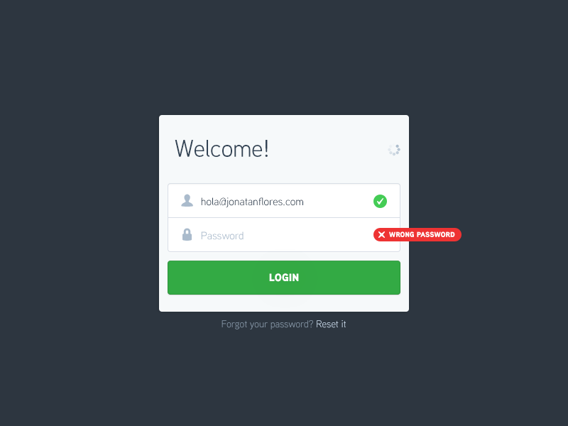
A less stimulating way is to point out the error fields and show the error messages one field at a time. This will help the user to amend their mistakes quickly as there will be less confusion and more focus on the form. Callout bubble error messages highlighting the fields are a great way to execute this idea.
But remember, your callout bubble must not hide the label for the given field and make it difficult to understand. Whenever the user goes for a new error field, the callout bubble for the last one should vanish, and a new one should appear.
6. Interactive Validate Fields

There are fields, for example, username and password that require multiple input entries for security purposes. Instead of showing an error message with lengthy must haves after submission, validate these fields first only.
This can be done by having a callout bubble adjacent to the field. Each input criteria must turn green as the user’s input complies with it.
7. Avoid Separate Screen

Users get frustrated when they undergo a tedious process of form filling only to discover that they have committed a mistake. The best time to tell them about the validity of the given data is right after the user has filled the data.
Assist users in solving input issues immediately when they are identified with the help of real-time validation. Real-time validation instantly tells the user about the accuracy of the submitted data.
A critical point here is sticking to the context of the task as this permits the user to rectify the errors they have done quickly without having to go select the submit button to detect the errors.
You should show the error message only after the user enters a field and be certain that the user sees it. It is advised that you go for contrasting color in error text like the warmer tone of red or orange and keep the message adjacent to the wrong input field.
8. Easy to Understand

Now, you have to give a message that an error has been made by the user. For instance, a scenario when the connectivity is affected and the user is on a screen that only works in online mode.
You must use this chance to tell the users what is going on and follow the principle of instant assistance; your error message must be an aide for your users. Remember not to give-
- Code- driven error message- Messages displaying the internal coding errors or abbreviations such as ‘an error of type 2 occurred’ are overwhelming and difficult to interpret by the users.
- Dead-end error message- Such error messages are of no use as they lead the users nowhere and don’t come up with a solution to fix it.
- Clueless error message- Error messages giving vague idea are of no help as the users won’t know what it means and what action they should take next.
Don’t stress the users displaying incomplete errors and never assume that the people are aware of the context of a message or that they are technically proficient in finding out what it means; just inform them in simple clear language.
To follow this, you must avoid incorporating technical jargons and use user’s vocabulary to express the error. Let the error message be lucid and useful.
Error states should have a short, crisp and directional copy that covers what was the fault and what can the user do now to sort it out.
9. Use Imagery

Error states can ideally make use of icons and illustrations as people understand visual information much better than plain old text. Include attractive imagery that complements your app and offer maximum support to the users.
It can add a human touch to the message as well as be an excellent medium to convey the app’s personality.
10. General Errors
In the case of an error, an app must show loading indicators till the time error message is visible. Features not present will be taken as disabled in the UI.
For instance, a button may not be shown in a disabled mode along with text implying it is not available. Not every error needs a new element to emerge. Try giving your user a solution that can sort the error.
11. Loading Error

When the sync is not working or the content fails to load, the user must be able to engage with the rest of the app as much as possible.
12. Connectivity Issue
In the case of improper connectivity, the user must be in tune with the rest of the app till the extent it permits. If suitable, give the user a link to fulfill their task.
The only present links that you can actually work upon. For instance, don’t give ‘Try Again’ in the areas where you know that the operation will fail.
13. Ask Permission

If your app needs user permission before going on with an action, have the permission request in the app flow rather than considering it an error. If permissions are mandatory before the first run of an app, think of counting them into your app’s first-run experience.
Conclusion
Error messages should not be there in the first place. But if errors happen, smart error handling not only makes people aware how to use the app as it was initially planned but also does not make them feel left out.
Don’t make the users spend too much of their time and effort by showing overwhelming and cryptic error messages. Reassure them that mistakes are a part of the process and there are solutions to fix it.
Error messages do have a great impact on the completion rates than you can actually think of. Don’t take them too lightly or be prepared to lose your users over another website.
Images Credits: www.dribbble.com


