
How To Implement Good UX On Landing Page Design
Always keep the User in mind as then it will become easy to convert them. Attractive CTA buttons and more tips will enhance Landing page UX.

Nothing irks a user more than clicking on a promising ad and ending up on a landing page that is – a disaster. People are unforgiving.
Website Vs Landing Page
If the landing page is nowhere close to the ad they chose or the benefits and CTA are somewhat a riddle, they’ll surely bounce. By this, you are not only missing out on leads but also projecting a poor image of your brand.
And the worst after-effect, users never hide their displeasure. Just when they are full of nice expectations and ready for the best, the bubble bursts, the experience takes a downturn and they quit. So, what’s the solution?
How to change numbers with that first impression?
Tips For Setting Up Landing Pages To Convert Traffic Into Profits
Consider optimizing your landing page. This way, you can make your landing soft and effective and even persuade your visitors. But first things first, let’s get our fundamentals correct; what is a landing page all about?
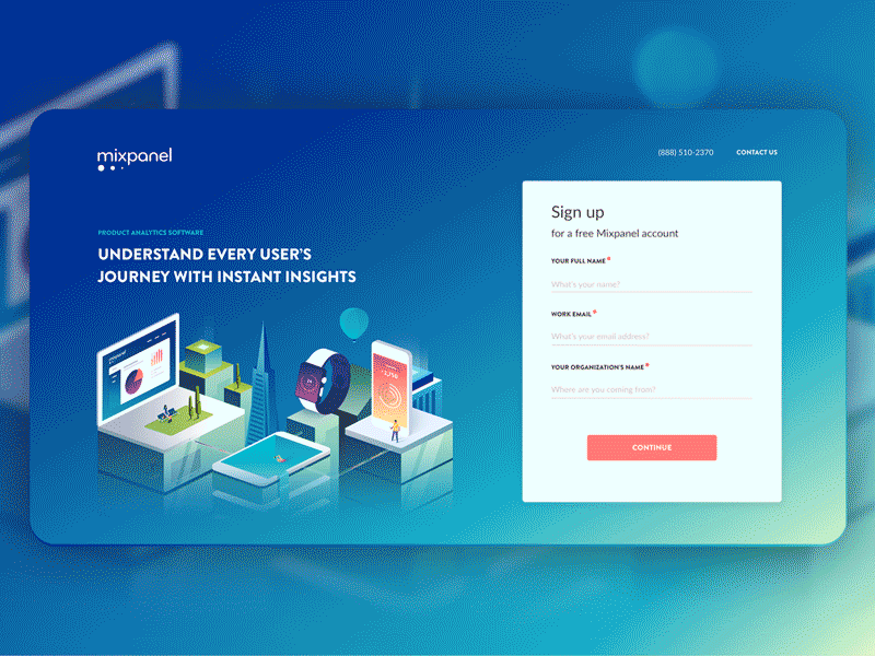
The Land of Landing Page
The phrase landing page was inspired by ‘landing spot’ in the physical world. In the web world, it is the page on which the user landed while exploring the Net and commenced their journey with the website.
This phrase is still used in the same context when it comes to web analytics but a deeper meaning has also surfaced that is prevalent not only among the designers but even marketing specialists.
At present, the term refers to a web page centered on a typical goal and a swift way of completing a specific action. Yes, goals can be varied, however, a large proportion of landings are found in e-commerce arena which deals with a large number of items.
Never direct all the traffic to the home page as it can confuse the user with the overdose of content and links on the home page or they will get distracted and disrupt the route to purchases.
How To Design: a Landing Page
Conversion Says it All
One of the key attributes that signify the perfection of a landing page is conversion. In simple words, it is the result, the ultimate goal which is fixed on the landing page.
Conversion is the metric that tells about the transformation of passive users into active i.e. from exploring, watching and considering to actual buying, downloading, trying and subscribing etc.
Tracking conversions and enhancing the performance of landing pages is the sure-shot way to creating a problem-solving design and strengthening business strategies.
Note that a landing page is not only about visual appeal rather an overall positive experience. Here are some excellent UX principles that you must implement on your landing page.
White Space
White space or negative space is that part of a web page that is left unmarked or empty on purpose. It is that space that is left between page elements such as lines of text, paragraphs, and images.
Now, white space mustn’t be taken as wasted space as it is left empty because it functions as an active element on your landing page and adds clarity to your landing page elements and attracts your visitors’ attention towards it.
Even though it is named as white space that doesn’t mean that it has to be only white colored. As a matter of fact, it can be of any color as long as it fulfills its function of visibility.
All of the Attention
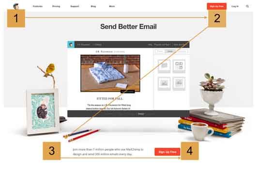
The content that is present above the fold on your landing page can decide the fate of your website. Yes, and why not? It is very critical for creating the first impression.
Stark hero images, motivational headlines, engaging background videos and attractive animations can capture people’s attention and makes them want to score more to get more.
Once they are engrossed, animated transitions between sections can make your design more interactive and make people desire to see what’s coming up next.
Just set up your content to keep them reading and don’t get overboard with animations. The main motive of your landing page is to make people perform a single action.
Too many calls to action, confusing navigation, and other empty elements will make the people lost and they’ll forget their purpose.
Okay, don’t think you shouldn’t have any links, it is okay to have a few links on your page; the only condition is that they must drive people towards a particular action.
Set Service
The main difference between the home page of a website and that of a landing page with a particular pattern is their dynamic use.
The home page fixes a global point of departure helping the user to take a variety of tracks around the website whereas the landing page takes into consideration just one aim that should be perfectly presented and is easily attainable.
The first step in designing a successful page is deciding on a specific goal and then framing the page architecture which will guide the users to the ways of achieving it.
Simply Functional
Making a comparison with the physical landing of an aircraft, it’s not possible to execute safe landing on the place that is heavily stuffed. For soft landing, open and clear space is a vital condition.
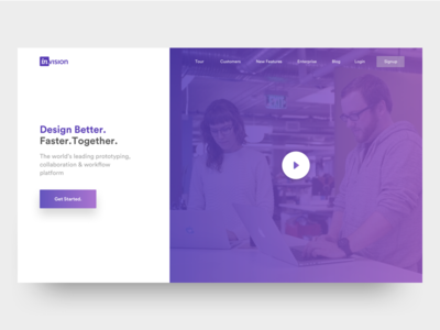
For landing page, same is the case. Unnecessary overloading with everything will ruin the result. Generally, minimalist design ruling on core functionality, attractive elements, easily guiding the user to the CTA works as a superb approach.
A/B Testing
A common belief about A/B test results says that a certain color CTA button converts effectively than the rest, this color could be either red or blue, actually, it doesn’t really matter.
What really is important isn’t the individual button \ rather than this button is in what contrast to the page background so as to create more visual appeal.
So, color is not the issue, contrast is the issue. Contrast means being noticeably different from something else typically in relation to something joined together or placed close to each other.
On your landing page, contrast refers to the different colors you employ in your design elements, majorly the CTA button so that they are stark clear on the entire page and capture attention completely.
Consider the color wheel while deciding on the contrast in your landing page. Colours placed on the opposite in the color wheel are complementary i.e. they are solid contrasts only to grab visitors’ attention towards them.
For instance, a yellow CTA button on a blue background is a good combination and will get proper attention from the visitors.
F Says Flow
The F-pattern is followed while designing as visitors first go the horizontal way generally on the upper part of the content region, further they go down the page and go through a second horizontal line and finally visitors examine the left side of the content in a vertical movement of eyes.
If you will design your landing page by keeping this particular visual order in mind, it will ensure that your readers will go to the page and click the CTA button. The F pattern is best for the pages that are dense in content.
Go for Z
For pages that aren’t too heavy on content, the visitors’ eye movement is much like the pattern of the letter Z.
The Z-pattern eye movement is apt for most landing pages because pages have one common takeaway i.e. the call to action button.
You can take hints from the Z-pattern to place elements in a manner that is appealing to the visitor.
Transparent Approach
A landing page in order to connect with the user must build trust first. It should have social proof i.e. if you have the good social following then flaunt it by name-dropping and displaying the number of users, of course, only if they’re impressive.
When it comes to privacy, it is always a concern amongst users, so be particular to mention a link to the privacy policy in the footer. Don’t shout it out; just include a microcopy assuring users that their data is safe.
Contact info is significant so either place this in the footer or state a clear link. Want to strengthen your trust quotient even more? Include testimonials and case study links that too with lots of images of the person or concerned companies.
These are useful when paired with social proof indicators. Make sure that your copywriter and designer are on the same page so that all the content on the page is visible with no factual mistakes or chances for false interpretation.
The Video Charm
Explainer videos generally use animation to market your offering, persuader videos include humans to tell how your product functions, or shows customer testimonials that explains how your product or service has benefited customers.
Persuader videos build a human bond with your visitors. When a real person elaborates on the benefits of your product, it makes your offering more trustworthy which in turn heightens your conversion rates.
Anchor Tag Hints

Visual hints guide visitors about the set direction or location on your landing page. Generally, various cues like arrows and human line of sight are there to highlight CTA button on landing pages. Visual cues also tell visitors to scroll down the page.
This can successfully be done with the help of anchor tags at the end of page sections. An anchor tag permits you to keep links on your landing page to prompt users to jump from one location on the page to another.
This makes it easy for the users to move between page sections thus ultimately delivering a pleasant user experience.
Typography Balance
Just like colors, fonts not only reveal the copy hidden behind them but also bring forth the meanings and emotions along with it.
Typographic hierarchy and well-balanced font structure have a tremendous impact on the readability of the page and is directly proportional to the conversion rate.
A landing page is not the area where the users are likely to spend much time so poor readability can spoil the spirits before they make a decision.
Following the general stylistic concept, suitable fonts lay the foundation of a powerful visual performance thus grabbing the viewers’ eyeballs completely.
Super Branding
Landing pages contribute a lot to the web marketing plan so they should fall in sync with the general scheme of brand promotion.
Combining outer resources, social networks, advertisements etc. users must witness the high reach of brand image to build their trust.
Thus, identity elements like logo, slogan, mascots, colors and corporate fonts must be considered while promoting the brand.
Rocket Loading
All these strategies will only work if technical grounds are not neglected. However sleek, clean and informative is the landing page, it won’t work its charm if it makes users wait while it is loading.
It should be in short seconds without much time wastage.
EndNote
Keep it Simple, Stupid (KISS principle); yes, this is what will make your landing page experience awesome. These days, people are flooded by web pages that try to sell one thing or the other. So, if you want to rise and shine and create your own mark, you must strategize well and create such landing pages that give an edge in the competition. Always keep the user in mind as then it will become easy to convert them. Attractive CTA buttons, anchor tag visual cues or other features are used just to make your page compelling, but the goal that stands above all is to make user experience enjoyable. Let the users land in style!


