
How To Improve The Scrolling Experience In UX Design?
Scrolling has never got its due share of importance in UX process. It is often underrated but actually can turn the fate of your user experience.

Scrolling has never got its due share of importance in UX process. It is often underrated but actually can turn the fate of your user experience. The thing is, you think that much of the interactions that you have on the internet are consciously done, but in reality, there is a lot of stuff that is on a subconscious note.
Users bowled over with curiosity absentmindedly switch through screens, browse the web and interact with content. So, it gets all the more crucial to make the back end hyper-conscious. Your website must be ready to fulfill users’ wants and needs anytime, anyplace.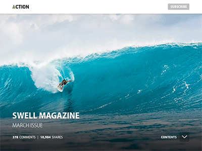
Designers need to integrate customer data and personas so as to bring out tone, visual elements, and sufficient complexity for their target user.
With the social media fever hitting the masses, infinite scrolling has somewhat become the need of the hour. It has a standard navigation pattern that allows user to browse through various items when they are on the lookout for something specific.
People hunt for content first, rest is the bonus. And scrolling takes them closer to it. Unlike earlier times where scrolling was a forbidden boundary, now it has reinvented itself as a core interaction element and become the newfound love for many.
In this article, you will learn how scrolling can make or break your user experience and why it is a must-have for your application:
No Time Trouble
The loading time for the landing page is a big-time waste. And the greatest problem is that every time you open a new tab, it starts loading the data for that very tab. This is an issue for every new tab that you work on. The solution is, if you enhance the height of the page, it might take more time to load the first page but after that, you can save on a lot of time loading every single page.
Ease of Decision Making
Every time you want to access a new tab, you have to evaluate the information; whether to open the tab or not. This means that the designer wants the user to process the info every single time he/she comes across a tab. Now, if the page was scroll-able then he doesn’t have to get stuck in confusion.
The user is at ease to decide if he wants to open a new tab or not. Why? That is because when he scrolls he automatically views the information rather than wasting time on the dilemma of the decision. Like this, information is by default subjected to him and can give him clarity.
No Repetition
What happens is that when we bring in new tabs and hidden panels to keep scrolling at bay, we have the tendency to repeat the information. There must be some valuable key metrics in every single tab to deduce the information better.
Redundant information makes the dashboard heavier as well as increases the data loading time. So, if we have all the key metrics and information stored on one page with the help of scrolling, we are definitely saving on space and time.
Reduced Anxiety Levels
Flooding the user with a number of tabs at the start of the application raises his/her anxiousness. The more are the pages, the greater is the information that is to be processed and thus more anxiety levels.
Even the hidden information in every tab adds up to the rate of anxiety. In contrast, when scrolling is done, there isn’t much time left to get overwhelmed by the amount of the information that is there to be judged.
Stick to Habit
A dashboard is just like a web application. And as we know, most web applications are made scroll-able. So, users are in the habit of scrolling. In fact, this is the reason that Macbook removed the scroll bar as users are quite used to scrolling a webpage. Scroll-able dashboards aren’t surprising for the user as most of the applications are scroll-able too.
For Every Platform
While creating a tab layout or a panel layout, you must keep the view different platforms and environments. if there are a lot many tabs, you must devise a way to assemble it as the screen gets smaller. The designs of different screen sizes vary in type. This becomes very hectic as multiple layouts have to be designed.
All this hard work goes down the drain as the script becomes more complex which also prolongs the dashboard load time. With the help of a scroll-able dashboard, the design can be kept same across all the platforms. This excellent feature aids the designer to keep the design constant and decrease the script i.e. less load time.
Sensory Delight
Scrolling, by far, has a great sensory appeal than repeated tapping in different areas of the screen as it reduces the complication of the process. It works on user interaction touch element where it is simple to swipe down or scroll your mouse in one go.
But if talk about shifting the focus every single time and selecting various tabs, it reduces the charm of the user interaction.
Extra in Design
The space that can be otherwise utilized for valuable information like key metrics, charts, filters etc. have to be adjusted for tabs or hidden panels. Also, the layout has to have tampered every time a hidden panel surfaces forth. Yes, this can lead to extra script too.
Tips for Best Scrolling Experience
Influence Users
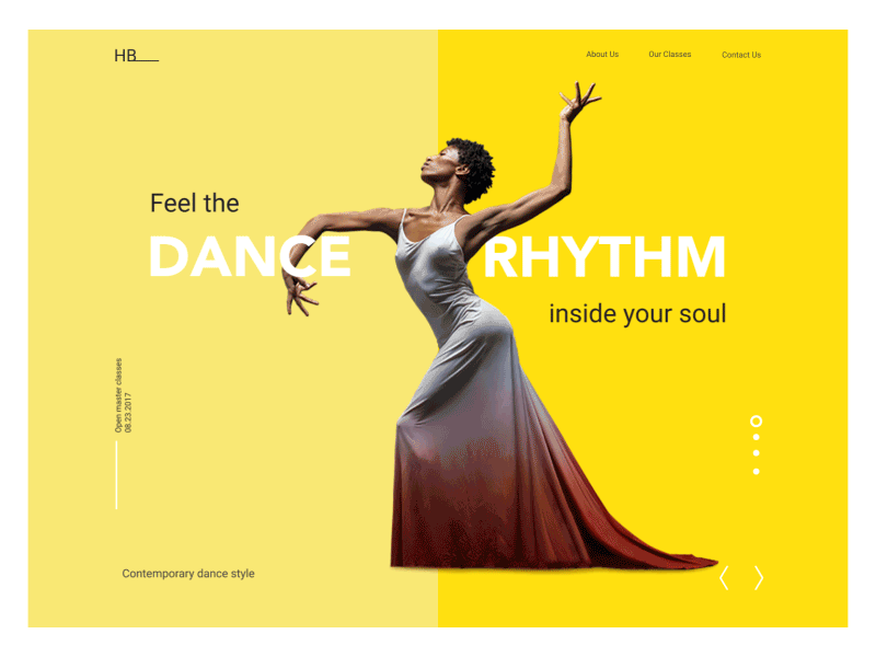
It is seen that the people start scrolling promptly as soon as their page loads, but still never forget that the content above the fold is significant too. What is shown at the top of the page creates a striking first impression and paves standardized expectation for your users?
Users scroll provided the content on the above fold looks promising. This is valid for every screen size, be it mobile, tablet, desktop; anything that isn’t obvious and has to be discovered by the user will be initiated only if the user finds it worth his time.
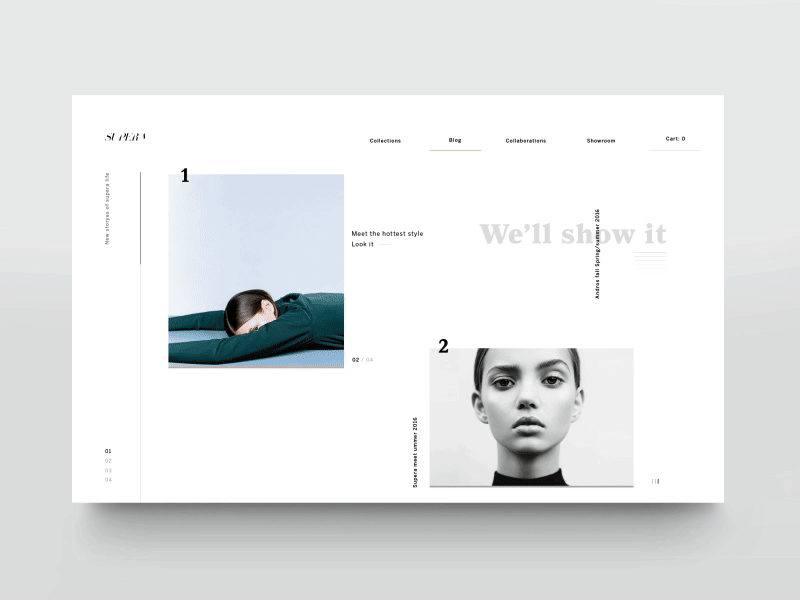
Content is King
Whatever the user sees on the page influences him to scroll and give the website a chance. To make people inclined towards scrolling, you have to give them the content that keeps them engaged.
So, it is always better to place the most attractive content above the fold. Make the introduction impressive as it gives the idea what the page is all about.
Also, provide good factually rich information that keeps them fascinated and captures them completely. Interactive Imagery can be used that corresponds to relevant information to keep the viewers attracted to the content.
No False Button
The area above the fold paves the way for future content. The content above the fold should be like an announcement for the content that is about to follow. In case of a false button or end content at the end of the page, don’t give an impression to the users that there is something left below the fold.
This can hamper their scrolling patterns. Not using a false button is very easy- just give a visual hint that there is still some information left below the fold. For instance, for the content based on the grid or card-oriented design, it is advisable to cut off grid/card tiles in the view’s basic scroll position to convey the scroll direction for extra content.
All Power to Navigation
Navigation is a major criterion when it comes to user experience. Its smooth functioning is important so that the users can easily locate themselves on the page and decide how to proceed further in their search.
On the flip side, long scrolling can make navigation a nuisance for users. Imagine if the navigation bar is not visible when the users move down, they will have to go all the way to the top that too when they are on the page.
The best way out here is to have sticky navigation menu; it is a foolproof way to keep the navigation continuously visible so that moving to the various areas of the site or app is quick and not bothersome.
That said, if you want an expansive screen estate, you can conceal the navigation as per the scrolling direction and make it appear on the screen upon request. This is a good approach for mobile devices as screens are much smaller than tablets, laptops, desktops; a navigation bar can consume a great portion of the screen.
If the screen works like scrolling feed, the navigation bar can be kept concealed when people hunt for new content and brought back when they start shifting to the top.
Jump-to Solutions
What makes infinite scrolling tedious is disorientation; users may find it difficult to locate a piece of information that they have previously read on the page. This can be an issue when content is segregated into various other equally significant sections or blocks.
A jump-to option is the best to tackle this problem. A jump-to section is a series of links that connect the user to the related content placed down the page. It is much similar to that of a table of content.
Back Button on Rescue
When users click on a link on a page and then proceed to back button, it is much likely that they will return to the same spot on the original page. But if the user’s position is not stabilized on the page, using a browser’s back button will generally take the scroll position to the top of the page.
Losing track of their spot on the page makes them suffer by scrolling again through the content that they have browsed. Not having usable ‘back to position’ functionality makes the users very frustrated. For instance, Flickr, as it integrates the browser’s back button to that of the user’s expectation.
It keeps a track of the user’s position so that when the back button is pressed by the user he returns quickly to the original position.
Animation for User Interest
Owing to the fact that user attention span on the web lasts as long as 8 seconds, an awesome scrolling experience is something that will definitely maintain user interest. Versatile use of animations can help users during their long-scrolling experiences. Scroll-triggered animations are very useful as it breaks the page into scroll-able pieces.
Each piece is used to bring forth the content with the aid of animations. As users proceed with scrolling, they are shifted to the next screen with a path of content to follow. It’s good to reveal the flow of content to the users which will keep them interested in what will happen next.
For smooth storytelling in your website, pair long scrolling with that of parallax effect in order to enhance the browsing experience. In Parallax scrolling, the background moves at a slower rate and imparts a 3D effect as you move down the page.
When used in special cases, it can provide a glimpse of depth. This style is apt for a more engaged and stimulating experience based on better visuals.
Control Scroll Hijacking
Websites that have scroll hijacking as a feature take complete power over the scroll and weaken the hold of the user. Scroll hijacking is a poor concept as the user has no control on the page and is left guessing the behavior. Don’t spoil user’s expectation of a website’s scrolling interaction just for the heck of the narrative experience.
SEO Disadvantages
Long scrolling can harm SEO. Go for behavior analysis to interpret how your design is actually functioning. Always split your infinite scroll page content into segments that can be used even when JavaScript is disabled.
Figure out the amount of content to be included in advance. Make the page user-friendly i.e. the user should be able to find the exact item that he wants without any trouble. Keep a tab on the load time.
Wrap Up
When it comes to web design, the journey can be equally fulfilling as the destination. Long scrolling can impart a deeply stimulating browsing experience. Scrolling just adds to the flow; it is clicking that is what the game is all about. If the users find UI attractive and scalable, they will be ready to scroll to explore the best that the website has to offer. Work on your goals and make the experience worthwhile for the users. There shouldn’t be any problem with the queue as long as the wait is enjoyable!
Image Credits - www.shutterstock.com
and www.dribbble.com


