
Web Design Principles – A Master Guide For Conversions
Web design principles are rules that must be followed to produce great designs and designers must know about effective web design principles.

‘Looks that kill’- well, you might have heard it as a praise, but the websphere takes the downside. Going with the literal meaning, yes, a poor web design can kill the website and miss the mark in the eyes of the viewers. A web design goes a long way in deciding the fate of the web product and should be given utmost importance. Awesome or Awful- it is design that seals the deal and can make you bridge the gap. Also, needless to say, will even keep those conversions high! In fact, it is the visual appeal that acts as a stepping stone in making the website trustworthy for the customers who are seekers of information and products. Now, you might be thinking what leads to the rejection and mistrust of websites.
The factors can be complex layouts, too much text, irrelevant content, poor search facilities etc. The look and feel of the website plays a major role in casting good first impressions on the people. Poor interface design is a big disappointment and contributes to rapid rejection. Whenever they encounter any aspect of design that they do not like, they do not explore beyond the home page, and leave the website without giving it a second chance. Back button is actually a curse for the designers.
So, what does it take to get that perfect design that turns the tables in sales? What are the principles to be followed for a high converting website? Here are some techniques that can help you improve your rankings in lead conversions-
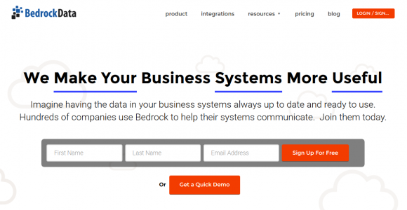
Bold With The Fold
Above the fold refers to the upper-half area of any published medium that instantly captures the eyes of the readers. The idea is to place the juiciest articles above the fold so that the buyers can instantly see them. People do not have much patience and very few go past the headline. The readership falls significantly after 50 words. Using this technique for the website can definitely work as it can even highlight the call to action that lies below the fold.
You can put the headline and sub headline, required call to action, offers on display and a sign-up form above the fold so that the visitors can easily know what the website is all about. However, make sure not to stuff in too much information that gives it a forced look. Leave some breathing room for the content, especially in case of a complex product, so that the readers can grasp it at their pace.
Page length can also be used at its best by using the space that is below the fold. The information should be placed in such a manner that it attracts the readers to scroll more. The content below the fold includes features, benefits, calls to action and various pictures that make the potential customers decide the suitable services for them.
All in all, it depends upon the product as to where the eye catching content is to be placed. Do not be hesitant to add to the details of your product and services on the way down to the page. If the headline did its work then the prospects will like going for more Visual cues make way for more content below the fold.
Whitespace – The Balance Maker
A website without whitespace is like a product bloated with information. Layout can only get at its best if proper attention is paid to spacing. Content, undoubtedly, rules any day. You might have set the words rolling to put forth the best piece, but amidst all the info there is a need for breather so that the reader can settle with all that he or she has read. Whitespace is essential to make the visitors go in a flow and explain what is going on. To make them realize the idea behind each element and the significance it has. Whitespace gives a freedom to the design as it leaves a portion blank between the elements. Visitors can easily navigate across the website without getting confused or lost figuring the next call to action.
Each element is different from the other and whitespace helps them stand out by making them visible to the users. It makes the interface clutter free and gives an ideal balance to the design. Even the targeted call to action –sign up deserves a highlight and whitespace can surely bring it in the eye zone. Negative space need not necessarily be in white or plain colors, but even background image can be used. Isolating the call to action through negative space is a great tactic as it brings the content to limelight. A balanced website arranges the content on the canvas in the best manner and is like a treat to the eyes!
The Font Fix

Looking for maximum sign up registrations? Want your headline to an instant capturer? Targeting various views on the blog? Well, fonts are where you need to work at. Fonts play a vital role in commitment, comprehension and impression and should never be settled for less. Font size and type have a major influence on the readability. Various studies reveal that exercises and text take less time if the font is easy to read. Easy to read font, in fact, prompts to more willingness from the users.
Complicated or confusing fonts are a major no-no as they require lot of time and effort on the part of the viewer and acts as a big rejection to the website as a whole. It has been proven that if any task is hard to read, it is hard to do and that is what happens with the users who encounter poor and mismatched fonts.
Effective fonts can actually compel the reader to take the call to action by maintaining easy flow on the website. Harder to read text and big words give the impression to the reader that the website demands tedious steps and will require great skill to proceed ahead. On the other hand, if you want to convince the customer or client to perform any task, you must opt for simple, easy to read fonts. Also, increased size and bold option can be used if you want special focus on a message so as to create an impact on the audience.
The Color Code

A color that sells the best? Well, there isn’t. Colors are too dynamic in nature to be tamed and restricted to a sure shot option. Can you even imagine everything in green, red or blue for that matter? Actually, No. Colors work the best in combination. The trick lies in creating a perfect blend of the strong colors with the subtle ones. The dark shades with the light. Using the ideal mix can work a great deal for the website. It adds to the visual appeal and prospects definitely ask for more than the homepage and explore further. Let the hues complement each other.

Give a good color definition to the logo as it stands as the major representative of the company. Don’t compromise with the combination. Maintain a proper balance that brings out the best of the layout. Let the elements stand out so that their very purpose is achieved.
The Fasttrack ‘F’

The content that is structured in an F-shaped pattern offers a lot of ease in terms of readability. It enforces a quick scan by the users; the F route- left to right, top to bottom. ‘F’ pattern helps in the natural reading behavior and thus the visitors start reading from the upper left corner of the homepage and then proceed to the upper-right corner. This is where they cover the first horizontal line of ‘F’ and get to read the logo and locate navigation bar.
Further, they move to the next bar and cover the same pattern as above forming the second horizontal line. The second part focuses on the headline, sub –headline, image and sidebar highlighting the latest articles, social sharing widgets and finally call to action in the form of search bar or a sign-up form. Finally, they will look across the bulk content in a vertical, downward flow.
So, what should be the approach here? If you want certain content to shout it out to your audience, place it in the top position. Never leave the users guessing, keeping them in a puzzle. Encourage them to explore your website by giving them access to navigation tools like the search bar or menus. Visitors are always in a hurry. Let the benefits stand out of the entire content as they will leave the section if they do not find anything beneficial.
The opposite side should encourage them to interact. Let their attention be on the widgets and call to action so that they make their mind and opt for the services. If the users have reached the third bar, it means you bought the website to their notice. The content should satisfy them and give them what they want. Convince them by showing them the testimonials, FAQs or explainer videos. Give that extra edge by providing additional links or free demos. Last but not the least; never forget to end the page with another call to action so as to derive the most of the results.
Bottom Line
High-converting websites are a major pull for the audience as they cast a big influence. They understand the users well and convert the readers to subscribers, doubters into believers and leads into buyers. The design principles should not deviate and bring in focus the message with a great layout. Make sure it is functional and stands to the purpose. The design should be a good guiding force for the prospects and lead them at every step. Beautiful websites are useless unless they have good conversion rates. Content can do nothing if the design is a big blunder.
The design and content should go hand-in-hand and create an ideal mix for the onlookers. Don’t squeeze your content and make it look like a deliberate attempt. Similarly, don’t complicate the web design as it frames the package that is put on the platter before the users. Use the colors in a right combination to draft an extraordinary look and make the website a delight for the client. Follow these tips and see the magic spin of sales!
Think 360 with its expertise in the web design arena provides you the leverage of awesome layouts that makes every website worth a view. Our services take to ‘clicks that convert’ policy so that you prosper high in your businesses.


