
What Dimensions & Resolution Should Be For iOS And Android App Design?
Designing for desktop and mobile is different. there are many devices available with several resolutions, working with these resolutions can be challenging.

Does your application make the users believe that it was designed for ‘their’ devices? Is the display proper with optimized experience or is it a one-size-fits-all solution? Well, with the challenge of multiple environments across devices and handles, these questions are bound to surface. A designer has to work on the application’s UI in consideration with particular screen sizes and densities so as to optimize UI design as per different screen configurations. Yes, it is about controlling the visual language to suit a specific platform.
And for that, you need to be very clear with the dimensions and resolutions of the application. It is often seen that even the seasoned designers who are widening their horizons to mobile or other screen designs get confused amidst the numbers of sizes and resolutions. Tackling this very concern, in this article, we shall be covering the terms of the screen and density essentials that are required while designing mobile apps:-
Let us start with some fundamentals that you must know about screens sizes and images:-
- Pixels- It refers to a picture element; a single dot of color on a screen.
- Screen sizes- These are represented in inches
- Resolutions- It means width and height, for example, 320wx480h
- DPI- These are Dots per inch or pixels per inch
- Density Independent Pixels- It is an abstract measurement for Android
- Points- It refers to an abstract measurement for iOS
Righting categorizing these, screen size, pixels, resolution and DPI correspond to physical attributes of a screen while points are the coordinate system which differs as per the device it is running on. It is important to understand the difference in the categories as we proceed to the full-fledged explanation of the dimensions and resolutions.
A pixel refers to a single cluster of colored dots (typically red, green, blue) on a screen. By enabling and disabling those at different intensities, innumerable colors and range of brightness can be created. If all the dots are off, the resultant color is black, similarly, a white can be formed when red, green, blue are enabled at the same time. Thus, pixels are the physical lights on a screen because of which you can see what is being displayed as it is difficult to recognize them separately without a close look.
Screen Size

Screen size refers to the length of the screen across diagonally or from one corner to the other.

Resolution in mobile is the number of pixels that are across the screen is to a number of pixels that are downwards. For instance, the first iPhone had a resolution of 320x480, with 320 pixels across and 480 pixels down. Some of the latest mobiles have the same resolution to that of a high definition TV, 1920x1080, separate sets of red, green and blue lights, all present in a 5-inch screen.

DPI stands for dots per inch and the figure calculates how many pixels are present either across or down in a single inch of the screen. DPI is often called as PPI (pixels per inch) and is measured by dividing the width or height of the screen to the number of pixels that run across it. A higher DPI signifies that each separate pixel must be smaller in size to adjust in the given space, thus making the screen clear and including a higher level of detail as compared to the actual capacity of the screen.
We have already covered pixels, density, screen size, and resolutions. Now, let us understand how images are drawn, but for that, you must know points and Density-independent pixels (DPs) first.
In order to understand a point, let us start from the beginning of the history of the iPhone. The first iPhone initially had a screen resolution of 320x480. Then as time passed and iPhone 4 made its way, there came Retina screen. It was this Retina screen that doubled the DPI that too with the same screen size; so, now the number of pixels that adjusted in the same space had quadrupled, that is, twice across and twice down in number. Therefore, the resolution of the first Retina iPhone was 640x960 pixels. However, for this higher density phone, all the old graphics had to be drawn according to similar proportions.
If 1:1 was the original scale for the graphics of the phone, then everything had to be created at a quarter of the size in the new screen, thus, in turn, ruining the look of every old app. To keep the situation in control and not harm the working of these old apps, Apple brought forward ‘points’ as a means of distinguishing the scaling of the graphics from the density of the screen on which they were running. In short, the point was conceived as a measure of distance that permits graphics to be drawn independently of the resolution of the phone they are on. Currently, every iOS graphic can be drawn as per its points values and then adapted to display clearly on the new screen. In the measurement, an iOS point is 1/163 of an inch. Whatever be the resolution of the phone, the size is always the same and has come into force from the 163DPI of the first iPhone.
If you want to convert between pixels and points, first, it is important to remember that these are static units and do not change, whatsoever are the factors. 1 pixel is always 1 pixel and is actually the smallest piece of a screen that can show colors. 1 point is always 1 point and is referred to as an abstract unit; it has meaning in co-relation to other points. Points differ from pixels as it’s the DPI which influences their size:-
- On the iPhone, 1 point stands equivalent to 1 pixel when the actual resolution is 163DPI. Before the Retina era, all the iPhones complied with this number.
- In iPhones 4, 5 and 6, where it is 326 DPI, 1 point is equivalent to 2 pixels across the screen and 2 pixels down, that is, 4 pixels in total. This means your 100x100 image will cover quarter the size on a Retina device if the pixels are counted alone.
- For iPhone 6+, where it is 401 DPI, 1 point equals 3 pixels across and 3 pixels down, that is, 9 pixels in total.
These comprise of a full number of pixels that are scaled. The rendered pixels give you the number when you use the multiplier (1x, 2x, 3x) that the device has to the screen size in points. If you want to draw an image in max resolution, then this is the size that you should stick to.
Physical pixels represent the actual screen’s pixel resolution. In iPhone 6 plus, the image resolution is larger on a screen with fewer physical pixels, thus there comes the need to down-sample its size. This value is of significance in terms of details but as such, it shouldn’t affect the structure of your designs.

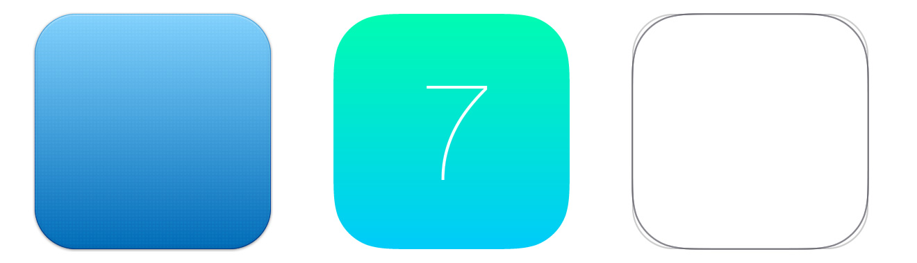
The rounded corners with simple radii have become a thing of the past. Apple has created a new shape called a superellipse. As there is no official template of the shape, you can employ unofficial templates that will more or less create a replica of the shape. Remember, rounded corners should not be present in final exported assets, although they can be used in the design process especially during stroke or shadows to add effects to the corner of the icon.
Apple has devised a golden ratio grid system using which you can size and align your elements in the right manner. Nevertheless, the grid template received a lot of flak from the designers and they aren’t sticking to it completely. Do whatever suits you the best for the look of the icons even if that means not abiding by the grid system.
The unit of measure in Android is called a density-independent pixel. It is almost the same as points. It equals roughly 160 pixels fitted into 1 inch of screen space just like iOS’s 163. So, DP is a physical unit of measurement as per the coordinate system held by a computer and is like an abstraction of a pixel for use by an application that is further converted to physical pixels through a supporting system. DP is of major use while working on the Android platform. It is a virtual pixel unit and should be utilized while planning a UI layout to define design dimensions or position in a density-independent manner.

Touchable UI elements have a value of 48 DP units and the spacing between each of these elements is 8 dp.
Right from Android 1.6 (API level 4), Android has been open to various screen sizes and densities, putting forth the different screen configurations that a device can support. You can utilize the user-centric features of the Android system to best optimize your app’s UI for each screen configuration to make sure that not only the design be outstanding for the app but also the user experience is made powerful for each screen. To make you understand how user interfaces can be designed for multiple screens, Android has categorized actual screen sizes and densities into 4 general sizes- small, normal, large and xlarge. For densities, 6 ranges has been set- idpi (low)~120 dpi; mdpi (medium)~160dpi; hdpi (high)~240 dpi; xhdpi (extra-high)~320 dpi; xxhdpi( extra-extra-high)~480 dpi; xxxhdpi (extra-extra-extra-high)~640 dpi. The generalized sizes and densities revolve around a baseline configuration that comprises of normal size and mdpi (medium) density.
Each generalized size and density includes a range of actual screen sizes and densities. For instance, two devices that qualify for a screen size that is normal might actually report actual screen sizes and aspect ratios that vary slightly when measured by hand. Note that Android makes these variations abstract to applications so that you can render UI as per generalized sizes and densities and leave it for the system to make any final adjustments if required.

As you undergo designing for different UIs in multiple screens, you will learn that each design needs a minimum amount of space. So, each generalized set requires a minimum resolution that is very well marked by the system. These minimum sizes are also in dp units in order to avoid any trouble while making changes in screen density.
- Xlarge screens are minimum 960dp x 720dp
- Large screens are minimum 640dp x 480dp
- Normal screens are minimum 470dp x 320dp
- Small screens are minimum 426dp x 320dp
During run-time, the system makes use of the most suitable resource for your application as per the generalized size or density of the current device screen. The system provides powerful compatibility features that can manage most of the working of your application on multiple screens considering your UI techniques permits resizing with ease.

When can density independence be achieved? It can be attained if the application manages to retain the physical size of a user interface when shown on screens with varying densities. Maintaining density independence is crucial as without its UI element appears distorted or larger on a low-density screen and tiny on the high-density screen. Such absurd density-related changes can lead to issues in your application layout and usability. The Android system allows your application to achieve density if the system covers dp units which is suitable for the current screen density and when the system renders drawable resources to the convenient size, again based on the current screen density.
iOS pixels= (Points* DPI)/163
Android pixels= ( DP * DPI)/160
The idea behind using multiple screens is to create an application that can work properly and be visually compatible with any generalized screen configurations in both Android and iOS. I hope the above article will serve as a good guide for complete information on dimensions and resolutions so that you can successfully customize the look of your application on different screen configurations and deliver an optimized experience to the users.


