
What Is Branding? A to Z Branding Guide (Part 2)
Branding will always be key element in the success of businesses. Good branding is something that create a unique identity and company image. If you have good branding that will set you apart from competitors when it comes the business success.


In the first part, we introduced you to the actual meaning of the term branding and covered all the elements that give a brand its force. We also covered the concept of designing a brand identity that touched upon the stages of design briefs, logo and identity system and monitoring and rebranding. Let us now learn about the art of visual branding. As we know, with branding comes huge responsibility. Of course, after all, a brand is a promise you make to your customer. A brand is everything a company or a product is about. But what tops the ladder of importance here is the visual branding as it defines the overall appearance of your company. Read on to know about its basics, understand each component and know how they fit into the process as a whole. Must follow 4steps to Visual Branding –
![]()
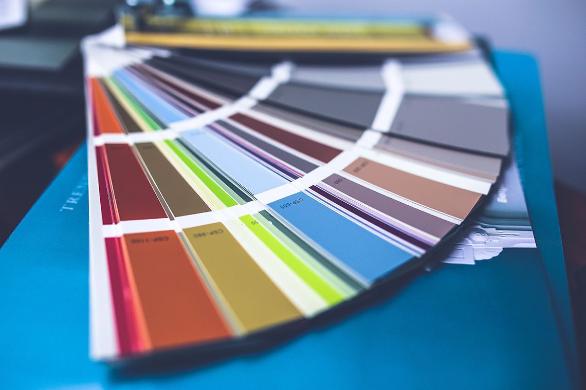
Your choice of color palette decides a lot of stuff. Indeed, as colors are the triggers that convey the mood very well. Always keep the common meanings of the color in consideration so that you can use them as and when you want, like, bold and vibrant colors denote high energy and zing. Subdued shades are for the calming effect.
Warm and earthy tones symbolize soothing comfort. Cool hues are for the peaceful purpose and also inspire trust. Pink and purples stand for sensual appeal and magnificence. If you are clear as to what colors you want, you just have to contemplate which shades work well with each other.
Many online generators like Palleton, Adobe Color CC, and Color Hunter can be used to experiment with various colors. When you are done finalizing the colors, pick the ones you prefer the most aside. These will account as base colors and the remaining will be add-ons to them.

The logo does not stand for the brand but it is the path that leads to the brand. It must offer a preview of the experience a customer can get from selecting the product. Try keeping the iconography as clear and straight as the design permits so that the unique yet clean layout can be easily recognized even from a far distance.
In the design race, the trend is more up towards user-friendly, simple and understandable designs that the user can connect with immediately. Nevertheless, these are not universal rules. Large-scale businesses flourishing on luxury and precision attract customers through the bells and whistles in the design that is embellished with details.

The typography in branding must match with the feel of the company or product. As soon as you choose the header text, you need to opt for complimentary body fonts that accentuate the body image. If you want your header text to be bright and all different, then let the body text be subtle in the background.
Web design comprises of shapes, type, and colors so as to grip with the visual quotient. But as soon as the real world comes in, it is a different story altogether as the factors like textures, layouts, and three-dimensional shapes has to be seen too. If your business deals with design governed products, then, of course, designing is a very significant process to your brand.
You must go that extra mile to ensure that the aesthetic quality accelerates the experience the user gets from the product. As mentioned earlier while explaining brand identity that the first stage is to come up with a brief that sums it all together.
The reason being that efficiency comes only when the elements work together to convey the same message and finally appear as if they are all united in one. Harmony in design brings out brilliant products that communicate well with their modern and lively framework.
The Base of a Brand Identity System

Colors can arouse feelings, relations, and responses that determine how your brand is viewed. Certainly, colors have their own language. But one wrong choice and your design can turn into a pain for the customer.
It is seen that colors contribute majorly to brand recognition, memory, text understanding and connection with the design piece. Thankfully, we are now in an era where colors are no longer a small group of natural pigments.
Our colors are not limited to the hues of minerals, animals, and plants only. Synthetic pigments have made our lives simpler but decisions complicated. With the plethora of options in store, choosing a palette for a design project has become quite a task.
That seems daunting. But don’t worry. Here are some tricks that will help you to build amazing color palettes; so, let your next branding project be breathtaking with the best color selections-
The best color inspiration can come at any place and any time. Click photos whenever you get your source and use those color schemes later in the software like Photoshop or Illustrator. By this, you can complement the text or graphics with the photo and impart cohesiveness to it. There are tools that easily convert photos into color palettes. Keep exploring the hues from the awesome image to take maximum advantage from the shades.

Always make use of the 12- part color wheel while pairing colors. Experiment with analogous color schemes to incorporate shadows in your titles and add borders to your backgrounds. The analogous colors combine well as they are very well related to each other. Unique combinations can be devised by proper matching of the colors from the wheel.
Note that different design fields encounter same challenges while dealing with color. Even the interior designers have to unite spaces with elements like textures, objects and color schemes that blend well. Interior design principles work pretty much for the graphic design as it says to use 60% dominant color, 30% secondary color and 10% accent color. If you prefer the fourth option, divide the secondary color or even dominant but not accent.
Click pictures or photo for the colors you like and then use it for later use. These screenshots or pins help to find a great color palette as you browse through these images for inspiration and opt for the best.
Sometimes a digital color wheel can’t make a decision what a trusty Pantone color bridge set can. It is occasionally good to look at a physical color swatch and choose the attractive color schemes the old-fashioned way. Yes, the screen colors are not just about it. The set is of great use if a client demands to see physical samples. And by the way, not all Pantone sets are traditional as it comes with its HEX equivalent. You can even select hexadecimal colors in any color picker.
Our eyes love natural color schemes. It is good to base your selections on the environment. You can find endless sources of inspiration, be it landscapes, fruit, foliage and many others; nature has it all!
Don’t go for excessive numbers in combination except when you are working on the full-on rainbow scheme. It is recommended to use three colors so that the graphics look clean in the final outcome. If you want to use more than three, then try adding textures to tone down the effect of the numerous colors.
Look at the topic you are showing in the brand identity project. It can be sports, beauty, business or fashion; this theme can be used to link with the mood. Thus, accordingly, you can craft a cute feminine flyer or sober educational brochure. You must create a vague definition of the color theme before embarking upon the details.
Pinterest has the great collection of color palettes for the designers all over the world. Just simply search what color palette you want and you are good to go. The site gives commendable results for inspiration in varied design fields like fashion, graphic, interiors and also event design.
Color.Adobe builds a community of creative artists from all over the world who are open to sharing their palettes, patterns, and colors. It is good if you join this site and connect with other people and use 3.7 user made color palettes for your work.
A strong typeface control what message your brand is trying to convey, what the tone is, and even who its creators are.

Fonts make the text readable, but sometimes designers get so overwhelmed and overdo with the fonts such that the typefaces can’t be read at all. Some fonts are very thin to read whereas some are heavy in such a manner that the letter can’t be separated from one another. Be careful with the readability of the fonts and that it can be kept beside other letters. Check if the shape is occupying too much space or if the strokes are not well defined.
Some text requires more stress as compared to others. For instance, the font Impact makes the letters stand out as against other typefaces. Some fonts have different styles to enable you to shift or change the amount of emphasis it can impart.
Like Helvetica Neue makes you choose from light or ultralight along with the general bold or italic styles. Also, look at the location of the text to judge the amount of the emphasis to be given.
If the text is to be the brand name then choose something that stands out clearly. Even the tagline beneath the brand name ought to be seen without being overshadowed.
Always take into consideration the personality of your audience while choosing the style of your font. What will they like? What is the age group involved? Once you have searched all the parameters, opt for the type that will appeal them the most.
The font Gotham has a contemporary feel to it and goes well with the audience those are modern and outgoing. So, whenever you want a modern look, go for it keeping in mind not to overdo it as it may not fit when used in excess.
Times New Roman can’t suffice if you want a professional result and your text to be highlighted. This font is tedious and somehow lacks creativity.
Fonts like Garamond or Baskerville is definitely the wrong choice if you want to craft material for a learning school for toddlers. Here you need something bold, happy, fun and lively that meets the goal. Look at the scope of your brand.
Consider your goals. Think about the impression you want to leave your audience. So, if the font of your choice matches with the set goals and objectives, you are good to go. If you satisfy all these factors you can successfully achieve what you want from your design.
Before you get onto the drawing board and begin your design quest, look into these points that you have to fulfill-
A design can’t work solely with one font. You must have more than one font if you want your design to capture typically on a brand application like the webpage. Pairing is important and you must take care that similar fonts are grouped together that are also different so that they stand out.
Legibility also implies to larger sizes. Brand names should be big enough to be clearly seen, but not too big that they shadow the tagline if it is present. Text bodies must be of proper size, but not so big that it occupies a lot of space.
Hierarchy is the essence of design. For instance, a brand’s name always comes on the top and gets the most importance. Taglines are of less emphasis, but not even too small that they don’t stand any worth in the design.

Leading refers to the space allotted between each line of text. Leading depends on the font you prefer. The smaller the font, the less space is needed between the lines else large space is required.
![]()
If leading implies to the space between the lines, then tracking denotes the space between the letters. Remember that the spaces must not be very small as it is difficult to figure out one letter from another and not even too much spaced up that it spreads in spite of the smaller font.
Color does not directly affect the choice of the font, but it influences the end product, so it can’t be ignored in any case. If your font is light in appearance, don’t go for light colors rather opt for bold ones. Note: always keep these points with you while designing the brand’s identity system to be effective with typefaces.
Here are few tips that will make your decision on the fonts or typeface easy and guide you amidst all confusion-
It is always good to have a clear brief of the complete project on a page so that you can decide the number of fonts that will be used as you know where and how you have to place them.
There are some exceptional designs that are a perfect example of the right fonts ideally used for the text. Use these masterpieces for your inspiration.
Now by inspiration, we didn’t mean that you should make your design exactly similar to the resource. Find out ways to make your design unique. Play with fonts and be open in choices.
It is crucial to do some research before choosing the fonts for your project. For example, going for Trajan as a font for a page based on Ancient Greece is a bit vague as Trajan is a Roman Emperor that came much later in Ancient Greece.
It is not necessary to go for Comic Sans for funny text always or use Papyrus for anything corresponding to Ancient Egypt. Such approach makes the design fixed and is a big blow to creativity.
Brands only come alive when their audiences get to interact with them.

Brands look beautiful in retina display but they only come in action when the audiences engage with them. Applications in different mediums like paper, billboards, screen etc. contribute to establishing a relationship with the customer. By now you must have known that crafting pieces that pinpoint towards values and identity are the mantra to have a long lasting impression. Remember there are chances that you only have the option to make the first impression.
Don’t get pulled by the logo and ponder how you will represent it in front of the audience. Instead of working solely bring your identity system in focus through a variety of devices. The most popular brand applications are business cards, outdoor/indoor signage, letterhead and stationery, menus and catalogs, flyers and brochures, social media, uniforms, stamps and stickers, tradeshows and event displays. Below are some questions to consider as you aim to create an efficient set of brand applications-
Which applications will come in contact with the potential customer?
Frame the entire customer life cycle and foresee which branded instruments will be needed by them.
Who is the audience that is served by these potential applications?
You must figure out as to who will be looking at these applications – customers, investors, suppliers, partners or employees. Know what they want. Ask questions and discover what mode will best work for them. Try to learn about their preferred type of brand communications.
How to maintain a constant, reliable identity across different applications?
Consider the type of brand applications rationally. Do they all point towards the same? Is there a unity in the applications and they correspond to the brand? Take into account the flexibility of your identity system. Is it possible to make new applications based on the existing methods in use?
Which call-to-action the brand application meets?
Take into view the practical quotient of the applications that you have crafted. Never ever ignore the conversion targets. Keep the goal in mind and see that the applications meet the set targets through different pieces. Can these pieces successfully achieve the goals?

Why some brands stamped in our brain? Know why their design that makes us feel engaged & delighted…?

As users come in contact with the product, they want friendly guidance that takes them through the flow of events. Build a personality with which consumers engage easily. Give it that human touch so that the people can relate easily.
By forming a brand personality it becomes easy to face the user. Also, it defines the voice that tells the user the story. Yes, it is not a robot rather a human now. The set voice will influence the different stages of user experience and will even contribute in sales collateral, social channels and customer support. Voice is the general style that your brand contains in response to specific situations.
Brand voice can be bought to designs by incorporating it in every stage of the user experience. Use it in landing pages, notifications, emails, call-to-action etc. no matter whatever is the framework.
So, these were some invaluable tips for choosing the colors and typography of your brand and creating brand applications. Follow them to build a different personality and conquer the market by beating your competitors in style. Turn the conversion tables with your super branding techniques and make the online presence a rage in no time.
Images Credit – Unspash | Paxel


