
20 UI/UX Mistakes That Can Ruin Your Mobile App
Nowadays UI/UX design is one of the most important ingredient in your mobile app, Still many app development teams are making common UI/UX mistakes in apps.

Want your app to become the next big thing?
A winner in the online marketplace?
For that, you have to carve a niche amidst the other 3.9 million apps (yes, that's what the number has reached in the mobile world) present in the app store.
Some benefits of using a mobile app for your business
Nowadays: Mobile apps have become more popular among business and services provider and has changed the whole way of doing business.
From the eCommerce store and Payment Medium to Food Delivery, Logistic services, and the Healthcare department, there is no industry left that is not using the mobile app for targeting their customers and effective communication with users.
Not going far, let's discuss some prominent benefits of Mobile App in detail.
1. Mobile apps help your business to become popular with a broader audience.
People who are interested in buying your product/services prefer to shop online because no one wants to waste time on roaming store to store.
By developing an app, you give them a specific platform where they got everything without going anywhere. As good services, you provide that many substantial revenues you get.
Not even this, the mobile app also helps in business branding.
For that, you just need a confidential Message or (Tagline) to become more famous and trending; then everyone will take an interest in your product. You can make it happen by reaching a broader audience.
2. Mobile apps also help with better communication with your customers.
Mobile apps are also a great platform to reach out to your customers for their experience and quick feedback towards your services.
Mobile apps are the better source to communicate with your customers personally makes them feel that you care about them.
3. The efficient use of mobile apps stands out with more reliability and loyalty.
Nowadays, competition is growing among companies, and people have many options to choose the best one.
No one trusts a company with no digital presence - mobile apps are the best option to make your brand image more visible in the eyes of your audience.
While having both sound website and mobile app makes you stand out more reliable and trustworthy.
It encourages your target audience to do business with you, and ultimately you gain more profit.
Designing a successful app that stands out with good usability, design, and fulfill the user requirement is more challenging in the app industry.
A poor design app never gets a second chance as already it is hard to convince the users to download.
I know it's hard to believe, let me show you some data:-
- 83% says seamless experience makes them more engaged with an app
- 90% of users have stopped using an app for poor performance, 86% have at least uninstalled an app for slow performance
- 52% of users complained a bad UX as the significant reason for uninstalling
A bad experience of a poorly designed app affects both performance and popularity.
Below I am discussing some pitfalls which you should avoid for user engagement and a better experience.
1.Poor UI/UX Design

It is the biggest mistake a designer can commit during the creation stage. UI takes care of the placement of elements in the mobile app, which affects not only the performance but also UX.
While designing, place yourself in the user's shoes and then decide about the design interface that will go for the app. A simple and interactive UI helps to engage users better as they can easily navigate across and use all the features.
Keep in mind to make the app operate on multiple devices and not face any issue incompatibility. You must be aware of the latest trends in UI design and even use some as inspiration from the other apps to craft a unique product for your customers.
2. Bombarding With Features

Implementing too many features in your app can make your app sluggish and lower the overall performance. Having several features can consume a lot of memory and thus affect the output of the app.
When you start designing, include the primary features which serve the main functions to the visitors. After that, if you feel you want more features, then you can go for updates in a later stage.
3. Neglecting Target Audience

Ignoring the target audience will lead you on the path of failure. Yes, the target audience is even more significant than the app design concept. Your extraordinary plans won't work unless you are clear with whom you will be catering to.
It is crucial to have a lot of clarity on the end-users of the app to measure the targets accordingly. Knowing about the target audience will give you a fair idea about their age group and what all do they expect from the app. And expectations once met no doubt grants satisfying UX.
4. Tiring Tutorials
No doubt, tutorials are important to guide a person with proper explanation, but most tutorials are a burden than a blessing. Users are overloaded with excessive information, and it's just like beating about the bush with the subject.
If you are incorporating a lot of tutorials to make the users understand the functionality of the app, you are yourself giving the impression that your UI is a big failure. Self-explanatory UIs are always suitable for the target audience as they require less info on navigation within the app.
5. Making Things Difficult

For mobile app designing, the KISS rule works very well. Yes, Keep It Short and Simple. Don't complicate things as it will create confusion, which will meddle in the working of the app. Designers should beware of getting overambitious and overdesign the app to make it unique.
Overstyled visuals are a bit tedious for the users as they have to learn how to use them from scratch and put in more effort and money.
6. White Space Is Missing

White space gives a breathing space to the page. Although taken for granted, but it adds a balance to your design and its elements. Don't get so driven by other features that you forget to include white space in your design.
It is the space that aligns your text, images, and other design elements together and makes your work communicate better. Just don't fill everything up to the brim. Give it a proper room to let the users absorb well. Make your design breathe.
7. Lack Of Feedback
You must give a confirmation signal to the users after they perform specific tasks. For instance, change the color of the button when it's been clicked to make them know the action is done. Through visual hints or simple messages, you can tell the users whether their actions are right or wrong and how they can achieve what they want.
8. Sticking To Sign In

Generally, web designers assume that sign-in is a must for the app. No doubt, there are a lot of advantages to the sign in, but it is also a big pain point for the customer.
They find it a significant task to fill in the same personal data repeatedly for the app or service. Yes, a big test of patience. Now, most apps give the benefit of skipping the registration for the time being so that they can try out the app and judge its value.
By doing sign in-signup with social media is Cutting the funnel of lengthy registrations can give an edge.
9. Trying To Copy Other Apps
Remember, each product is unique in its goals, value, audience, and functionality. There is no guarantee that what works for others will also work for you.
Although it is good to take online advice and learn from it, imitating other apps straightway is where you make a big mistake. Also, instead of taking tips online, you should apply customer feedback to make your app desirable.
Read reviews, do surveys, and gather sufficient qualitative data to know the preferences and the changes they want. Such data is useful in generating ideas that can be further verified through testing to accelerate the performance.
10. Redesigning Without Proper Feedback
With stiff competition in design, the need to redesign the app timely is obvious. However, being overdriven in revamping can backfire the performance of the app.
You must remember conversions are the primary target of an app, not its looks or aesthetics.
People prefer an app that is quick to get conversions rather than just a decorative piece that is attractive in-store. So, instead of going overboard with visual design, strive for the goals you are originally here for.
Updates are good, but once you have implemented them, it is impossible to go back to the original version.
Don't gamble so much with changes that you make the user disappointed and delete the app. Collect their feedback and then decide what sort of improvements they want to see in the app. Redesigning after feedback will have a positive effect and add to the meaningful experience.
11. Not Giving Perks Before Conversions
Every app has its own set of conversion points. It can be sign-ups, videos watched, bookings, reviews, purchases, and many such counts. These conversions, in turn, help to meet the main goals and make the app a showstopper in the online store.
If you want more conversions on your app, then try creating a flow for a user that gives them pleasure before they take the call to action. For instance, if you have a new deal to offer, you can place it somewhere close to the booking to delight the users before they take action.
12. Ignoring Social Media Login

If you want the users to be more comfortable with your app, link it to social media. People are very fond of social media sites like Facebook, Twitter, Instagram, etc. these days and integrating your app to them will surely help in enhancing the overall performance of the app.
Long registrations test the patience of visitors and ultimately make them leave it for the toll it takes on time and effort.
Giving them multiple logins through social media sites will reduce the burden of the lengthy registrations, and they won't have to bother remembering IDs and passwords separately. According to research, 77 percent of users prefer social media login as they find it more suitable than the tedious registration processes.
13. Not Informing The Happenings To User
It is important to keep the users informed whenever some kind of processing is happening in the app. Processing actions like form is being submitted or searching for results should be shown so that the users know what the page is doing.
By adding these messages, you have to also find areas for loading screen or a progress bar and use them along. Take note not to get too technical with messaging here. Use a more personal message to connect better with the users with the help of pleasant design.
14. Wrong Estimates Of Updates
Making changes on the web is easy as the developers can make adjustments easily and apply them instantly. But on mobile, making changes is a task in itself. As an app is hosted on a client's phone, updates have to undergo a long process before they finally appear.
Changes after development are taxing and involve lengthy app store review cycle.
Also, updates need manual confirmation from unwilling users, and that adds to the challenge. So, it is very important that whatever you change is properly tested to enhance the interactive experience rather than pull it down.
Correcting mistakes on mobile is difficult, but if you use testing as a part of the development process, you can save yourself from the trouble later.
15. Not Considering Monetization

Don't be under the impression that after creating an app, you will be paid loads of money in return. It is unlikely that users will pay for the apps as several apps are free and provide the same functionality to that of paid ones.
It doesn't mean that you can't earn money from your app. Various methods can be used for monetization in an app such as in-app purchases, in-app advertising, freemium etc.
Now, app monetization is nice, but too much of it can put off the users. Deliberate in-app purchases or flooding the app with ads are great for income but will hamper the user experience as a whole. It could even reduce the impact of your app and stop it from becoming the next big thing in the market.
16. No Onboarding Screens

First of all, you need to understand the use of onboarding screens, especially in the app.
Every app has a different mechanism of use. Onboarding screens are the kind of guidelines for using apps that usually appears just after the splash screen.
Sometimes app mechanisms become challenging to understand for 1st-time users; to overcome this, we use the onboarding feature in the app.
The main purpose of onboarding is to educate the audience about your app. Poor onboarding systems can destroy the whole concept of the app.
So make sure that your onboarding screen looks simple with enough brief overview yet attractive. It is vital for the UX perspective.
17. Overplay with fonts

As you know, there are two types of design font,
- System Font
- Custom Font
Let's start with the system font -
As you know, Roboto is the system font of Android and iOS has San Francisco. Both are easy-to-read and quite similar.
But the question is - Are these systems font okay to use in the custom design?
Yes, after all, these are safe and proven options.
But don't forget about the Samsung - Samsung phone feature allows users to choose fonts accordingly, which can destroy the beauty of your app design in just seconds.
To overcome that, you have another sophisticated solution. Choose a custom font but during the process keep the thing in mind that-
There might be plenty of awesome fonts available online, but be reasonable because, from the design point of view, less is more.
The purpose of font should be User experience because too much use of colors, types, and sizes can complicate things.
If you are using the custom fonts, then keep it coherent and straightforward. Use custom fonts when needed or chances to improve your app design.
Don't use the custom font for the sake of having variety.
18. Transferring from iOS to Android 1:1
For Android version 4.0, Holo Design was the first sensible theme with structures navigation and guidelines that was not compatible with ios.
Then why can't we transfer from iOS to Android or vice versa?
By doing it directly, we can save time and money both.
Well, it's possible, but we can't compromise with the User experience.
Users use their phone all the time, and grow familiar with each function of the app, So if your app behavior changes than people are habitual, they seem less likely to enjoy the app.
IOS and Android have different interaction patterns that can break the consistency. Just try to keep most of your visual style similar to both platforms.
Not understood?
Nowadays, big data apps like Uber, Ola, Zomato want to keep the same UI design in iOS and Android devices. Why? Because they don't want to play the user's usability — especially those users who are using both android and iOS devices.
19. Slow Apps Kill User Experience
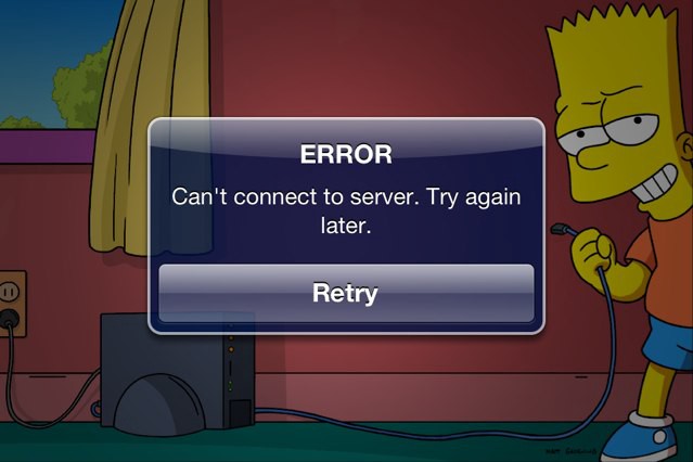
No one is going to take slow speed, whether it is an app or website.
Customers don't like If your app takes so much time to load, In most chances, users uninstall the apps because of bad speed experience.
In the running life, users don't have enough time to stick around the slow app and get irritated with this behavior of the app, whether it is buffering or any functioning process.
When your page load time increases by 1sec to 3 sec, there are chances of increasing the bounce rate by 32%.
If your cress 6 sec, it reaches an alarming 106%.
20. Avoid the use of App Templates.
There are many services available online which provide a large number of app templates with the variant of design, pattern, font, color, and layout.
Use of similar app templates can save your time and money both, but it doesn't look unique and impressive, because these templates are not exclusive anymore, anyone can use these without any copyright.
I do not recommend to use the template. No matter if you are a self-funded startup because of experience matter and top of that, the BRAND experience.
So if no template than what?
I prefer to design a custom template with proper user research and brand guidelines. This process defines the success pathway.


