
Your Site Could Do Much Better- Learn How?
25 ways to improve the user experience of your website and user experience is the most significant factor in any web design.

Want people to get talking about your website? Eyeing for a top spot in favorites? Get ahead in the race. Gain an edge over your competitors. The best is to beat them in the interaction game. As we launch new and new projects, it is quite easy to get drifted with the new and forget the old. We don’t even bother to update our older blogs and websites and change for better. Remember great websites make users happy and the key to keeping them satisfied is to give them valuable, useful and more engaging content.
The target is not just to pour in information rather it is to deliver that information in a different and distinct style. With every web page, you get an opportunity to perform better. Every website has undoubtedly got ample scope to improve. Even a single update of a particular web page can transform the result and rank it as an outstanding resource for your users. Now, if you desire your website to stand high in Google search, you must find ways to outperform others and make people relish your website more. This post will enlighten you with some ideas to refine your product and make it shine in the marketplace. Robust, scalable and responsive websites are plausible and here are some tips to get you going-
1. Test It Out

Testing makes things easy. With testing, you can get to know a lot about your user interactions by analyzing how people react to your website. User experience studies should be done via tools like Google Analytics or by way of other 3rd party resources. Needless to say, the advantages are many. UX testing is of great use for web developers as they can figure out the problematic areas of a website posing trouble to the users.
Don’t rely solely on digital tools but also take the opinion of your friends and colleagues to decipher the scope for improvement. Remember, human feedback on your website will give more valuable insights as compared to that of a computer screen.
2. The Visual Impact

Yes, we agree, content is king, but don’t forget, visual appearance has its own charm. A website should be clean and impressive. Sales are influenced a lot by color schemes. Try to understand the psyche of the human brain, example blue is a color that can be used to establish trust and security and is quite visible in the matters of finance, insurance, and banks. Prior to the selection of your color schemes, design, and looks, do conduct research on this business website.
3. Clear Mission

Let your mission be clear on your homepage itself- bright and bold in a headline if possible. Display your aim in your blog section and on the about page to educate your visitors well. A user should gauge the objective of your website just by looking at the homepage or by the display of a tag line in your site. Also, the logo must be apt and voice properly for your business. Let the users be aware of the brand, what all the site offers, the gains that they get, etc.
4. Easy Navigation
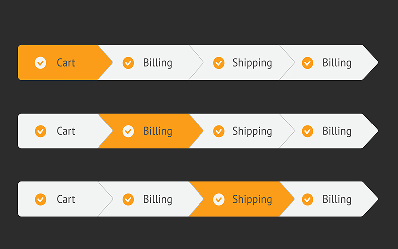
Make the navigation as simple as possible so that the users can locate what they want easily. Clear navigation is not only beneficial in making the task simple but also indicates the search engine the status of your products and contents. Descriptive navigation is advisable so that the visitor can know where to look and how many clicks will suffice to complete the task. It will save on user’s time and will contribute immensely to enhancing the ranking on the search engine too.
5. Spruce With Space
Consider whitespace as the amount of room that is there between the attributes in your page. Some visitors are using congested designs and don’t mind looking at the same. But this is not the case always. Your target audience may not necessarily be computer literates as the younger generation is, so it is better not to compromise on spacing. You can get the idea of extra space with the help of A/B Tests and act as per the user feedback.
6. Open To Fonts

Versatile web fonts enable the designers to produce web pages that aren’t limited to typical font families. This trend has made its place now that most of the internet users are using DSL/T1/Fiber-Optic connection. Now 3rd party font stylesheets will not be a disappointment and not lag in DL speeds. Google Webfonts is a dynamic provider of fonts. You can operate the application even without a Google account, although registration has its own benefits.
7. CSS3 Shadows
Shadows here imply two different properties that should be catered to. The usual box-shadow is a sought after option for divs and boxed placed within your layout. Adding this style onto your wrapper, container etc. will render a slimming 3-D effect to your webpage. To apply the CSS3 text-shadow property in the context of typography that jumps off the page. Apple is one brand that religiously follows text shadows around their designs. You can create a special effect by implementing text shadows that are opposite in color to that of your fonts.
8. Fine Textures
There are various websites that can survive just by applying the usual color schemes. But to be labeled as best-of-breed you have to do something different and include textures and repeating tiles into your background. There are apps that can help you with the creation of a tiled background image and even provide you with a vast collection of usable textures.
9. Gradient Works

As we have already discussed the role of backgrounds, let us look into the all-time favorite CSS3 gradients. The web developers can avail a lot of benefits in terms of web backgrounds and don’t have to resort to Adobe Photoshop any longer. These gradients can be applied to not just the body but navigation bars, footers and other significant parts of the layout.
10. Bootstrap
Twitter’s Bootstrap is an amazing frontend UI pattern for the web developers. This framework consists of form inputs, buttons, columns, and numerous other pre-formatted page elements. The best use of Bootstrap is seen within the landing pages of applications new on the horizon. Open-source developers also employ Bootstrap at the time of creating demo pages for libraries, plugins or even mini scripts that they want to publish.
Bootstrap has witnessed such wide popularity that it is part of all the websites these days. Developers in need of quick fix are using Bootstrap in place of their own UI designs to create magic.
11. Innovate With HTML5 Kickstart

Although new, but HTML5 Kickstart is one sure thing to try. Made by 99Lime, HTML5 Kickstart is also a frontend UI library that includes fine design aesthetics than the usual HTML5 layouts. You have to go through code samples for building both in spades. You can always select between the available gradient buttons and drop-down menus. Gain, not better than Bootstrap, but then not that bad even! Remember, Kickstart is not made for every product, but in times of crisis, it can be a major time-saver.
12. Go-Go jQuery UI
jQuery library has a huge collection of animations, sliders and fading elements. This is, in fact, the most preferred open-source JavaScript library for frontend developers and has a partner library jQuery UI. Developers generally ignore this under the notion that there won’t be much gain in return to the extra KB. But having the UI library means that you can easily modify the easing call for any vital page and its animations. This implies that you have the power to tailor jQuery animation type for any element like the scrolling slideshows, drop-down menus, fading items etc. Go to the jQuery website and look at the demo page to experience the effect of several variations and choose the best animation of your type.
13. Call-To-Action In Style

Users have visited your site quite a few times and now are keen on more action. So, of course, your site must have few call-to-action buttons like open an account, download or try it now, so that the user can go ahead with pursuing their goals. The voice for the call-to-action button should be in the first person such as ‘my shopping bag’. Do keep apt colors for CTA buttons.
14. Solid Testimonials
Do include a testimonial page on your website. Get the opinion of the customers on your service as well as that of your brand. Publish their views and thoughts in a concise manner on the home page. Many potential users like to go through the old customer’s testimonial before giving your service or company a chance.
15. Bolder With Backgrounds
It is seen that the websites are experimenting more and more with their backgrounds and are using the fullscreen background image. If you come across a high-resolution photo sample that will work well as a background image, do incorporate it into your design. Large backgrounds are worthwhile in capturing the user’s eye and at the same time also denote the genre of the website well. jQuery Backstretch plugin is a good option in this regard as it only needs a single line of code for your new background to fit properly and is clearly using any resolution.
16. Shine Bright With Icons
If you want to catch the attention of your visitors, it is advisable to put a small icon set in your web page. Although standard menu links are suitable for functionality and guide users to navigate between pages, still when it comes to customized icons they create an instant pull. There are lots of free icons sets available online which can make your navigation, sidebar or footer area look amazing.
17. New Color Scheme

Now, this doesn’t mean modifying the overall color scheme of design rather adding some new colors to it. After looking at the same design for months, it is refreshing to see some small updates and throw some surprise for the repeat visitors. Some potential elements for change are headers, anchor links, toolbars, and backgrounds.
18. Nice Browser Support
We know it is complex to create a website that is recognized by all the major legacy browsers. Even though very few people are working on Internet Explorer 6, it is still seen in Google Analytics reports. Developers who are brainstorming for ideas can go for a small trial of browser tests. Mainstream browsers gaining popularity are IE9, Mozilla Firefox, Chrome, Safari, and Opera etc. Also, Internet Explorer 6-8 is seen in usage in businesses and older computer labs.
19. Care To Share

Social media sharing has seen quite a development in the last few years. Now every developer knows about the badges that are displayed on popular social networking websites. Facebook, Pinterest, Twitter all provide you with codes to embed into your website. With this, visitors have the option to spread the link onto these networks without even leaving your website. You might even see these badges bucking up as you scroll down the page in some blogs and web magazines. This is a superb style as it is often present in the body area where no hindrance is caused.
20. Responsive Images
Adaptive and responsive web page images are ruling the web world. It is strange if you still have your images made of fixed widths spreading out of the container wrapper as the window size is adjusted. The best way is to use width: 100% in CSS when it comes to img elements. Other open-source methods can also be employed as long as they work effectively. ResponsiveImg is a jQuery plugin that is worth using as it makes the single-line code target all the images present on the page. It is very useful for mobile layouts which are still displaying desktop-based info.
21. The Extra With Microformats

Microformats and also microdata features are helpful to increase metadata present in HTML code. These give away additional content and tell the relation with the other content already placed on the page. Further, these results guide Google to calculate your web site's rank for individual keywords and also in other engines namely Image and Video search. The most significant documented version of Microdata is Schema.org.
This website enumerates all the bits you need to edit your HTML content with semantic schema markup. This Schema syntax is recognized by all the major search engines and will definitely proceed ahead in semantic metadata design.
22. Jump To Top Link
If your website is loaded with lengthy info, then this is a useful element in your layout. The scrolling back to top links can be seen everywhere now. Users don’t bother going to the Home key and it is really frustrating scrolling up and up. The best place to find this link is near your container or present right in the footer.
23. Suited Code Tags

At the time of forming a website stylesheet, it is the general tendency of many developers to ignore the usual page elements. Headers and paragraphs are the commonly neglected babies, but does that apply on pre tags and inline code tags too? These are important and put up preformatted source code syntax just as you would view in a text/NFO file. Even though some websites don’t require these elements, still it is suggested to have them styled to keep safe.
24. Varied Stylesheets
Think of all the media styles you utilize when you carve a website layout. You consider the look on all the devices namely laptops, tablets, desktop monitors and also smartphones. And yes, how can we forget projection and print media which wavers on support. If there is a large set of the target audience who uses a wide range of media, it is best to include your own alternate stylesheets.
These can be labeled on the basis of the type of media like print.css or made in addition to the current stylesheets. If there is a lot of demand, then your visitors wouldn’t stop thanking you. And as a matter of fact, editing your default website design for common printers is not that time to consume too.
In the End
Let us face it; people are here only for awesome websites and there is no need for trash. Make your website notable keeping in mind the users who would want to use your website. Creative designers and front-end web developers can change the fate of their website if they take into view the above points and implement them at the right place and right time. It is always good to modify your layouts and update them with a dash of latest trends from time to time. This collection of ideas will definitely help you in creating viral content, get a large following and give your website and your company recognition of authority.


