
Tips For Designing a Perfect iOS Mobile App
Good ios app UI design can play important role in the success of ios mobile app. A key thing for designing a successful and popular app is getting the UX.

iOS has set a benchmark in user interface design and gives the apt platform to deliver engaging and powerful user experiences. Although Apple claims iOS 10 to be the best of the lot, it is seen that most of the new attributes are consumer-facing say the widgets, Siri/messages integration and even expanded notifications. Talking of designers, the only design change that stands out is the bolder titles and more usage of cards as noted in native apps like Music and News.
Now, iOS 7 widely used thin fonts, but iOS 10 has reverted back to bolder texts. Before beginning your journey towards a commendable interface design, it is always advisable to go through the App Store guidelines, which states everything quite clearly. Use those guidelines along with the combination of some of their other communications and there you will surely come up with a successful app. Below are some of the design concepts to enrich your layouts before you move onto coding to enhance the appeal and usability of your apps. This piece is your guide to designing apps like a pro in iOS:-
1. Adaptive Design
With a large number of device resolutions on the surface, it is important to make sure that your layout is adaptive. Employ tools like Xcode or Sketch Constraints so that you come up with a design that has flexible screen size and displays extra menus if required. It is good if the user interface expands instead of scaling up in size. For larger screens like iPad and iPhone 7 Plus to view in landscape mode, left navigation appears instead of the Tab Bar.
2. High Platform

iOS has advanced a lot over the years. As it upgraded onto the 9th level, Apple bought a new feature called San Francisco font in the system and 3D Touch and multi-tasking on the iPad. If you look at Xcode, you will find an excellent tool for creating more adaptive layouts without the troubles of Auto Layout. With time, Apple has promoted adaptive designs so that it can work across various devices.
3. San Francisco Font

The default font in usage is the San Francisco font, which has been created in-house by Apple itself.
4. The 3D Touch

An attribute new to iOS is the 3D touch that permits the users to speedily go through the options in and out the app. Viewers are now given the power to force press the App icon and look into the frequently used items. Inside an app, emails can be glanced at and links can be seen before fully entering the screen. Consider 3D Touch just like the keyboard shortcuts on your Mac that facilitate people to perform repetitive tasks quickly.
You have to create design shortcuts, which increases the productivity of power users. But as in keyboard shortcuts, don’t limit the important features to 3D Touch. Your users should be able to access your app normally too.
5. Step-By-Step
Take one screen at a time while designing an app on iOS. Pay attention to what is the main motive of each screen and then divide it out into the smallest possible number of additional options, buttons, and other controls needed to attain the goal by the user. Don’t include too much on one screen but especially on a mobile device.
6. Icon Matters
The best tip to building an awesome app icon is to focus. Market what your app does in a clear and transparent manner that is visually attractive at the same time. iOS users are generally very choosy about the icons that make place onto their home screens. Plan and devote time to building every possible size to be sure that it appears sleek on whatever device it is used, even the tiniest version that is shown in the System Preferences menu.
7. The Core Game
A great tip here is to lock down the main feature set for your app as early as possible in the design process and don’t deviate from it if possible. Through this, you can modify and improve the concept of your app and also refine the look and feel without the trouble of putting in new variables.
8. Follow The Rules
While you are designing for iOS pay heed to Apple’s conventions. It actually describes the best of UI design. Yes, you can modify the style of a particular control to enhance the look and feel of your app, but that doesn’t mean that you can change their function altogether; this, in turn, will only puzzle out the users who want all the apps to behave like other OS apps. Red buttons, for example, are used to delete items and blue buttons are meant to complete actions, always.
Tips by Apple – https://developer.apple.com/design/tips/
9. Points Differ Pixels
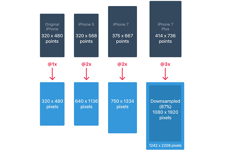
Developers use point values so be careful to understand the difference between pixels. When iPhone came on the horizon, two units were identical- 1pt equals 1px. Then came retina screens so 1pt became 2px. So, consider points as the values mentioned in the original iPhone and pixels as the real values based on pixel density, i.e. iPhone 4, 5, 6= @2x, iPhone 7 Plus= @3x. Always include high-resolution versions of all image assets. Images that don’t qualify as @2x and @3x will give a blurry view on the Retina display.
10. Super-Ellipse

iOS 7 brought a change in the shape and the rounded corners changed from plain rounded corners to a superellipse shape. Take care that you are not supposed to export icons with the mask as you will end up finding black artifacts. You should rather export square assets to the App Store.
11. Icon Grid
Apple used a golden ration on some of its icons. This made the icons the shining heroes along with the good proportions. Although it is a fantastic rule to follow but it is not compulsory by any chance. Even Apple has not kept onto it in many of its icons.
12. Keep It Intuitive
It is seen that the best of the app interfaces are simple and intuitive. Yes, they give the native feel to the viewers making them feel very comfortable, just at home. The biggest challenge for the designer is to keep the visual appeal intact so that the users are in awe with it, but still know how to operate it without using any of the tutorials.
13. Plan Well
Commence the design process by considering the basic navigation framework first and then include the other functional blocks. The simplest way is to draw a complete flowchart of your app and then link all the screens and dots. Ask someone not connected to your project to look over the sketches and judge if the suggested functions feel appropriate to them.
14. The Resolutions

The iPhone comprises of four main resolutions – 320 x 480 pt (iPhone 4), 320 x 568 pt (iPhone 5), 375 x 667 pt (iPhone 7) and 414 x 736 pt (iPhone 7 Plus). The layout usually expands on the resolution and doesn’t scale as per the dimensions. For instance, the Navigation Bar varies the width but sticks to the same height. Elements remain the same within. The iPhone 7 Plus is the only iPhone that serves more like an iPad in Landscape mode. That means a Left Navigation will come in view replacing the requirement for the Tab Bar.
15. The Color Chart

iOS prefers bright colors for its buttons. These colors suit well in contrast to a white background as much as the black background. Pay attention that the colors should not be used too much just for call-to-actions and minimal branding areas like the navigation bar. Say only 10-20% of your design should include colors or they will defeat the purpose of the content. iOS generally utilize neutral colors for its background and menu areas. A well-contrasted black text against a white background will prove suitable for the readability of the text. And yes, pastel blue is used to make the buttons unique.
16. The Buttons and Fonts

The standard size is 44pt for buttons, 12pt for small text, 17 pt for body text and at last, 20pt+ for titles.
17. Space Out
Minimum padding or margin of 8pt is preferred generally. This allows enough space, which makes the design easier to scan and there is the readability of text. Further, UI elements must be aligned and the texts should include a similar baseline position. Note that the text must never overlap. You can work on the legibility by either increasing line height or letter spacing.
18. Touch Controls

Such UI elements should be present that are specially crafted for touch gestures and which make interactions feel very simple and natural.
19. Hit On
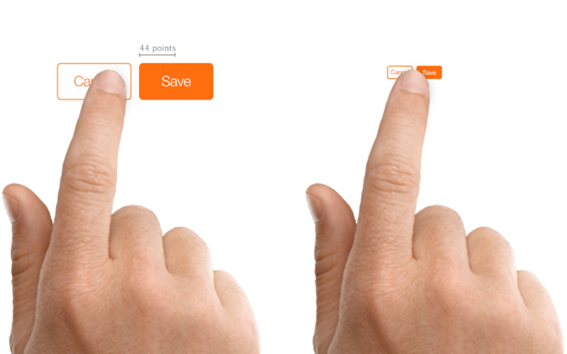
Design controls that are at least 44 points x 44 points in size so that they can be conveniently and accurately tapped with a finger to meet the targets.
20. Eye For Text

Make sure that the text is at least 11 points so that it is readable from a good viewing distance without even zooming.
21. Not to Distort

If you want to avoid distortion of images, keep in mind to keep the display images always at their intended aspect ratio.
22. Trick to Organizing
Build such kinds of layouts that are easy-to-read and that places control near to the content that modifies.
23. Status Bar in Places

It is suggested that you keep the status bar in as many places as it can be fitted in. Users depend on it greatly for any important information that they are seeking such as time, battery and signal. The text or the icons can either be black or white, but it is allowed to customize the background into any color and mix it up with the Navigation Bar.
24. Easy To Navigate

If you want fast information about the screen, it is the navigation bar that gives you the clue. Keep the left portion for Back, Profile, Menu buttons and the right portion for action buttons like Add, Edit, Done. Remember if you want to use any of these system icons, you don’t have to create assets for them. Just as the case in Status Bar, the background can be customized to any color and generally as a subtle blur to take care that the text is always readable. During the presence of the Status Bar, both the backgrounds get mixed together.
25. Time To Search

If you know that the app has a lot of content, it is always advisable to make it searchable.
26. Toolbar In Action

If you require more real estate for your action buttons and screen status, it is best to use the Toolbar.
27. The Art of Tabbing

Your tab bar is the main source of navigation between multiple screens. Keep the Hamburger menu at bay if you have very fewer items. Menus that stand out will be good for usage as obvious things always win. Also, it is suggested to put text adjacent to your icons as the majority of the people don’t recognize symbols instantly especially if they are not popular universally. If they are not active, icons usually show an outline rather than being filled. Through this, they gather less attention.
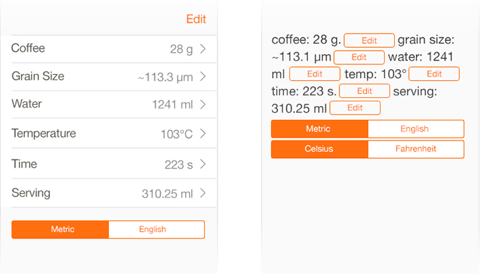
28. Look at Tables
The table view is generally used for listing content. Most apps employ a form of the table view. The reason is that it is very basic and customized to the level of the smallest elements. At the basic level, there are various preset Styles and Accessories that can be taken into play. There is also an option to group the cells with a title above and the description below.
29. All Collected

If there are both rows and columns present in a grid style, you require a collection view. Yes, it is advanced much but you can definitely make any layout that you desire. With collection view layouts, the possibilities are endless.
30. Modals
The alert dialog is used for the purpose of communicating important info and encouraging quick actions. Keep in mind to use fewer alerts and the ones present must be obvious. Further, the activity dialog helps you to share content via text, links, and images to iOS features like Favorites, Bookmarks, Airdrop and apps like Facebook, Twitter etc. Although the look can’t be customized, still the options can be. If the information presented is bit lengthy, use a model that is full-sized and appears from a slide, flip, fade or page animation. Just like other models, it should be easy to cancel and keep it as brief as possible.
31. The Keyboard Style

The keyboard is needed to input information in text fields like chat, log in or search. It is very customizable for email, phone numbers, URL and even emoji. You can select between light and dark themes and even choose how the action button should be named.
32. Pick Up
If there are a plethora of options to choose from, you can utilize the picker control. It is very good for dates, which manage 3 fields in one action.
33. Track The Progress

The progress bar pinpoints how far an activity has taken place. For instance, you can use this to display the loading progress of a web view. Remember that the height can be customized.
34. Switch On or Off

Use this to shift between on or off mode. Don’t use this for any other function except on and off.
End Thoughts
Designing an iOS app is a serious business. You can’t just have fun as you create for the Apple Store. Remember if you keep basking in the same glory of your grand product without any innovation further, there are other pro developers, designers, and entrepreneurs waiting to snatch your title and replace your product with something new. Attention is a zero-sum game here. The best thing is to keep designing apps that are different, well-crafted, useful and supreme. Create apps that have an impact on peoples’ lives in small, but meaningful way.


