
20 Common Typography Mistakes That Designers Should Not Make In 2020
Good typography plays a important role in making your brand more effective, if you avoid typography mistakes designs will be well received by the people.

Typography is an inevitable part of creating designs. Though from the looks of it you might think that it is just about arranging fonts, but trust me, there is a lot more to it.
Typography FAQs -
What is Typography?
Let’s break it down first. Typography is derived from
Greek words Typos = Form, Graphy = Writing.
In practical words - Typography is the visual component of the written word.
In technical words - Typography is the art and technique of designing, setting and arranging type. The majority of this information comes from words. Therefore, typography is the most basic form of graphic design and perhaps the most important tool of a graphic designer. Typography can be a very complicated topic but understanding some simple concepts and rules can result in solid typography and help make a good graphic (UI) design great.
How Many sections of Typography?
There are five sections of typography::
- Typefaces
- Line length
- Leading (line spacing)
- Tracking
- Kerning
What is Typefaces?
A typeface is a design for a set of display fonts, each for a set of characters, in a number of specific sizes.
Typefaces often come as a family of typefaces, with individual typefaces for italic, bold, and other variations in the main design.
A Font = Member of a particular typeface.Ex: Arial Black is a typeface. Arial Black – Bold, Regular, Italic, etc.
How many types of typefaces?
Types of typefaces
- Serif typefaces
- Sans serif typefaces
- Script typefaces
- Ornamental typefaces
- Monospaced typefaces
- Symbol typefaces
What is the difference between Serif typeface and Sans-Serifs typeface?
Serif: Ever noticed those little pointy things (the thick and thin ones) that stand out at the end of some of the strokes that form a letter? Yup! Those little buggers are called Serifs.
Sans-Serifs: on the other hand are typefaces without the Serifs.
How to differentiate Tracking and Kerning?
Tracking: In typography letter-spacing, also called tracking, refers to the amount of space between a group of letters.
Kerning: In typography kerning is the process of adjusting the spacing between characters in a proportional font.
Lets Start!
Now let's talk about common typography mistakes which designers do by mistake or lack of knowledge.
Typography is no way as straightforward as it appears to be.
The effort and cares it requires for blending a type on a page are nowhere to be seen but what remains behind is a visually appealing content that is a treat for the eyes of the reader.
However, the irony with typography is that the errors tend to stand out more than good choices. Typography is a platform that makes the words and the meaning shine with their focus.
That said, it is up to you if you want your type to shine or your mistakes.
By getting too much driven with typography, designers tend to misunderstand and abuse type and this can get even worse if they aren’t trained to handle and set them.
This article focuses on some of the biggest blunders that designers commit when it comes to type.
If you want your message to be conveyed without getting lost amidst the typographic errors try avoiding the typography mistakes mentioned below-
1. Leading Trouble

The space between the two lines is known as leading.
The name was coined after the strips of lead that were used in original metal type press to make sure enough space was there between the lines.
In simple words, congested lines can affect the legibility and make the copy too bunched up and difficult to read.
Similarly, too much line spacing or loose lines can ruin the connection between the lines of type.
As such, there is no fixed rule when it comes to leading, but logically legibility of the text can be used to make the aesthetic decisions.
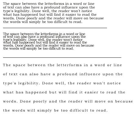
2. Tracking Crowd
![]()
Tracking means the spacing in between the letters of a word or phrase.
More the tracking, greater is the space alongside words in a line.
Designers make use of tracking to fit in type so that it is set along a particular line length flawlessly with some adjustments here and there.
But remember, too much tracking can harm the legibility and readability of the copy.
A rule of thumb can be to leave tracking at its default value to give a perfect look to a specific font.
If you are using a font for the headline or a display face, it is normal to lower the tracking to a value of up to -20 to make it appear heavier and more like a headline rather than leaving it to its usual value.
3. Tracking vs. Kerning
![]()
Designers invest a lot of their time deciding over the tracking and kerning in typography.
However, note it is important to understand the difference between the two.
Tracking, as stated earlier, refers to the spacing between the letters of the word or phrase.
Kerning, on the other hand, is adjusting the given space between two characters specifically. Kerning can come to play when there is a lot of white space around the characters and you want to bring them closer to their neighbors.
The best example here can be letter forms W and A, which can be combined due to their aligning angles that make up their shapes.
4. Poor Scaling

Another disastrous mistake that designers usually commit is stretching or condensing words terribly to size them into a particular space.
Beware of this blunder as it ruins the letters and gives them a shape far from their original form. Fortunately, there are quick fixes to this problem.
One is that when you are scaling a textbox either up or down, keep the proportion in mind.
Different design programs support different shortcuts for this measure.
For example, Canva has automated adjustment when you drag the corner of a text box or any other object.
In Photoshop and Illustrator, you need to hold the Shift key as you drag the corner of your text box.
5. Giving Readability a Miss
If you want your design to be a hit amongst the masses, you ought to make them read it.
However, sometimes you get so driven by the design process that you end up making choices that aren’t quite compatible in terms of readability.
For instance, fine, white text on a black background might look classic but can be a lot difficult to read.
Legibility hurdles can come in various forms like font can be too small; font and background colors might not get well; transparency effects can harm the visibility of the text etc.
Long passages of text require special attention in the context of readability.
Instead of focusing on capturing the reader’s eyes make sure the passage is clear and simple to read.
This can be done by placing the text in a manner that it is quick to navigate and further by working on other aspects such as tracking, leading, font size, etc.
It is believed that serif fonts are the best for body copy as they encourage eye movement more quickly.
But that is just a myth as simple, sans-serif typefaces work wonders for readability too.
6. Faces and Weights Overload

Designers, new to the field, have a habit of using too many fonts and weights in a design.
As a rule of thumb, it is advisable to limit a particular design to a maximum of three different fonts.
Yes, there will be times when you will require more than three, but by adding a lot of typefaces you can irritate the reader and make the design appear disintegrated.
The same applies when you are adding too many weights to a particular font.
However, using the same font with different sizes and density is still not as big a crime as adding too many typefaces.
7. Unreasonable Line Lengths

This is another legibility issue you are left complaining with.
Lines of unreasonable lengths make it difficult for the reader to fix their eyes on the next line and dismantle their understanding.
As a piece of general advice, it is good to take a hint from newspapers and magazines and fix your content’s lines to a maximum of 75 characters.
There will be exceptions when you won’t be able to stick to it, but if your content finishes to a more than a couple of lines, you must pay special attention to curbing the line length.
8. Ignoring Orphans And Widows

When it comes to body copy, one of the disguised errors that can happen is while working with paragraphs of text through orphans and widows.
These are typographical lingo for words or short lines that appear on the top or bottom of a column or page of text and stand-alone from the rest of the copy.
While you are typesetting your text-heavy copy, pay heed to these hovering in the corners somewhere.
This got to be tackled to avoid ample white space interrupting the flow of the text.
The solution is easy- just change the lines manually at breakpoints or set the line length or tracking value to suit the white space.
9. Double – Spacing Hell

Want to make your copy reader-friendly? Avoid double-spacing between sentences.
Agreed, we have been taught to place type two spaces after a full-stop, but this practice has retired now and is no longer necessary.
And, not forgetting, double-spacing causes visual jerks in a block of text that disrupts readers’ flow.
If you are addicted to this one, don’t worry, many programs have options to locate and replace double-spaces with singles at your help.
10. Insufficient Contrast

If you are flooded with thousand options it doesn’t mean you start using all of them.
This is much like having a copy that has inadequate contrast with its background and poses problems in reading and grasping of the text.
The reasons can be, either the type is selected using a color that is similar in tone to its background color or it is set on top of a tinted semi-transparent background that is placed above an image.
Whatever is the case, this mistake can be fixed by stressing your eyes and ensuring that you can read the characters of your type thereby reducing your color effect and making it easier to distinguish between the shades of different colors.
11. Going For Text Centering

A common practice that every design pro follows is not to center align the text. Although, this can’t be done always as there are designs which vouch for centered text.
But the key is to use it wisely and with precision. Amateur designers are caught up with the centered text in an attempt to bring harmony in design.
But this backfires as they harm the symmetry and make it difficult to read long passages of text.
Avoid center aligning your text on a universal basis and relish the asymmetry of design with its attributes like irregular lines or in some cases, go for justified text when you require a solid block of copy.
12. Away From Content

It is important to see that the style of the fonts goes with the content of your project.
Fonts can vary in moods like serious, playful, elegant, casual, modern, vintage, etc.
But if these moods fall altogether indifferent zone to the purpose of your design it can disjoint and confuse your viewers.
This is truly a no-brainer; as if you are designing a business report, it is common sense to use conservative, low key font whereas for a children’s book cover you should use fun, bright and cheerful font.
Typefaces reflecting personalities are chosen as display fonts in design, but remember to use them minimally and for particular designs only.
13. Forgetting Function
Yes, as a designer it is easy to get caught up with the latest typographical trends and use unique fonts that enhance your design.
But amongst all this rage what is left behind is function. Even if typography stands high in the artistic score, it must be high in functional quotient as well.
If you get stuck on the look of typography in the manner that you forget readability and suitability of your project, then you must pay extra attention to creating a right balance between form and function.
14. Too Much Emphasis

Sometimes the design demands you to highlight certain portions of text to make it visually sound and pronounce its importance.
There are a lot of ways to carry out this emphasis like italics, caps, boldness, underlining, font size, etc.
Remember not to go overboard with these features and use them all in one passage of text.
It gives a wrong impression that you are trying way too hard to convey your message and creates a mess instead of meaning.
It should be one out of ten times when you go for more than one feature for emphasis.
15. Shouty Capitals

Capital letters are no doubt a great way to emphasize. Writing in all caps is in these days especially in a conversational environment like social media.
If you are quite in favor of this technique, it is suggested that you do it for specific purposes like headlines and on an occasional basis because using it for lengthy texts will affect the readability negatively.
Also as a general factor, capital letters seem to scream to the readers even though the intention may not be to do so.
16. Full Stop Spaces

Going for two spaces after a full stop has become a common error.
In reality, this is not the designer’s fault but it is worth mentioning here as these tend to cause trouble in production.
The double-space after a full stop is a curse from the past, typically from the days of typewriters, and was used to avoid placing the character too near to the period.
Modern software, desktop publishing tools, and web browsers are in charge of this type of correction, making the designers safe from the old school practices of the bygone era.
17. Not Considering Hierarchy

In the context of typography, hierarchy is used to distinguish between various textual elements to highlight their order and importance.
A clear picture can be understood from the headline, sub-headline and body copy of a newspaper article.
The headline is of supreme importance and is the largest, mainly in bold or capital letters as it is meant to be read first.
The sub-headline is smaller in size as compared to the headline and might be in italics or different font and thereafter, the body copy is generally of the smaller font size.
This arrangement gives an organized structure to the news stories and makes it clear for the readers to understand.
When you ignore the hierarchy in the typography of your design, you create chaos for your viewers as they don’t know where to focus first and start reading.
18. Keeping Away Margins and Guides

To make the alignment of your text perfect, it is advisable to turn on the margins and guides in your respective design program.
Although this measure will not overcome the alignment problem, it will prove beneficial in giving your design an organized structure.
Many programs give you the privilege of alignment tools that does all the challenging tasks for you, for example, aligning various objects to a certain point on a page or lining up the left edges of a text box, etc.
19. Shallow Special Effects

There is nothing wrong in adding bells and whistles to your typography.
Of course, special effects are good for your text, just like the dynamic ‘WordArt’ tool in Microsoft Word.
But the problem is every design may not be appropriate for special text effects.
Effects like drop shadows, gradients, warping, and 3D or embossed effects don’t go with the theme of text always and look cheap and gimmicky.
20. Neglecting Final Check

Okay, so this one might not be design-oriented strictly but holds a practical implication for the entire process.
Don’t forget doing a final check of your text, verifying all the spelling and grammar errors as well as typographical mistakes that can occur during the various rounds of the design process.
Errors, even though unintentional, can ruin your project and make it look unprofessional, which as a result will make the audience form a wrong notion about your company.
Conclusion
In typography, as such nothing can be labeled as ‘right’. Even the mistakes are made under the persuasion of various technical or style reasons and are subjective in cases of project, goals, and circumstances. Typography mistakes can cause a huge blow to the effectiveness and appearance of your designs and should be kept at bay. Hope the list of type faux pas will act as a reminder in your design process and prove as an effective guide on fixing errors


